

Your home should make you feel something. Not just comfortable or functional, but genuinely, ridiculously happy. A bold home isn't about following trends or ticking design boxes. It's about creating a space that reflects who you actually are, not who Pinterest thinks you should be. If your living room makes you smile every single time you walk in, you're doing it right. If it doesn't? Well, darling, we've got work to do.
What Actually Makes a Home Bold
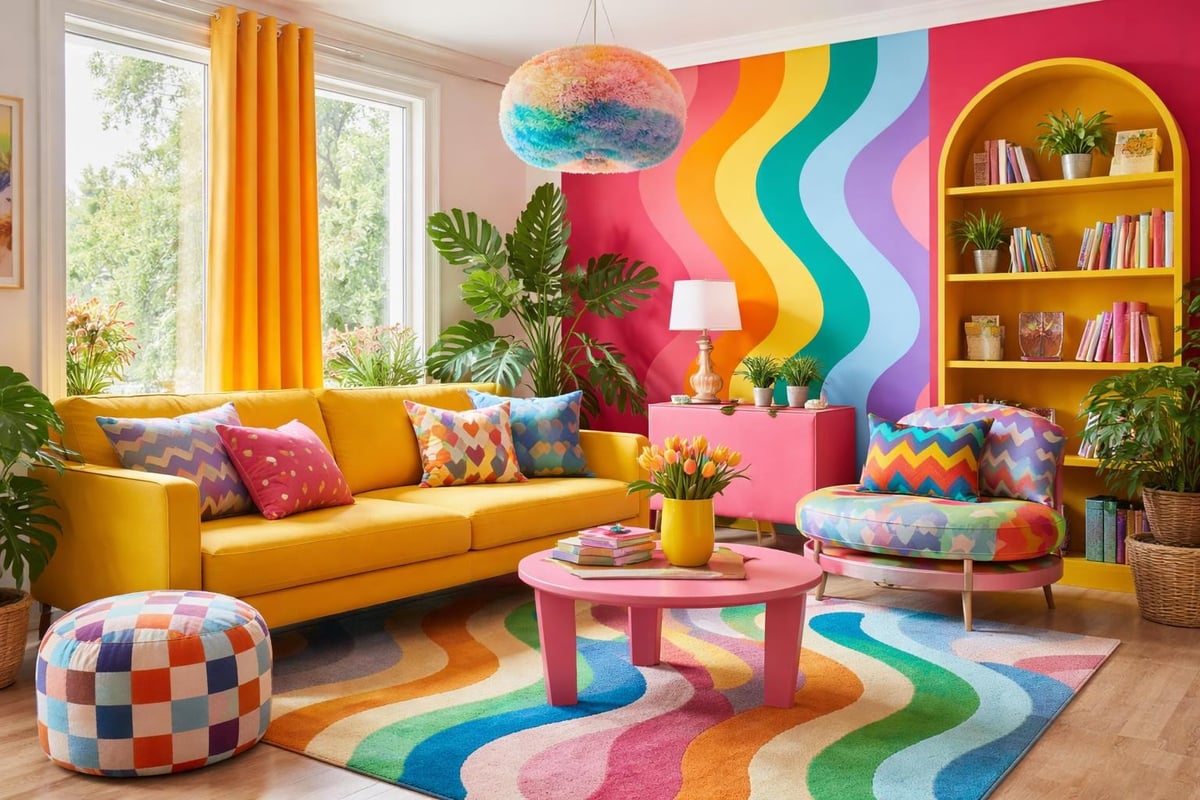
A bold home refuses to apologise for existing. It doesn't whisper when it could shout. It layers patterns that shouldn't work together but absolutely do. It chooses the saturated jewel tone over the safe neutral every single time.
Bold doesn't mean overwhelming. It means intentional. It's the difference between throwing every colour at the wall and strategically curating a palette that makes your heart race in the best possible way.
The Psychology Behind Fearless Spaces
Colour affects mood. Shocking, right? But seriously, the dopamine decor trend proves what colour consultants have known forever: vibrant spaces create vibrant moods. Your environment shapes your energy, your creativity, your entire bloody outlook.
When you walk into a bold home, your nervous system notices. Saturated hues stimulate. Playful patterns engage. Unexpected combinations delight. You're not just seeing colour, you're experiencing it.
Key psychological benefits include:
- Increased energy and motivation
- Enhanced creativity and problem-solving
- Improved mood regulation
- Stronger sense of personal identity
- Greater emotional connection to space
Building Your Bold Home Foundation
Start with what actually matters to you. Not what Architectural Digest says matters. Not what your mother-in-law thinks is appropriate. You.
Choosing Your Signature Colour Story
Every bold home needs a colour anchor. This isn't about choosing one colour and calling it done. It's about selecting a palette that speaks your language, then having the confidence to use it properly.
| Approach | What It Means | Best For |
|---|---|---|
| Monochromatic Bold | Multiple shades of one saturated colour | Cohesive, dramatic impact |
| Complementary Clash | Opposites on the colour wheel | High energy, playful spaces |
| Analogous Adventure | Neighbouring colours in varying intensities | Harmonious yet interesting |
| Triadic Triumph | Three equally spaced hues | Balanced vibrancy |
The right colour scheme for any room starts with understanding your response to colour. What makes you feel alive? What colours have you avoided because someone told you they were "too much"? Start there.
Pattern Mixing Without the Panic
Pattern drenching isn't new, but it's having a moment. Candice Bergen's pattern-drenched living room demonstrates how multiple motifs create depth rather than chaos when done with intention.
The pattern mixing formula:
- Choose one dominant pattern (largest scale)
- Add a complementary pattern (medium scale)
- Introduce a third pattern (smallest scale)
- Ensure colours connect across all patterns
- Balance busy areas with solid blocks
Your bold home can handle stripes with florals. Geometric with organic. Modern with traditional. The secret? Repeating at least one colour across all patterns creates visual cohesion even when individual elements seem wildly different.
Room-by-Room Boldness Strategies
Different spaces demand different energy levels. Your bedroom bold home approach differs from your kitchen's, and that's exactly as it should be.
Living Spaces That Actually Live
Your living room is where life happens. Make it reflect that energy. Making your home pop with personality means treating this space as the heart of your bold home, not a showroom nobody uses.
High-impact, low-commitment changes:
- Paint one wall in your most daring colour choice
- Layer rugs in complementary patterns
- Upholster one statement piece in a wild fabric
- Display art that makes you genuinely happy
- Replace neutral curtains with saturated drama
The 2026 home design trends lean heavily into personalised colour choices over safe neutrals. Your bold home shouldn't look like everyone else's bold home. It should look like you let your personality loose with a paintbrush and excellent taste.
Bedrooms That Energise or Soothe
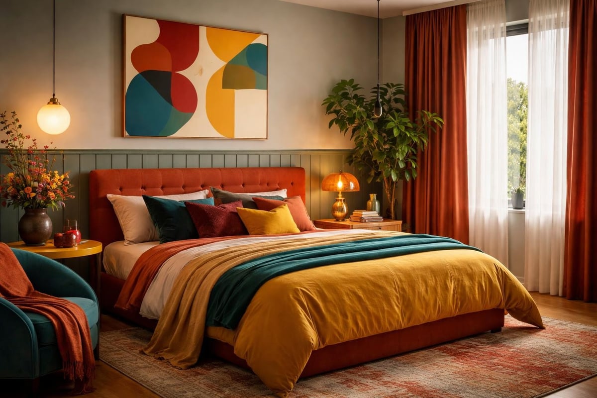
Your bedroom serves dual purposes: rest and revival. A bold home bedroom balances these needs with strategic colour placement and texture layering.
Consider texture-maxxing in bedroom flooring as your foundation. Deep pile rugs in saturated jewel tones create sensory richness while maintaining restful vibes. Layer this with bold bedding, dramatic window treatments, and wall colours that support sleep rather than hinder it.
Sleep-supporting bold choices:
- Deep teals and navy blues for walls
- Burnt orange or terracotta accents for warmth
- Forest greens with metallic touches
- Plum and aubergine with soft lighting
- Mustard yellows balanced with darker tones
Kitchens and Dining Spaces with Appetite Appeal
Food tastes better in beautiful spaces. Science probably backs this up, but honestly, you know it's true. Your bold home kitchen should stimulate appetite and conversation in equal measure.
| Element | Safe Choice | Bold Home Choice |
|---|---|---|
| Cabinetry | White or grey | Deep emerald, cobalt, or burgundy |
| Backsplash | Subway tile | Patterned cement tiles or coloured glass |
| Island | Matching cabinets | Contrasting saturated colour |
| Accessories | Stainless steel | Copper, brass, or coloured metals |
| Lighting | Recessed | Statement pendant in unexpected colour |
The Amalfi decor trend brings Mediterranean boldness through ceramic patterns and lemon motifs. But your bold home doesn't need to follow any specific trend. It needs to follow your specific joy.
The Art of Confident Colour Application
Knowing which colours you love is step one. Actually using them? That's where courage meets competence.
Wall Colour Beyond the Accent Wall
Accent walls are fine. They're also safe. A truly bold home considers entire rooms in saturated hues, multiple walls in complementary colours, or unexpected surfaces (ceilings, anyone?) in show-stopping shades.
Advanced wall colour techniques:
- Colour blocking: Multiple colours on different walls within one room
- Ombre effects: Gradual colour transitions from floor to ceiling
- Ceiling drama: Deep colours overhead with lighter walls
- Architectural highlighting: Using colour to emphasise or disguise features
- Wraparound colour: Continuing wall colour onto trim or floors
Moving beyond beige with bold palettes requires trusting your colour instincts more than your fear of commitment. Paint is changeable. Regret over playing it safe? That lasts longer.
Furniture as Colour Statements
Your bold home furniture should work harder than just providing seating. Each piece is an opportunity to layer colour, introduce pattern, or create visual punctuation.
- Upholster vintage finds in contemporary bold fabrics
- Paint wooden furniture in unexpected saturated colours
- Mix furniture styles united by colour rather than period
- Choose statement pieces in colours you'd never wear
- Layer textiles in complementary bold patterns
The butter yellow wall resurgence shows how one bold furniture or wall choice can anchor an entire room's personality. Your sofa in peacock blue? That's your anchor. Build from there.
Textiles, Art, and Accessories That Pop
The finishing layers make or break a bold home. This is where personality really sings, where you can be genuinely fearless because these elements are easily changeable.
Textile layering strategy:
- Start with your boldest pattern on the largest surface
- Add solid colours in complementary or analogous hues
- Introduce a secondary pattern at smaller scale
- Use metallic or textured neutrals as breathing space
- Layer throw blankets and cushions seasonally
Art deserves walls that enhance rather than compete. But in a bold home, your art and walls can absolutely have a conversation. They just need to speak the same colour language.
Overcoming Bold Home Hesitation
Everyone gets cold feet. The difference between a neutral home and a bold home often comes down to pushing through that moment of doubt.
When Family Members Resist Colour
Not everyone shares your vision. Partners, housemates, or family members might baulk at your bold home ambitions. Here's the thing: compromise doesn't mean capitulation.
Negotiation strategies that work:
- Start with shared spaces using colours everyone enjoys
- Give them veto power over one room, you get another
- Use removable elements (cushions, art) for testing
- Show professional examples, not just Pinterest boards
- Remind them that homes evolve, nothing is permanent
Most colour resistance stems from fear of getting it wrong, not genuine hatred of colour itself. Why fearless interiors create happiness applies to everyone living in the space, once they give it a proper chance.
The Resale Value Myth
"But what about when you sell?" If you're making design decisions based on hypothetical future buyers, you're living in someone else's home. A bold home sells to bold buyers, people who appreciate personality and distinctive design.
Generic neutrals appeal to everyone, which means they excite no one. Distinctive spaces with confident colour choices attract buyers who value character. They might paint over your magenta dining room, but they'll remember it fondly while they do.
Making Bold Home Choices Stick
Commitment to colour requires maintenance, evolution, and occasionally, adaptation. Your bold home should grow with you, not trap you in a 2026 time capsule.
Seasonal Colour Refreshes
Bold doesn't mean static. Your colour story can shift with seasons, moods, or life changes without losing its essential fearlessness.
| Season | Colour Shift Strategy | Textile Changes |
|---|---|---|
| Spring | Introduce fresh brights, lighten intensity | Lighter weight fabrics, floral patterns |
| Summer | Embrace saturated jewel tones | Natural fibres, coastal patterns |
| Autumn | Deepen existing colours, add warmth | Heavier textures, geometric patterns |
| Winter | Layer rich, cocooning hues | Velvet, wool, maximalist patterns |
Small adjustments keep your bold home feeling current without requiring complete overhauls. Swap cushion covers. Rotate art. Change textile colours while maintaining pattern scales.
When to Edit, When to Add
More isn't always better, even in a bold home. Sometimes the bravest choice is removing elements that no longer serve your vision.
Signs it's time to edit:
- Your eye can't find a resting place
- Colours compete rather than complement
- Patterns create visual noise instead of interest
- The space feels chaotic rather than curated
- You avoid spending time in the room
Simplifying interior design choices means trusting your gut. If something feels wrong, it probably is. Bold homes require curation, not accumulation.
Living Boldly Beyond Aesthetics
A bold home reflects a bold life. The colours you choose, the patterns you layer, the fearlessness you embrace in your interiors-they all feed back into how you show up in the world.
The Confidence Transfer Effect
Strange but true: people who create bold homes tend to make bolder choices elsewhere. Wearing colour confidently. Speaking up in meetings. Trying new experiences. Your environment shapes your self-perception.
When your home celebrates your authentic taste rather than hiding it, you practice being unapologetically yourself every single day. That practice transfers. Building confidence with bright colours in your wardrobe often follows creating a bold home first.
Inviting Others Into Your Bold Space
Some guests will get it immediately. Others will politely ask if you're "still decorating." A bold home isn't for everyone, and that's precisely the point.
Hosting in a bold home:
- Own your choices without apologising
- Share your colour story if people seem curious
- Don't explain or justify, just enjoy
- Notice how the space affects conversation and energy
- Let your home be a conversation starter
The right people will appreciate the personality. The wrong people? Well, they probably prefer beige anyway.
Creating a bold home isn't about following rules or achieving perfection. It's about giving yourself permission to live in spaces that actually reflect who you are, complete with saturated colours, clashing patterns, and zero apologies. If you're ready to transform your neutral space into something that makes your heart race every time you open the front door, The Colour Rebel specialises in exactly this kind of fearless transformation. Because life's too short for beige walls and safe choices, and your home deserves to be as vibrant as you are.
0 comments