
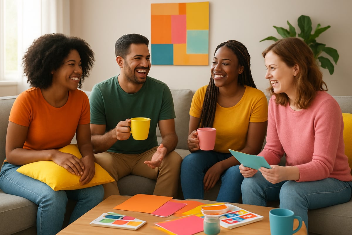
Imagine walking into a world where every wall, outfit, and gadget beams with shades that make you grin. What if you could bottle that feeling and sprinkle it through your daily life? That’s the magic of the colors of happiness.
This guide is your ticket to understanding how these hues work their mood-lifting wonders. We’ll dig into what makes certain colours feel so joyful, how they mess with your brain (in a good way), and why you should care in 2025.
Get ready to decode the science, discover what happy colours mean around the globe, spot the hottest shades of the year, and pick up rebellious tips for splashing happiness into your home, wardrobe, and mindset. Let’s kick beige to the kerb and start living in full, unapologetic colour.
The Science Behind Color and Happiness
Ever wondered why a pop of yellow can make you smile, or why a blue room feels instantly soothing? Science says it’s not just in your head—our brains are wired to react to colour, and the results can be downright magical when it comes to the colors of happiness.
Colour isn’t just a visual treat. When light hits your eyes, the brain gets busy translating those wavelengths into emotional responses. That’s why seeing a rainbow—or even just your favourite jumper—can trigger an instant mood shift. This is where the colors of happiness begin to work their magic.
The Brain on Colour: Mood Chemistry in Action
When you’re surrounded by vibrant hues, your brain responds with a cocktail of neurochemicals. Dopamine, also known as the “feel-good” chemical, often kicks in when we see lively, energising shades like yellow and orange. Serotonin, the mood stabiliser, is boosted by calming tones such as green and blue. These reactions are part of why the colors of happiness aren’t just about looks—they’re about literal chemistry.
Let’s put it in a cheeky table:
| Colour Group | Mood Impact | Brain Chemical |
|---|---|---|
| Warm (Red, Yellow, Orange) | Energising, Uplifting | Dopamine |
| Cool (Blue, Green, Purple) | Calming, Soothing | Serotonin |
Warm vs Cool: The Temperature of Joy
Warm colours are like a double espresso for your senses—they spark energy, creativity, and sometimes even appetite. Think of brands like Fanta or Post-it, using orange and yellow to grab attention and boost positivity. Cool colours, on the other hand, are the spa day for your brain. Blue and green can lower your blood pressure, relax your mind, and help you focus.
Research backs this up: 85% of shoppers say that colour is a primary reason they buy a product (Kissmetrics). In classrooms, yellow walls have been shown to improve memory and attention span. Meanwhile, blue is the go-to for productivity, helping people stay calm and focused during high-pressure tasks.
Light, Saturation, and the Power of Pastels
It’s not just the hue—it’s how bold or soft it appears. Pastels, with their gentle saturation, tend to be soothing and safe, perfect for bedrooms or quiet spaces. Bold, saturated colours are like a party for your eyes, great for creative studios or anywhere you want to feel energised. The balance of light and saturation can completely change the effect a colour has on your mood.
Productivity, Creativity, and Social Connection
The colors of happiness don’t just sit pretty—they get things done. Offices using blue or green report higher creativity and focus. Social spaces painted in warm tones see more laughter and conversation. Even digital backgrounds can alter how we feel during video calls or online meetings.
Personal Preferences: Age, Gender, and Context
Here’s where it gets personal. Your own colors of happiness might not match your neighbour’s, and that’s perfectly normal. Age, gender, culture, and even life experience all play a role in what colours lift your mood. Children often gravitate to bright, primary shades, while adults might prefer more nuanced hues. Context matters too: what feels energising in a gym might feel overwhelming in a bedroom.
Curious about the nitty-gritty? Dive deeper into how colour affects your mood with this Color Psychology and Mood guide, packed with research and practical tips.
In short, the science behind the colors of happiness is anything but beige. It’s a vibrant, rebellious toolkit you can use to hack your mood, spark creativity, and build a life that feels as good as it looks.
Decoding the Meanings of Happy Colors
Ready to break free from the beige brigade? Let’s decode the colors of happiness and see how each hue can sprinkle a little extra joy into your life. These aren’t just pretty pigments — they’re mood-boosters, conversation starters, and the secret sauce to a life that feels as good as it looks. Whether you’re a sunshine seeker or a lover of calm, there’s a color waiting to lift your spirits.
Yellow: The Universal Symbol of Joy
Yellow is the poster child for the colors of happiness. It’s the colour of sunlight, daffodils, and those cheeky emoji faces that say “you got this.” Psychologically, yellow is uplifting, energising, and sharpens your mind — studies show it actually improves memory and attention span. No wonder you see yellow in brands like Post-it and Snapchat, or splashed across statement walls and summer wardrobes.
- Associated with optimism, clarity, and fresh starts
- Sparks creativity and a can-do attitude
- A little yellow goes a long way: try it in a hallway or as a pop of colour in your outfit
Feeling hesitant about going bold? You’re not alone. Building colour confidence is a journey, and embracing yellow can be your first rebellious step toward a happier you.
Orange: Enthusiasm and Creativity
Bring on the zest! Orange is pure vitality — the life of every colour party. As one of the most energetic colors of happiness, orange symbolises warmth, adventure, and unfiltered enthusiasm. It’s a proven motivator, boosting sociability and sparking creative ideas just when you need them most.
- Seen in playful branding (hello, Fanta and Nickelodeon)
- Dominates creative workspaces and wellness studios
- Trending in activewear and feel-good interiors for 2025
Orange invites you to say yes to new experiences, even if it’s just swapping your beige mug for a tangerine one. Go on, you know you want to.
Pink: Compassion and Playfulness
Pink is the softest rebel in the colours of happiness lineup. It stands for love, nurturing, and a playful sense of mischief. Psychologists say pink is calming and comforting, making it perfect for soothing spaces and stress-busting outfits. Think pastel pink bedrooms or a bold magenta blazer when you need a confidence kick.
- Popular in modern home décor and fashion runways alike
- Pastel pinks create peaceful retreats
- Bold pinks are making a splash in 2025 colour forecasts
Pink proves you can be gentle and powerful at the same time. Wear it, live it, and watch your mood thank you.
Green: Harmony and Growth
Green is your ticket to balance and renewal. Out of all the colors of happiness, green is the most grounding, echoing the calm of leafy parks and fresh spring mornings. It’s a stress-buster, shown to reduce anxiety and promote relaxation both at home and in the wild.
- Central to biophilic design and indoor plant trends
- Used in eco-friendly branding and mindfulness spaces
- Green accents help create restorative, happy environments
Invite green into your daily routine and notice how your mind starts to breathe a little easier.
Blue: Serenity and Trust
Blue is the cool-headed champion of the colors of happiness. It’s all about calm, trust, and a sense of stability — the reason bedrooms, spas, and digital apps love a good splash of blue. Studies say blue can lower blood pressure and encourage tranquility, helping you find your chill in a noisy world.
- Perfect for bedrooms, bathrooms, and workspaces
- A favourite in digital design for its calming effects
- Versatile enough for both personal retreats and professional settings
Blue reminds us that happiness doesn’t always shout. Sometimes, it whispers — and that’s more than enough.
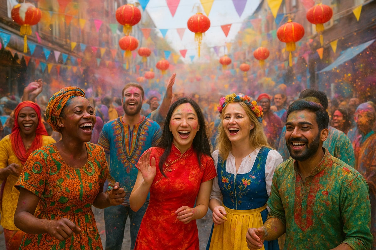
Cultural Perspectives on the Colors of Happiness
Ever noticed how the colors of happiness are anything but universal? What sparks joy in one corner of the globe might raise eyebrows in another. While a sunny yellow might scream optimism in the West, in Egypt it once symbolised mourning. It’s a wild, wonderful world where colour tells a thousand different stories.
Festivals and traditions are where the colors of happiness really strut their stuff. Think of India’s Holi, where everyone gets doused in bright pinks, greens, and blues—pure, unfiltered joy. Or picture Chinese New Year, where red and gold mean luck and prosperity, and every lantern and envelope glows with promise. Even weddings can be a riot of meaning, from the scarlet saris of South Asia to the crisp whites of Western ceremonies. Across Scandinavia, happiness is whispered in gentle, muted brights—proof that joy doesn’t always have to shout.
Culture and creativity are inseparable, and the colors of happiness weave through art, literature, and folklore like secret codes. In Japanese art, cherry blossom pink hints at fleeting beauty and hope, while in African textiles, vivid patterns celebrate community and life. These shades aren’t random—they’re loaded with the weight of generations, stories, and symbols.
But here’s the twist: in today’s globalised world, the colors of happiness are on the move. Migration, travel, and—let’s be honest—Instagram, mean palettes cross borders faster than ever. Suddenly, Scandi neutrals mingle with Bollywood brights, and TikTok trends turn yesterday’s taboo into tomorrow’s must-have. It’s a glorious mash-up, and your own happy colours might be a melting pot of influences.
Research backs this up. Cross-cultural studies reveal that while some hues (like yellow) are widely linked to happiness, there’s no one-size-fits-all. If you fancy a deep dive, the Cultural Significance of Colors offers a fascinating look at how societies interpret colour’s emotional punch. The bottom line? The colors of happiness are as personal—and as global—as you are. Embrace what lifts your spirit, and let the world’s colour stories inspire your own.
Colors of Happiness in 2025: Trends and Forecasts
What’s next for the colors of happiness? If you’re ready to ditch the beige and step into a year bursting with energy, 2025 is your time to shine. The world’s colour experts have spoken, and their choices are anything but dull. This year, we’re seeing a vibrant rebellion against blandness, with palettes designed to lift your spirits, boost creativity, and make every day feel a little more electric.
Pantone and Major Color Authority Predictions
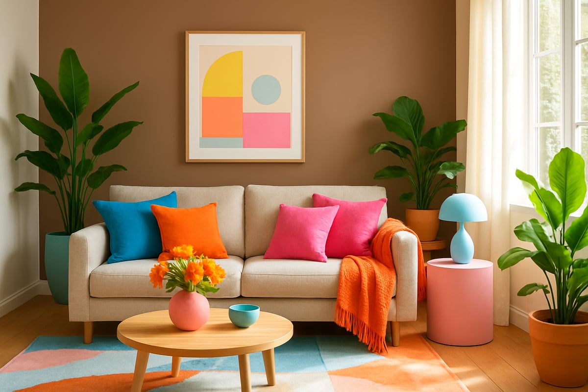
Every January, colour lovers wait with bated breath for Pantone to drop its Color of the Year. For 2025, they’ve chosen “Mocha Mousse,” a warm, comforting brown that feels like a hug for your senses. Why brown? It’s all about grounding, resilience, and a return to tactile, earthy pleasures. This choice reflects our craving for stability and comfort in a fast-moving world.
Other big names, like Dulux and Sherwin-Williams, are also leaning into cozy hues: think muted terracotta, gentle greens, and soft peach. Their picks echo a global mood—people want spaces that nurture, soothe, and recharge. If you’re curious why “Mocha Mousse” made headlines, check out Pantone’s full Pantone's 2025 Color of the Year breakdown.
This collective shift shows how the colors of happiness in 2025 aren’t just about boldness—they’re about emotional connection and finding joy in the everyday.
Emerging Happy Color Palettes
Let’s get to the good stuff: what palettes are actually making us smile this year? The colors of happiness in 2025 are anything but basic. Digital brights—think punchy coral, zesty lemon, and electric blue—are dominating social feeds and street style. Neo-pastels are everywhere, mixing soft mint, lavender, and blush pink with a fresh, playful twist.
But it’s not all about sweet shades. Earthy vivids like spicy orange, mossy green, and deep teal are surging too. What’s new? Multi-sensory palettes that combine tactile textures and unexpected pairings. Imagine a room with mocha walls, velvet blue chairs, and neon art—deliciously rebellious.
Designers and brands are mixing these palettes in fashion, interiors, and even tech. The result? Personalised, mood-boosting combos that make the colors of happiness feel utterly individual and alive.
| Palette Name | Key Colours | Mood |
|---|---|---|
| Digital Brights | Coral, Electric Blue, Lemon | Energetic, Fun |
| Neo-Pastels | Mint, Blush Pink, Lavender | Playful, Fresh |
| Earthy Vivids | Spicy Orange, Moss Green, Teal | Grounded, Bold |
Influences Shaping 2025’s Color Trends
What’s driving this kaleidoscope of color? The colors of happiness in 2025 are shaped by a wild mix of global events, tech innovation, and a collective yearning for nostalgia. With the world in flux, people are seeking comfort in familiar shades, while also craving escapism in bright, fantastical hues.
Tech is a huge player—digital platforms are making it easy to experiment with wild palettes at the tap of a finger. Sustainability is front and centre, with earthy tones reflecting a love for the planet and upcycled materials. Nostalgia is everywhere too, with retro palettes from the 90s and early 2000s popping up in everything from trainers to TikTok backgrounds.
According to trend reports, the most-searched and purchased colors of happiness are those that offer both comfort and a spark of joy. The world wants colour with meaning—something you can feel, not just see.
Where to Find and Experience 2025’s Happy Colors
Ready to dive in and experience the colors of happiness for yourself? Start with retail and design spaces—brands are splashing their stores and websites with the latest palettes. Social media influencers are rocking bold looks, and colour-forward brands are leading the charge in fashion, homeware, and even tech gadgets.
Want to bring these trends home? Try a mocha accent wall, neon cushions, or a pastel phone case. Digital platforms like Pinterest and Instagram are goldmines for inspiration, while interior designers are offering mood-boosting consultations.
The best part? The colors of happiness in 2025 are for everyone. Whether you’re making a statement in your wardrobe or just adding a pop of joy to your desk, there’s a shade to make your world feel brighter.
Practical Inspiration: Bringing Happy Colors Into Your Life
Ready to turn up the volume on your everyday joy? The colors of happiness are more than just a pretty palette, they’re your secret weapon for feeling fabulous. Here’s how to invite those mood-lifting hues into your space, your style, your creativity, and even your tech. No beige energy here—just pure, unfiltered colour confidence.
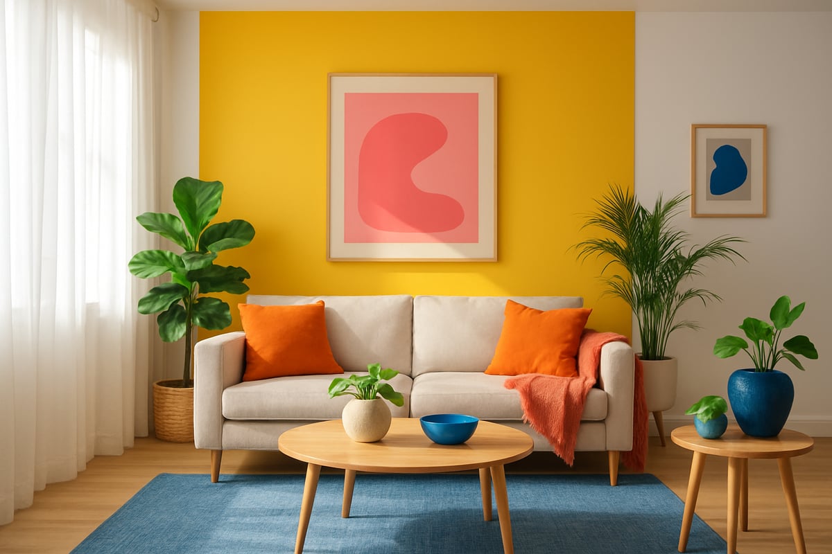
Infusing Color Into Your Home
Let’s banish boring and fill your nest with the colors of happiness. Start with a splash—think a zesty yellow feature wall, or emerald green cushions that whisper “relax, you’re home.” Colour doesn’t have to be loud to be joyful, but it should never be dull.
Try these quick wins:
- Paint an accent wall in your happiest hue.
- Add colourful throws, rugs, or art for instant pep.
- Bring in plants for a double shot of green goodness.
Want more rebellious inspiration? Check out these Happy Colors for Your Home ideas for transforming any room into a happiness hotspot. Remember, the colors of happiness are personal—choose what makes you grin, not what’s trending. You’ll be amazed how a dash of colour can shift your mood and spark creativity.
Dressing for Joy: Happy Colors in Your Wardrobe
Clothes aren’t just fabric—they’re your daily dose of dopamine. The colors of happiness belong in your wardrobe, front and centre. Start by figuring out which shades make you feel bold or blissful. Is it a hot pink blazer, or a sunny yellow tee? Try a colour self-assessment, or trust your gut—if it makes you smile, it’s a winner.
Mix and match:
- Pair a bright top with your neutral favourites.
- Layer colourful accessories for a subtle pop.
- Don’t shy away from that statement piece you secretly love.
Need a wardrobe wake-up call? Dive into the Personal Colour Wardrobe Guide for step-by-step tips on making the colors of happiness your style signature. Remember, confidence is the best accessory, and happy colours are your cheer squad.
Creative Projects and Mindful Practices
Feeling crafty or just craving a mood boost? The colors of happiness are your go-to for creative self-care. Grab those coloured pens and let loose in your journal, or paint something wild and wonderful. Art isn’t about perfection, it’s about expression and joy.
Try these:
- Start a colour-themed gratitude journal.
- Join a local mural or public art project.
- Experiment with colour meditations—visualise your favourite hues and let them lift your spirits.
Colour walks are a cheeky way to spot the colors of happiness in your neighbourhood, while DIY crafts with friends are guaranteed to spark laughter. Let colour be your mindful rebellion against the grey.
Digital Spaces and Everyday Tech
Why should your phone or laptop be stuck in a colour rut? The colors of happiness can transform your digital world, too. Change your wallpaper to a bold blue or a playful pink, or theme your calendar with colours that make meetings feel less like a slog.
Try these digital tweaks:
- Customise app icons with cheerful hues.
- Use colour-coded folders for tasks and projects.
- Brighten up virtual meetings with colourful backgrounds.
Social media is full of inspiration—follow accounts that celebrate the colors of happiness, not those that drain your vibe. Make your tech a reflection of your best, brightest self. Every click should spark a little more joy.
The Power of Personal Color Confidence
Ever felt like you’re living in a world of beige while everyone else is at a confetti party? You’re not alone. The truth is, embracing the colors of happiness isn’t just about slapping yellow on your walls or wearing a neon jumper. It’s about giving yourself permission to be seen, to express, and to let your true colours (pun intended) shine.
Let’s be honest, the fear of bold colour is real. Maybe you worry you’ll stand out for all the wrong reasons, or that you’ll get it ‘wrong’. But here’s the secret: there is no wrong when it comes to the colors of happiness. What matters is what makes you feel alive. Your colour preferences are shaped by memories, culture, even that one jumper your nan knitted you. Own it.
Breaking Free from Colour Shyness
If you’ve ever wished for more colour confidence, you’re in good company. So many of us play it safe, sticking to neutrals because it feels less risky. But the moment you swap beige for blush or navy for neon, something shifts. You start to see the world differently—and, surprise, the world sees you differently too. Need some extra courage? Check out this guide on Building Color Confidence for rebellious, real-life tips.
Colour Confidence = Life Confidence
Here’s the magic: when you embrace the colors of happiness, you don’t just look brighter—you feel bolder. Colour confidence spills over into your relationships, your work, and even how you see yourself in the mirror. It’s like wearing your mood on your sleeve, and suddenly, compliments (and maybe a few envious glances) come pouring in.
From Reluctant to Radiant: Real Stories
Take Jess, who went from hiding in grey hoodies to rocking turquoise trainers. “I started small,” she says, “but every pop of colour was a little rebellion—and I felt happier every day.” Her story isn’t rare. Every day, people discover that the colors of happiness are a shortcut to self-acceptance.
Your Colour Confidence Action Plan
- Start with a single, happy accent—a scarf, a mug, a cushion
- Track your mood: notice how colour changes how you feel
- Celebrate the wins, no matter how tiny
- Connect with colour-loving communities, online or off
- Ask for expert advice if you’re feeling stuck
Remember, building color confidence is a journey, not a sprint. The more you embrace the colors of happiness, the more you’ll realise that joy was never meant to be neutral.
Ready to stop living life in beige and actually let your colours do the talking? We’ve just unpacked how happiness lives in every bold hue—now it’s your turn to scribble outside the lines. If you’re craving more cheeky tips, rebel inspo, and a daily shove to wear (and live) your loudest, proudest self, you know where to find me. Because honestly, joy isn’t neutral. And your life was never meant to be muted. Let’s get unmuted together: Because joy isn’t neutral. And your life was never meant to be muted
0 comments