

Imagine strutting into a room where every inch is dripping in your favourite shade. Walls, ceiling, even the skirting boards are all in on the act. Welcome to the world of colour drenching rooms—the rebellious design trend set to take 2026 by storm.
Forget playing it safe. Paint is no longer just for walls. Designers and daring homeowners are embracing this bold, all-in approach to create spaces bursting with energy, mood, and personality. Want to master this look? You’re in the right place.
This guide will give you the inspiration, practical tips, and pro secrets you need to transform any space with colour drenching rooms. You’ll get the inside scoop on its roots, benefits, trending palettes, and step-by-step know-how—so grab your paintbrush and get ready to break all the rules.
Understanding Colour Drenching: Origins, Principles, and Psychology
Ever wondered what happens when you stop playing it safe and let one colour run riot across your space? Welcome to the world of colour drenching rooms. This technique means covering your walls, ceilings, skirting, doors, and sometimes even your furniture in a single hue or a few tonal siblings. The result? Instant drama, total cohesion, and a home that feels like an immersive art installation.
Colour drenching rooms aren’t just a TikTok trend. Their roots run deep. Think Bauhaus pioneers going monochrome in the 1920s, or the wild maximalism of the 1980s—when more was more, and nobody apologised for it. Fast-forward to the 2020s, and designers like Abigail Ahern and paint powerhouses like Farrow & Ball have made colour drenching the ultimate statement move. But it’s not just about being bold. It’s about creating spaces that feel intentional, unified, and, let’s be honest, a little bit rebellious.
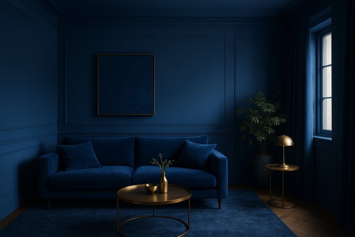
The Psychology of Colour Drenching Rooms
Let’s talk feelings. Colour drenching rooms can seriously mess with your mood—in the best way. Blue cocoons create calm, yellow energises your mornings, and green wraps you in a hug of tranquillity. It’s not just woo-woo. Studies from the University of Texas show that blue and green spaces boost productivity and reduce stress. Meanwhile, bold reds and oranges can spark creativity and excitement, but go too far and you’ll feel like you’ve had one espresso too many.
The magic is in the immersion. When you surround yourself with one colour, your brain stops seeing boundaries. The room feels bigger, cosier, or more focused—whatever vibe you’re after. Want more proof? Check out Fearless interiors for happier homes and see how embracing bold choices can boost your happiness at home.
From Accent Walls to All-Out Immersion
Remember when everyone wanted an accent wall? Cute, but colour drenching rooms have kicked that trend to the kerb. Now, designers crave unity. By painting every surface, you erase lines and corners, letting your chosen hue do all the heavy lifting. The trick is in the details: choose the right saturation, balance undertones, and think about how natural and artificial light plays with your shade. If you get it right, you’ll have a space that feels both dramatic and harmonious.
Designers like Abigail Ahern are masters at this. She’s famous for deep, moody palettes that turn rooms into enveloping sanctuaries. Farrow & Ball’s case studies show everything from serene sage bedrooms to cocooning navy lounges—proof that colour drenching rooms work for any style, from maximalist to minimalist.
The Art and Science: Principles, Pros, and Cons
Ready to try it? Here are the golden rules for colour drenching rooms:
- Balance is everything. Too dark and you risk feeling boxed in, too light and it might look flat.
- Match your finish to your vibe. Matte feels soft and cocooning, while gloss bounces light for energy.
- Layer in texture with fabrics, rugs, or metallics to keep things interesting.
Let’s break down the pros and cons:
| Pros | Cons |
|---|---|
| Jaw-dropping visual impact | Can feel overwhelming in small spaces |
| Creates unity and flow | Risk of claustrophobia with dark shades |
| Amplifies mood and personality | Needs careful planning and prep |
| Makes rooms look larger or cosier | Harder to change if you get bored |
Colour drenching rooms are about unapologetic self-expression. Yes, it’s bold. Yes, it’s a bit scary. But when you get it right, you’ll never look at beige the same way again.
Colour Drenching Trends for 2026: Palettes, Finishes, and Influences
Ready to drench your world in colour and leave beige in the bin? 2026 is the year of bold, immersive interiors, and colour drenching rooms is leading the charge. Let’s dive into the palettes, finishes, and cultural shifts that are rewriting the rules.
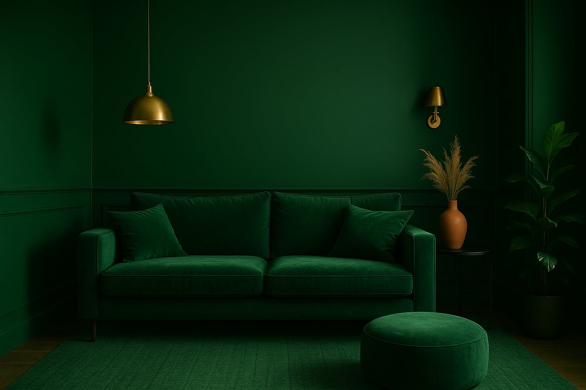
Top Colour Palettes and Hues for 2026
Let’s get to the juicy bit—what colours are about to take over your Instagram feed (and hopefully your home)? The forecast for colour drenching rooms in 2026 is all about deep, moody greens, earthy terracottas, muted lilacs, rich blues, and bold ochres. Paint brands like Dulux, Benjamin Moore, and Pantone are all singing from the same colourful hymn sheet. The world’s obsession with nature and sustainability is steering us toward biophilic hues, while global events nudge us to crave comfort and cocooning.
You’ll spot deep forest greens grounding living rooms, terracotta wrapping kitchens in warmth, and lilac bedrooms offering a soft, dreamlike escape. Rich blues bring drama to hallways, and ochre pops up in bold dining spaces. Not sure which palette speaks to you? Start by thinking about your room’s vibe and function. Want calm? Go blue or green. Need a shot of energy? Terracotta or ochre is your mate.
Check out this quick palette table for inspiration:
| Colour | Mood | Best For |
|---|---|---|
| Deep Green | Grounding | Living rooms |
| Terracotta | Energising | Kitchens, dining |
| Muted Lilac | Tranquil | Bedrooms, studies |
| Rich Blue | Dramatic | Hallways, entries |
| Bold Ochre | Uplifting | Dining, creative |
The verdict is in: designers are obsessed with colour drenching rooms. Don’t just take our word for it—see what the pros predict for 2026 in 2026 Interior Design Trends: What Designers Say Is Next.
Surface Finishes and Materials
The magic of colour drenching rooms is all in the finish. Matte, gloss, eggshell—they all tell a different story. Matte gives a soft, velvety look that’s perfect for cocooning spaces, while gloss bounces light and adds drama to doors and trim. Eggshell is that happy medium—subtle sheen, easy to clean, and forgiving of little imperfections.
But why stop at paint? 2026 is all about innovative materials. Think colour-drenched woodwork, lacquered metal, and even velvet upholstery that matches the walls. Layering textures within a single hue creates depth and keeps spaces from feeling flat. Imagine a deep green room: matte walls, glossy skirting, velvet sofa, and a painted radiator. It’s not just a room, it’s a vibe.
Maintenance matters, too. Gloss is tougher and wipes clean, making it a winner for high-traffic zones. Matte hides scuffs but needs gentle cleaning. Eggshell is your all-rounder for family spaces. When planning colour drenching rooms, always match your finish to your lifestyle.
Influential Design Movements and Cultural Shifts
What’s fuelling the colour revolution? Maximalism, for starters. People are craving more personality, less perfection. Colour drenching rooms are the ultimate rebellion against the dull and the predictable. Maximalists go bold, layering patterns and tones for a space that screams “look at me!”
On the flip side, minimalists are getting in on the action, too. Think subtle monochromes for a serene, spa-like feel. Digital culture is pushing us toward immersive spaces—if your room doesn’t look good in a selfie, does it even exist? Virtual reality and social media are making us bolder with our choices.
Sustainability is a huge driver. Eco-friendly paints, upcycled furniture, and conscious consumption are all woven into the trend. Designers are blending sustainability with colour drenching rooms, creating interiors that feel good and do good. The bottom line? 2026 is about making your space reflect your story, with no apologies and no beige in sight.
Step-by-Step Guide: How to Colour Drench a Room
Ready to cause a scene? Here’s your no-nonsense, all-colour, zero-beige guide to colour drenching rooms. Whether you’re a bold beginner or a paint-splattered pro, this step-by-step will transform your space from ‘meh’ to magnificent. Grab your roller, unleash your inner rebel, and let’s dive in.
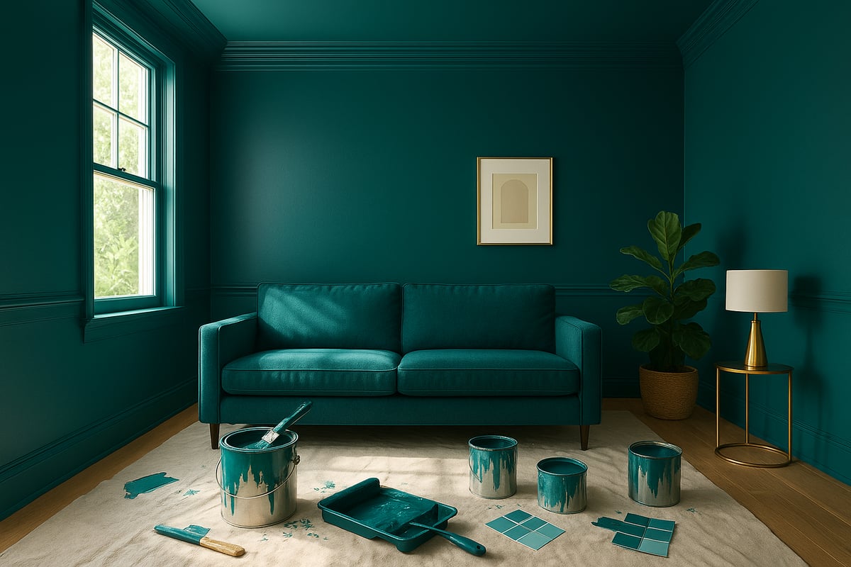
Step 1: Assessing Your Space and Setting a Vision
First things first: don’t just slap paint everywhere and hope for the best. Assess your room like a true colour detective. How big is it? Is it flooded with natural light, or more moody and mysterious? Take stock of architectural quirks, built-ins, and furniture you love (or loathe).
Now, channel your inner mood board addict. Scroll, pin, screenshot—whatever gets your creative juices flowing. Dream up the vibe: do you want your colour drenching rooms to feel like a chic cocoon, a vibrant party pad, or a tranquil retreat? Set your intention now, and you’ll avoid a personality crisis later.
- Measure the space and note window placements.
- Observe how light shifts throughout the day.
- Decide if you want to highlight or hide certain features.
- Set a clear goal: drama, serenity, or somewhere in between.
Step 2: Selecting the Perfect Colour and Finish
Let’s get real: picking a colour is the most thrilling (and terrifying) part. Test samples everywhere—walls, ceilings, corners. Watch how the shade morphs from morning to night. Pay attention to undertones. Is that blue secretly purple? Is your green a bit too hospital-chic?
Consider the finish. Matte is moody, eggshell is forgiving, gloss is glam. Make sure your chosen colour plays nicely with floors and fixed features. Want help? Check out Choosing the right colour scheme for a rebel-approved approach to palette picking.
Think about the room’s purpose. A bedroom needs restful energy, so go deeper or dustier. Dining room? Bring the buzz with warm, energising hues. The secret sauce for colour drenching rooms is confidence—trust your gut, but consult colour psychology if you’re feeling wobbly.
Step 3: Preparing Surfaces and Materials
Prep is where the magic happens (and where many rebels get lazy). Clean every surface like you’re expecting the Queen. Sand down bumps and prime with the right formula for each material—walls, woodwork, metal, even radiators. Skimp on prep, and you’ll regret it when your paint job peels faster than a bad spray tan.
- Remove or mask hardware, outlets, and floors.
- Use a stain-blocking primer for stubborn marks.
- Patch holes and cracks for a flawless finish.
- Don’t forget built-ins, doors, and random nooks.
Proper prep ensures your colour drenching rooms look pro, not DIY disaster. Take your time—future you will thank you.
Step 4: Application Techniques for a Cohesive Look
Now for the fun bit: painting! Always start at the top—ceiling first, then walls, then trim and doors. This keeps drips in check. For broad, smooth surfaces, use rollers. Grab brushes for corners, edges, and fiddly details. Want velvet-smooth built-ins? Try a sprayer.
Work in sections, keeping a wet edge to avoid streaks. Layer thin coats for depth and avoid slapdash coverage. Let each coat dry fully, especially if you’re layering gloss over matte for a playful sheen shift.
Tackle tricky bits—arches, beams, radiators—with patience and the right tool. The secret to seamless colour drenching rooms is consistency. Don’t stop at the walls—paint the skirting, doors, and even furniture for full-on drama.
- Ceiling first, then walls, then woodwork.
- Use high-quality brushes and rollers.
- Paint in daylight if possible for true colour vision.
- Layer for richness and longevity.
Step 5: Styling and Layering Within a Drenched Room
You’ve painted the rainbow—now what? Style like you mean it. Choose furniture and accessories that either melt into your palette or pop with attitude. Think tonal sofas, matching lamps, or a wild rug that breaks the rules.
Add texture: velvet, linen, metallics. Mix patterns, but keep them in the same colour family for cohesion. Lighting matters—layer it up with soft bulbs, statement pendants, or moody uplights to show off your handiwork.
Art can blend in or rebel; it’s your call. For colour drenching rooms that wow, balance harmony with a dash of surprise. Don’t be afraid to swap things out until it feels just right.
Step 6: Maintenance and Longevity
You did it. Your space is drenched in glory. Now, keep it looking sharp. Use a soft cloth and gentle cleaner for regular wipe-downs. High-traffic areas? Choose washable, durable paint so scuffs don’t ruin your masterpiece.
Touch up chips as soon as you spot them, and schedule a refresh every few years to keep colours vibrant. Seasonal checks for fading or damp spots will help your colour drenching rooms stay fresh, bold, and beautiful for years to come.
Expert Tips, Mistakes to Avoid, and Advanced Colour Drenching Techniques
Ready to drench your world in unapologetic colour? Hold onto your paintbrush, because even the bravest rebels can hit a snag or two. Let's break down the expert secrets, classic mistakes, and next-level moves for colour drenching rooms—no beige, no boredom, just pure, joyful rebellion.
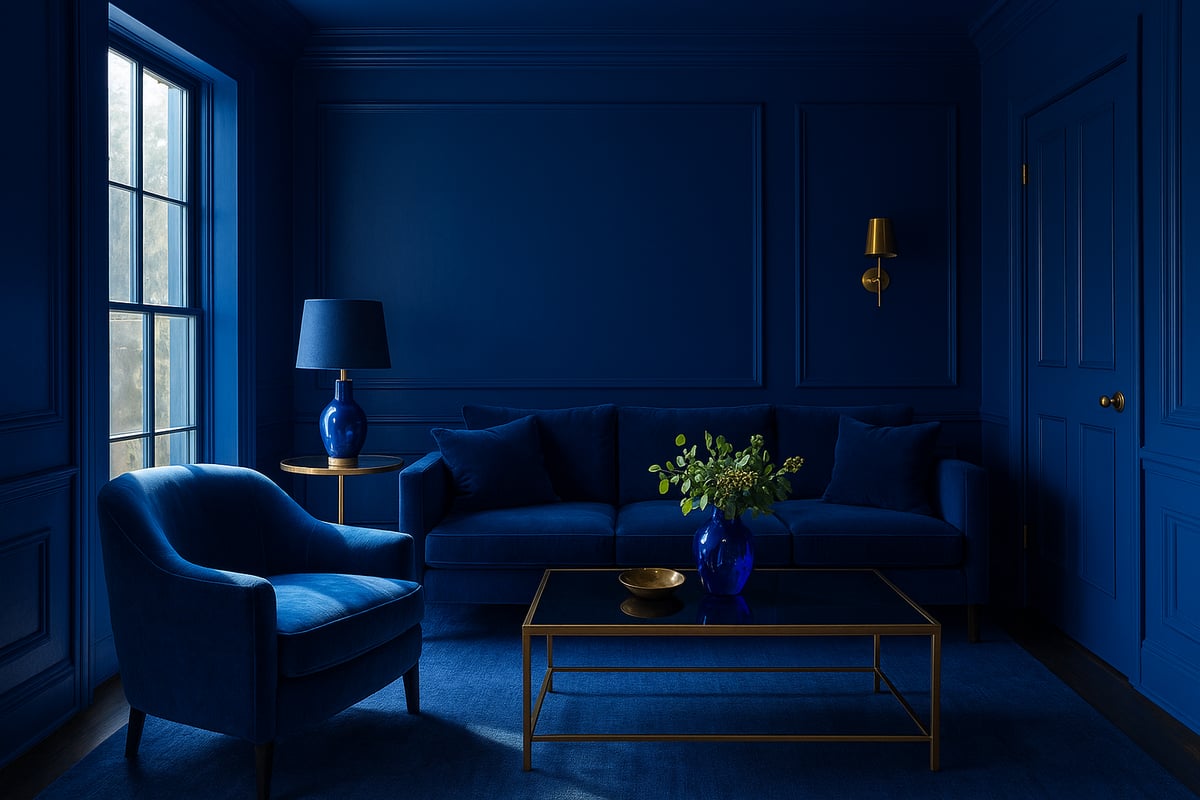
Common Mistakes to Avoid
First things first—let's talk blunders. The biggest crime in colour drenching rooms? Picking a hue you love in a tester pot, only to find it turns your space into a cave. Small rooms can feel boxed in if you go too dark, and ignoring natural light is a rookie error. Mind the undertones too: that “perfect” green might suddenly scream hospital ward if you miss its yellow kick. Always test your colours on every wall, at every time of day. And remember, bold does not mean blinding. A little restraint equals a lot more wow.
Layering and Sheen: The Secret to Depth
Flat, lifeless spaces? Not on our watch. The secret to unforgettable colour drenching rooms is playing with finish and texture. Mix matte walls with a satin ceiling, or throw in a velvet sofa that matches your paint. Layering different sheens and materials creates movement and stops things getting monotonous. Want a cocoon, not a box? Light is your friend—bounce it with glossy woodwork, or soften harsh corners with tactile throws. The right mix keeps your space feeling rich, not oppressive.
Playing with Features: Advanced Drenching
Ready to show off? Use colour drenching rooms to accentuate your home’s quirks—or disguise the not-so-charming bits. Paint awkward radiators, built-in shelves, or even the skirting boards the same colour as your walls for a seamless, gallery vibe. Want to go next-level? Try two-tone drenching by splitting the room horizontally, or create a subtle gradient effect. Colour blocking with tonal variations adds drama without chaos. For inspiration, the Color Drenching Is Spring 2025's Biggest Interiors Trend article breaks down how top designers use these tricks to push boundaries.
What the Pros and People Say
Designers rave about the transformative power of colour drenching rooms, but what about real people? Surveys show most feel their spaces are more inviting and stylish post-drench. The catch? Some underestimate the effect—going too bold or forgetting about lighting. Check out Colour makeovers that transform your home for jaw-dropping before-and-afters and lessons learned. When it works, the result is pure magic. When it flops, it’s usually down to skipping sample tests or failing to layer textures.
Renter-Friendly Rebellion and Final Tips
Renting? Don’t let the landlord kill your vibe. Temporary colour drenching rooms are totally possible with removable wallpaper or draping large textiles in your chosen hue. Use bold bedding, curtains, or oversized art to create that immersive look, minus the commitment. For everyone, keep a stash of touch-up paint handy for scuffs, and don’t be afraid to repaint seasonally. The trick is to have fun, experiment, and remember: your home should shout your personality, not whisper it. Go forth and drench—your future self (and Instagram feed) will thank you.
Colour Drenching for Different Spaces: Room-by-Room Strategies
Ready to colour drench like a rebel? Brilliant. Let’s break down how colour drenching rooms can transform every corner of your home, one space at a time. Whether you’re craving calm, drama, or a jolt of joy, there’s a strategy for every room and every personality.
Living Rooms: Warmth and Conversation Zones
Living rooms are the beating heart of the home. Colour drenching rooms here means creating a cocoon for connection and laughter. Go for earthy greens, sun-baked terracotta, or moody blues to anchor the space. Paint the skirting, walls, and even radiators for a bold, unified vibe.
Pair matching upholstery with a tonal rug for extra depth. Want a quick win? Try painting built-in shelves to match your walls. This trick blurs edges and makes your room feel expansive.
Bedrooms: Restful Retreats or Dramatic Escapes
In bedrooms, colour drenching rooms can either soothe or seduce. Think restful sage, muted lilac, or rich navy for a sleep sanctuary. Drench every surface, including the ceiling, for a true cocoon effect. If you’re feeling brave, opt for a sultry plum or inky black for a dramatic escape.
Keep bedding and curtains in the same colour family for seamless serenity. Want a pop? Add metallic lamps or a contrasting throw for a cheeky wink of rebellion.
Kitchens and Dining Rooms: Energising Gathering Spaces
Colour drenching rooms in kitchens and dining areas is a recipe for joy. Embrace vibrant ochres, zesty greens, or deep teal for a space that sparks appetite and conversation. Gloss finishes on cabinets bounce light and make colours sing, while matte on walls adds depth.
Tie in chairs, banquettes, or even appliances for a fully drenched look. For palette inspiration, check out the 2026 Colors of the Year and Top Home Color Trends—your next dinner party will thank you.
Bathrooms: Spa Serenity or Bold Statements
Bathrooms are small but mighty when it comes to colour drenching rooms. Wrap the space in soft blue for spa vibes, or go all-in with emerald or flamingo pink for a hit of personality. Paint woodwork, pipes, and even the ceiling for a luxe, boutique feel.
Choose moisture-resistant paints for durability. Add a matching bath mat or towels to extend the drenched effect, making your morning routine anything but boring.
Hallways and Entryways: First Impressions and Flow
Hallways set the scene for your home’s story. Colour drenching rooms in these spaces creates drama from the moment you step inside. Try bold ochre, deep plum, or classic navy to make a statement.
Paint doors, skirting, and even the staircase for a sense of flow. Mirrors and metallic hooks add sparkle without breaking the palette. For more ways to make your home pop with personality, see Make your home pop with personality.
Multi-Functional Spaces and Adapting Strategies
Open-plan layouts and multipurpose rooms need clever colour drenching rooms strategies. Use tonal variations to zone areas—think a darker shade for the lounge, a lighter tint for the workspace. In small spaces, drench everything to blur boundaries and create intimacy.
Here’s a quick cheat sheet:
| Room Type | Best Strategy | Top Tip |
|---|---|---|
| Small/Modern | One hue, low contrast | Go for light-reflective finishes |
| Large/Period | Tonal layering | Highlight mouldings and features |
Adapt your approach to your home’s quirks. Period features? Highlight them with a different sheen. Modern box? Go all-in for maximum impact. The only rule: make it yours.
So, you’ve made it to the end of our colour-drenching deep dive—braver, bolder, and ready to rebel against the dull and the drab. You know now that colour isn’t just for walls and life’s too short for muted spaces. If you’re itching for more tips, behind the scenes inspo, or just need a daily push to unleash your inner maximalist, I’ve got your back. Let’s make every room (and every day) unapologetically vibrant together.
Because joy isn’t neutral. And your life was never meant to be muted
0 comments