
Ready to ditch the beige? It’s time to see what a little rebellion can do for the colour in a house. If you think walls should whisper, think again—this guide is here to help you shout, sing, and splash your personality all over your space.
We’re diving deep into the secrets of colour psychology, the juiciest 2025 palettes, and the practical steps to make every room pop. You’ll get expert tips, real-life inspiration, and a foolproof plan to create a home that’s as daring (or as zen) as you crave.
Let’s turn your home into a masterpiece—one bold brushstroke at a time.
The Psychology and Power of Colour in the Home
Colour in a house is never just about paint on the wall. It’s the secret sauce that can turn a dull space into a sanctuary, a party zone, or a calming retreat. Ever walked into a room and instantly felt happier, more relaxed, or totally energised? That’s not magic. That’s the power of colour in a house, working its psychological wizardry.
Let’s get scientific for a second. Research shows that the colours you surround yourself with can shift your mood, influence your energy, and even impact your productivity. Blue tones in a home office can help you feel focused and calm, while a splash of yellow in the kitchen might spark energy and creativity. There’s a reason so many psychologists, designers, and even hospitals use colour strategically. For a deep dive into how bold colour choices affect your happiness at home, check out Fearless Interiors for Happier Homes.
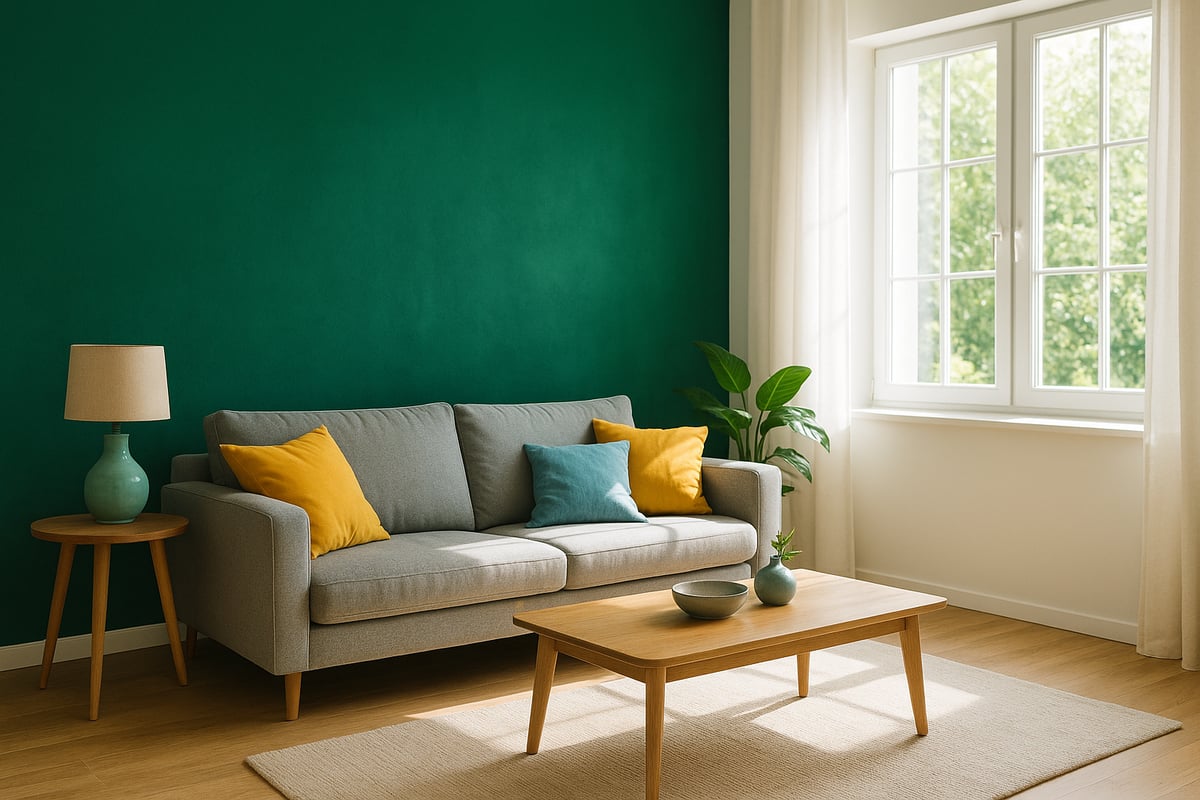
Now, let’s talk about the mood-makers: warm versus cool tones. Warm shades like terracotta, coral, and ochre create a cosy, welcoming vibe. They’re perfect for living rooms where you want to gather and connect. Cool tones, such as sage, teal, or soft lavender, bring calm and tranquillity, making them ideal for bedrooms or bathrooms. The right balance of warm and cool colour in a house can totally change how each room feels and functions.
But colour in a house isn’t just about science or trends. It’s also deeply personal and cultural. Around the globe, certain hues carry specific meanings. Red might symbolise luck in one country and passion in another. Your own memories and preferences play a huge role too. Maybe green reminds you of your nan’s garden, or you’ve always dreamed of a blush pink bedroom. The best interiors reflect the personalities and stories of the people who live there.
Here’s a fun fact: colour in a house can literally change how big or small a room feels. Light, cool colours can make a tiny box room look airy and spacious, while deep, rich shades can make a vast open-plan space feel snug and inviting. And don’t forget lighting. Natural daylight brings out the truest hues, while artificial lighting can shift colours warmer or cooler. Always test your chosen colours at different times of day before you commit.
Let’s look at some real-life magic. One family transformed their gloomy hallway with a bold cobalt blue and lots of mirrors, instantly making it brighter and more welcoming. Another swapped beige for a zesty green in their kitchen, boosting both the energy and their morning moods. The lesson? Intentional colour in a house is always more powerful than defaulting to “safe” neutrals. Neutrals have their place, but life’s too short for boring beige, don’t you think?
2025 Colour Trends and Timeless Palettes
Ready to give your home a serious glow-up? The world of colour in a house is about to get a wild makeover in 2025. Forget safe and predictable; this year is all about bold choices, earthy grounding, and a punch of personality that says, “Yes, I actually live here.”
2025’s Must-Have Colour Trends
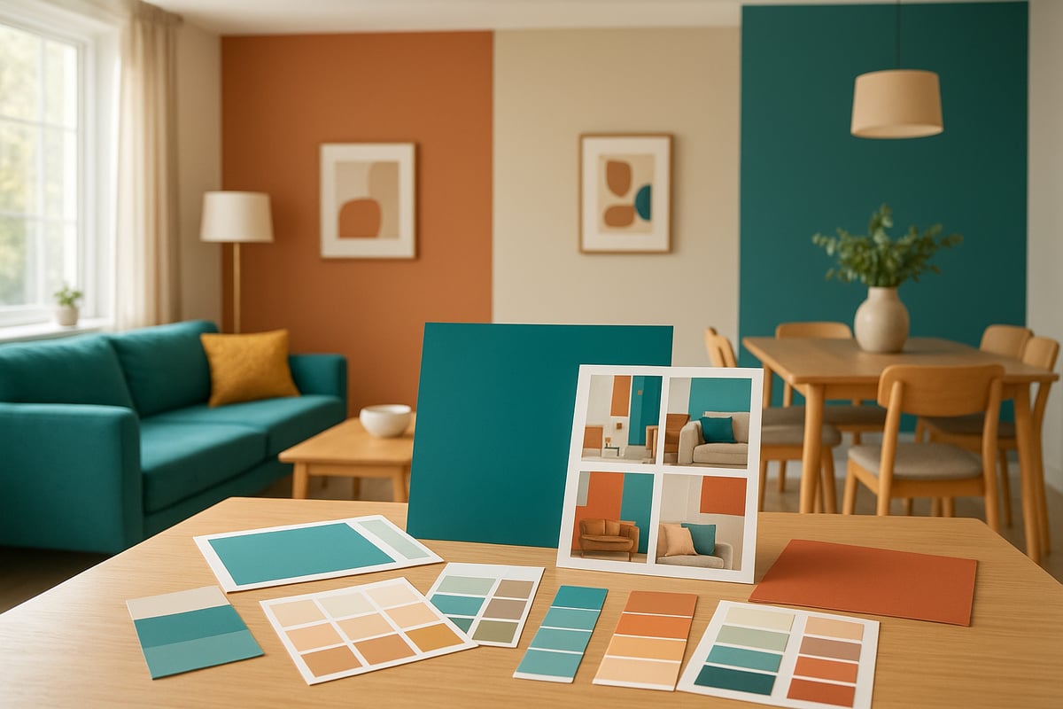
Let’s spill the paint: 2025 is all about rich earth tones, unapologetically bold brights, and soft, dreamy pastels. Think warm clay, mossy green, and sun-baked ochre. Pair those with electric blue, punchy coral, or zesty yellow if you’re feeling brave. And if you need a breather, muted lilacs and buttery creams are here to save the day.
According to the 2025 Interior Design and Color Trends Report, earth-inspired palettes are dominating, with 42% of designers rating them as the most influential look this year. Brights are coming in hot, especially in kitchens and home offices, while pastels sneak into bedrooms for a calming touch.
The best part? These trends make colour in a house feel both fashion-forward and liveable. No sterile show home vibes allowed.
Palette Showdown: What’s Hot and Where
| Palette | Mood/Effect | Best Room Use | Timeless? |
|---|---|---|---|
| Earth Tones | Grounded, organic | Living/dining | Yes |
| Bold Brights | Energising, playful | Kitchen/office | Sometimes |
| Muted Pastels | Calm, soothing | Bedroom/bath | Yes |
| Deep Blues/Greens | Sophisticated, rich | Study/library | Yes |
Notice how every palette can find a home? That’s the magic of using colour in a house with intention.
Balancing Trend and Timelessness
You don’t have to turn your lounge into an art school to enjoy the latest trends. The secret to mastering colour in a house is all about balance. Use that wild lime green on cushions or an accent wall, then ground it with classic neutrals or deep navy. Mix trendy brights with time-honoured earth tones, and you get a space that feels current but won’t make you cringe next year.
Pro tip: Test drive bold colours in places you can switch up easily—think throws, artwork, or even painted furniture. That way, when the trend winds change (and they will), your home won’t feel like a time capsule.
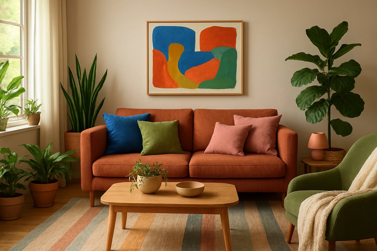
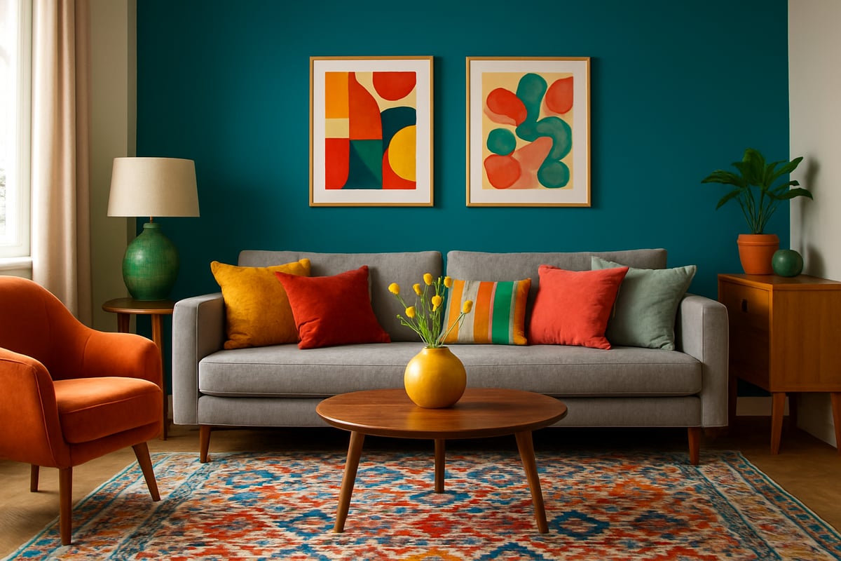
Designers’ Real-World Palettes
Designers are having a field day with colour in a house right now. Recent projects showcase olive and ochre living rooms, cobalt blue kitchens, and blush pink bathrooms that feel more spa than sweet shop. These combos don’t just look good; they create moods that make you want to linger. One London flat layered sage green walls with terracotta tiles, while a Sydney home used pastel mint and sandy beige for instant calm.
It’s not about copying a catalogue. It’s about finding the palette that makes your heart skip a beat—and adding a cheeky pop of something unexpected.
Trends, Value, and Social Influence
Let’s talk brass tacks. Does chasing the hottest colour in a house hurt your resale value? Not if you’re clever. Experts say buyers love a fresh, well-coordinated look—so long as you avoid polarising colours on big-ticket items. And with the world craving connection to nature and comfort, those earth tones and soft pastels tick both boxes.
Social and environmental factors are also fuelling these trends. People want homes that feel safe, sustainable, and personal. So, when you pick a palette, you’re not just following fashion, you’re making a statement about what matters in your world.
Go on, rebel against the beige. 2025 is the year your home gets its groove back.
Step-by-Step Guide to Choosing Colour for Every Room
Ready to banish beige? Let’s break down the process of choosing colour in a house into five simple, rebellious steps. No more guesswork or drab walls—just bold, beautiful decisions that’ll make your home sing.
Step 1: Assessing Your Space and Lighting
First things first—before you even eye up a paint chart, study your space like a detective. Light is the secret sauce for colour in a house. North-facing rooms? They’re cooler and can make colours look a bit dull. South-facing rooms? Lucky you—colours glow, especially in the afternoon.
Check every nook for natural light. Open those curtains, peek under lamps, and note how sunlight or bulbs shift hues throughout the day. Don’t forget artificial light. Warm bulbs can turn crisp whites creamy, while cool LEDs can make blues feel icy.
Look at your floors and ceilings too. Dark floors soak up colour, while light ones bounce it back. Snap a few photos at different times to see the true mood of your space. Trust us, this groundwork saves you from living in a space that feels like a cave or a dentist’s office.
Step 2: Defining Mood and Function
Now, let’s get personal. What do you want each room to feel like? Colour in a house is all about mood and function. Bedrooms deserve calm—think soft blues or gentle greens for relaxation. Kitchens? Go lively. Yellows and fresh greens spark appetite and conversation.
List each room’s main job. Is your lounge for lounging or lively parties? Do you want your office to focus your mind or fire up your creativity? Studies show most people prefer serene colours for sleep spaces and energising shades for workout zones.
Jot down three words for each room’s vibe—cosy, bright, dramatic, you name it. Match those words to colours that actually deliver. If your home office needs focus, blue is your best mate. If you want energy in the hallway, a pop of citrus might just do the trick.
Step 3: Building a Cohesive Palette
Let’s talk flow. A great colour in a house doesn’t just look good in one room—it sings as a whole. Grab a colour wheel and play with harmony. Complementary colours (opposites on the wheel) add drama, while analogous hues (side by side) feel relaxing.
Consistency is key. Pick undertones—warm or cool—and keep them running through your palette. A home with unified undertones feels intentional, not chaotic. Open-plan spaces especially need colours that transition smoothly without jarring stops.
Need a cheat sheet? Here’s a quick table:
| Harmony Type | Feeling | Example Pairings |
|---|---|---|
| Complementary | Bold, energetic | Blue & orange |
| Analogous | Calm, cohesive | Green, teal, blue |
| Monochromatic | Sophisticated | Shades of grey |
Craving more guidance? Check out Choosing the Right Colour Scheme for practical palette-building magic. This is your permission slip to break the rules—just do it with purpose.
Step 4: Testing and Sampling Colours
Don’t trust the tiny paint chip. For colour in a house, bigger is always better. Buy sample pots and paint A4 swatches (or even whole poster boards). Stick them on each wall and watch how they morph as the light changes.
Try samples in corners, behind furniture, and near windows. Observe them at breakfast, lunch, and dinner. The goal? Avoid that “oops” moment when your dream blue turns to hospital scrubs at night.
Pro tip: Don’t paint samples right next to each other. Give them breathing room, or your eyes will play tricks on you. Snap pics and sleep on it—your gut will tell you what feels right.
Step 5: Finalizing and Applying Colour
You’ve chosen your colours—now it’s time to make them shine. The finish matters for colour in a house. Matte hides flaws but marks easily. Satin has a soft glow and is wipeable, perfect for busy spaces. Gloss pops but can highlight lumps and bumps.
Decide if you’re DIY-ing or calling in the pros. Painting yourself saves cash, but prepping (think sanding, taping, priming) is everything. Rush it, and you’ll regret it. If you hire help, check references and get a detailed quote.
Watch out for classic pitfalls. Don’t forget your fixed elements—floors, cabinets, even radiators. They all play into your palette. And please, don’t skimp on the second coat. That’s where the magic happens and your colour in a house truly comes alive.
Expert Tips for Combining Colours and Patterns
Ready to break free from the beige brigade? Let’s talk about the rebellious joy of mixing colour and pattern. Mastering colour in a house isn’t about following rules, it’s about knowing them well enough to break them with confidence. Here’s how to become your own colour rebel and create a home that’s as bold, layered, and unapologetic as you are.
The Art of Colour Harmony
Let’s start with the basics. Colour harmony is the secret sauce for creating balance, not chaos. The main schemes? Complementary (across the wheel), analogous (side by side), and triadic (evenly spaced). Here’s a quick cheat sheet:
| Harmony Type | How It Works | Best For |
|---|---|---|
| Complementary | Opposite colours (blue & orange) | High contrast, bold drama |
| Analogous | Neighbours (blue, blue-green) | Subtle flow, relaxed vibe |
| Triadic | Three evenly spaced (red, yellow, blue) | Playful, energetic, balanced |
When you plan colour in a house, use these schemes to set the mood. Want drama? Go complementary. Fancy a spa-like feel? Analogous all the way.
Patterns, Solids, and the Perfect Mix
Patterns make a room sing, but too many and it’s a karaoke disaster. The trick? Layer patterns with solid colours. For example, pair a bold floral wallpaper with block-colour furniture. Use small-scale prints on cushions, and ground everything with a solid rug. This creates depth without overwhelming the senses.
If you want your space to ooze personality, Make Your Home Pop with Colour is packed with creative ideas for mixing patterns and hues. It’s proof that a little rebellion goes a long way.
Bold Colour Without the Fear
Worried about turning your lounge into a circus tent? Here’s the trick: limit bolds to two or three main colours, and repeat them throughout the room. Use the same accent colour in art, accessories, and soft furnishings. It makes the look intentional, not accidental.
Remember, using colour in a house doesn’t mean painting every wall a wild shade. Sometimes, a single statement piece does the job.
Designer-Approved Combinations
Designers love breaking the rules—strategically. Think emerald with blush pink, or navy with chartreuse. If you need inspiration, real homes show how it’s done. Check out Colour Makeovers That Transform Homes for jaw-dropping examples of colour in a house gone right.
Maximalist vs. Minimalist: What Do People Actually Love?
Surprise: recent surveys say 60% of homeowners want more colour in a house, but only 20% go full maximalist. Most people crave personality, but fear getting it wrong. The secret? Start small. Add a patterned chair, a vibrant throw, or a gallery wall.
Personal taste always wins. Trends come and go, but your joy should stick around.
Texture, Material, and the Magic Touch
Don’t forget: texture is the unsung hero of colour in a house. Mix velvet, linen, wood, and glass for extra depth. Patterned tiles in a kitchen, woven baskets in a living room, or metallic accents can make colours pop and feel intentional.
Find Your Own Colour Rebel
At the end of the day, the best homes feel lived-in and loved, not staged for a magazine. Use these tips as a launchpad, then trust your instincts. Whether you crave riotous pattern or a more curated scheme, the future of colour in a house is all about expressing what makes you tick.
Sustainable and Healthy Colour Choices for Modern Homes
Choosing sustainable and healthy colour in a house isn’t just woke, it’s essential. You want a home that looks good, feels good, and doesn’t make you cough up a lung every time you walk in. Let’s rip off the beige bandage and talk about eco-friendly paints, smart materials, and why nature-inspired palettes are the rebellious future of interiors.
Eco-Friendly Paints: What’s In (and What’s Out)
The new rule for colour in a house? If you can smell it, bin it. Traditional paints are packed with VOCs (volatile organic compounds), which is a posh way of saying “nasty chemicals that mess with your air and your head.” Low-VOC and zero-VOC paints are the rebels leading the charge, giving you rich colour without the headache.
Top brands are now offering ranges made from recycled content and plant-based binders. The benefits? You get vibrant, lasting shades and a space that doesn’t pollute your lungs. Here’s a quick table to break it down:
| Paint Type | VOC Level | Health Impact | Eco-Cred |
|---|---|---|---|
| Traditional | High | Headaches, allergies | Bad for planet |
| Low/Zero-VOC | Low/None | Minimal | Good for planet |
| Natural/Mineral | None | Minimal | Best for planet |
So, next time you’re picking colour in a house, check those labels. Your future self (and your pets) will thank you.
Colour and Wellbeing: The Science Bit
Let’s get scientific for a second—because colour in a house isn’t just about looks. Studies show that certain hues and paint types can actually affect your mood, energy, and even your sleep. For example, blue tones are proven to promote calm, while vibrant yellows energise a space. But here’s the kicker: paint fumes can ruin all that good work.
Research on paint emissions links high-VOC products to allergy triggers and poor indoor air quality. If you want to geek out, check out this deep dive on Color Psychology in Community Health Design. It’s a reminder that your colour choices aren’t just visual—they’re physiological.
Bringing Nature In: Biophilic Design
Biophilic design is the buzzword that actually delivers. It means filling your home with shades and textures inspired by the outdoors. Think mossy greens, sandy taupes, terracotta, and all the leafy, earthy tones you’d find on a woodland walk. Using biophilic colour in a house isn’t just trendy, it’s a proven way to boost your mood and productivity.
Pair those natural hues with real plants, bamboo floors, or reclaimed wood. Suddenly, your lounge feels like a spa, not a shoebox. The best part? Biophilic palettes are timeless, so you won’t need a full repaint every time trends change.
Sustainable Style in Action
Plenty of stylish homes are proving you can have your cake and eat it—colour in a house that’s sustainable and jaw-dropping. Look for low-impact paints, recycled furnishings, and textiles made from organic fibres. Prioritise quality over quantity: a few well-chosen, eco-friendly pieces outshine a landfill’s worth of cheap decor.
Investing in health-conscious finishes pays off. You get a home that’s safer, kinder to the planet, and way more interesting than your neighbour’s “neutral” box. In 2025, the only thing more rebellious than colour in a house is making it good for you and the world.
So there you have it—you’re armed with all the colour wisdom you need to turn your house into a living, breathing reflection of your wildest, boldest self. No more tiptoeing around neutrals or playing it safe. You deserve a home that sparks joy every time you walk in (and yes, your walls can totally wear sequins if you want). Ready to keep that rebel energy going and fill your life with even more unapologetic colour confidence? Honestly, sign up for daily colour confidence + rebel style inspo—because life’s too short for beige.
0 comments