
Imagine colour in the house that actually wakes up your senses. Forget those beige walls that sap your soul. Picture a space that boosts your mood and makes you want to dance in your socks.
This guide is your ticket to mastering colour in the house, blending the latest 2026 trends with a dash of psychology. Want rooms that feel as bold and unique as you are? You’re in the right place.
Inside, you’ll unlock the secrets of colour psychology, discover trending palettes, and grab practical tips for combining shades like a pro. Ready to ditch the dull and embrace your inner rebel? Let’s get started.
The Psychology of Colour in the Home
Understanding Colour Psychology
Colour in the house is not just about what looks pretty, it’s about how you want to feel. Every hue has a secret mission. Blue? It’s the master of calm, perfect for unwinding after a wild day. Yellow? That’s pure bottled sunshine, proven to boost energy and spark creativity. Scientific studies show that 78 percent of homeowners admit colour in the house affects their mood, so you’re definitely not alone in feeling the vibes.
But it’s not just science. Cultural roots and personal memories play a role. Maybe green reminds you of a childhood garden, or red makes you think of festive dinners. The right shade can turn a drab bedroom into a tranquil retreat or make a kitchen buzz with excitement.
Colour and Function: Matching Hues to Rooms
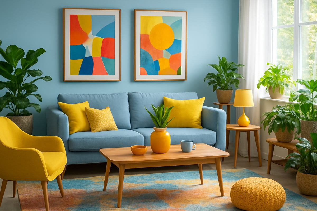
Let’s play matchmaker with colour in the house and your rooms. Bedrooms crave restful shades like soft blues or muted greens that help you switch off. Kitchens? Go bold with energising reds or zesty citrus for a wake-up call. Living rooms love warm neutrals or cosy earth tones for conversation and comfort. Bathrooms, on the other hand, shine in crisp whites or spa-like aquas.
Natural light and room size matter, too. Small spaces benefit from lighter shades, making them feel bigger, while bold colours define zones in open-plan homes. Got a home office? Green is your productivity wingman, boosting focus without shouting for attention.
Psychological Effects of Bold vs. Neutral Palettes
Bold colours are the life of the party. They spark energy, confidence, and joy, perfect for those who want their colour in the house to shout, “Look at me!” Neutrals, however, are the quiet types, bringing calm, balance, and a touch of sophistication. Both have their place. The dopamine décor trend and maximalism are on the rise, with more people craving vibrant, mood-boosting rooms.
Want proof? Check out these fearless interiors for happier homes and see how a bold makeover can turn gloom into glee. Sometimes, all it takes is a splash of colour in the house to flip the emotional script.
How Colour Choices Reflect Personality
Your taste in colour in the house is basically a personality test you didn’t even know you were taking. Love serene, muted palettes? You might be an introvert, craving peace and reflection. Adore electric pinks and zesty oranges? That’s pure extrovert energy, ready to make a statement.
Colour is your home’s selfie—unfiltered, authentic, and bursting with character. Use it to show off your quirks, fuel your creativity, or create a space that hugs you back. There’s no “one size fits all” when it comes to expressing yourself with colour in the house.
Common Colour Mistakes and How to Avoid Them
It’s easy to get carried away with colour in the house and end up with a circus. Too many shades can overwhelm, while ignoring undertones leads to jarring clashes. Lighting is the sneaky culprit that can make your perfect paint look completely wrong by nightfall.
Avoid these pitfalls by testing samples on different walls, studying the space throughout the day, and consulting a colour wheel. Don’t be afraid to ask for expert advice. Remember, colour in the house should bring you joy, not regret.
2026 Colour Trends: Palettes, Patterns, and Inspiration
Ready to turn your space into a riot of personality? The future of colour in the house is anything but bland. In 2026, boldness, sustainability, and global inspiration are shaking up every room. Let’s dive into the hottest hues, playful patterns, and creative ideas you’ll want to steal.
Top Trending Colours for 2026
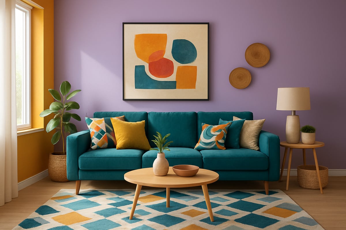
2026 is serving up a feast for the senses. Think digital lavender, sunlit ochre, and marine teal splashed across every stylish home. These colours aren’t just plucked from thin air. They’re inspired by tech, nature, and a growing hunger for joy and comfort. Digital lavender brings a calming, futuristic vibe, while sunlit ochre radiates warmth and optimism. Marine teal grounds the palette with a fresh, energising twist.
Fashion runways and global events are fuelling these shifts in colour in the house. According to Top Interior Colour Trends for 2026, tranquil teals and mellow reds are also making waves. If you want a space that feels both now and next, this is your starting point.
Pattern Play: Mixing Prints and Motifs
Maximalist patterns are back and bolder than ever. Forget playing it safe. The new rule for pattern and colour in the house is: more is more (as long as you balance it). Try mixing florals with geometrics in your living area for a punchy, rebellious look. Big patterns add drama, while smaller prints keep things playful.
Want a pro tip? Stick to a unified colour palette, and let scale do the talking. Pair a huge floral wallpaper with a small geometric rug, and suddenly your space has designer energy—without the designer price tag. It’s all about having fun and breaking the so-called rules.
Eco-Conscious and Tech-Driven Colour Innovations
Sustainability isn’t a trend, it’s a necessity. Luckily, the world of colour in the house is catching up. Eco-friendly, non-toxic paints are everywhere, making it easy to go green—literally and figuratively. Dyes from natural sources are popping up, too, so you can feel good about every brushstroke.
Tech is adding its own twist. Colour-changing smart surfaces and LED accent lighting let you shift your palette with a swipe or a tap. With 65% of consumers seeking sustainable décor (Statista, 2024), why not make your home both stylish and kind to the planet?
Cultural and Global Influences on Colour Trends
If you’re bored of the same old shades, look abroad for inspiration. Mediterranean blues, Japanese earth tones, and Afrocentric brights are spicing up colour in the house worldwide. Designers are blending traditional palettes with modern style for a look that’s both rooted and radical.
Try a splash of terracotta in the kitchen, or layer in indigo textiles for global flair. Mixing these influences isn’t just trendy—it’s a celebration of creativity and culture. Your home tells your story, so let it speak in every accent and hue.
Real-World Inspiration: Notable Projects and Influencers
Want proof that colour in the house can change everything? Just look at the latest makeovers from top designers and Instagram trendsetters. From moody, maximalist lounges to sun-drenched creative studios, the transformation is jaw-dropping.
Publications like Architectural Digest and Dezeen showcase real homes that traded beige for boldness. Before-and-after shots highlight how a clever palette can make a room feel bigger, brighter, and brimming with personality. If you need a nudge to take the plunge, these real-world rebels are your sign.
Step-by-Step: Planning Your Home Colour Scheme
Ready to shake up the colour in the house and ditch the dull? Here’s your no-nonsense, step-by-step guide to planning a scheme that’s as bold (or serene) as you are. Whether you’re a maximalist at heart or you’d rather keep things chill, this is your permission slip to rebel against beige and paint outside the lines.
Step 1: Define Your Goals and Gather Inspiration
First up, ask yourself: what do you want your space to feel like? Are you after a family-friendly hub that buzzes with energy, or a grown-up retreat where you can finally relax? Get nosy about your lifestyle and how each room gets used.
Start a mood board (Pinterest is your new best mate) and pin everything that sparks joy. Don’t just focus on interiors—fashion, art, and even your favourite coffee mug can inspire the colour in the house. Not sure where to start? Flip through magazines, scroll Instagram, or peek at design apps for a cheeky boost.
Step 2: Evaluate Existing Elements and Lighting
Before you paint the town red (literally), take a good, honest look at what’s already in the room. Floors, sofas, and built-in features set the stage for any colour in the house. Ignore them, and you’ll risk a clashing mess.
Lighting is the sneaky trickster of the decor world. Rooms drenched in natural sunlight will make colours zing, while gloomy corners might sap their energy. Use your phone’s camera at different times of day to see how the shades shift. If you’re extra keen, grab a light meter for a proper deep dive.
Step 3: Choose a Base Palette and Accent Colours
Now for the fun bit—building your palette. Pick one hero colour to dominate, a couple of supporting actors, and a scene-stealing accent or two. The 60-30-10 rule is a classic: 60% main colour, 30% secondary, 10% pop.
Struggling to balance bold and subtle? Consider a monochrome look, go complementary for drama, or try analogous hues for a sophisticated flow. If you need a nudge in the right direction, check out how to choose the right colour scheme for expert tips on nailing the perfect colour in the house every time.
Step 4: Test Samples and Visualize in Real Space
Never trust a paint chip alone. Get messy—grab testers and slap swatches on the wall, close to skirting boards and windows. Same goes for fabrics. Live with them for a few days, and watch how they shift in daylight and lamplight.
Feeling techy? Use AR apps to preview your chosen colour in the house before you commit. Snap photos, compare, and don’t be afraid to walk away from a dud. Small test patches beat costly regrets every time.
Step 5: Layer Patterns, Textures, and Finishes
Ready to dial up the wow factor? Mix textures like velvet, linen, and wool for a space that’s as touchable as it is gorgeous. Don’t just stick to walls—add interest with metallics, matte, or glossy finishes.
Patterns aren’t just for the brave. Try a geometric cushion, a floral rug, or a bold wallpaper. Layering patterns and textures is the secret sauce for unforgettable colour in the house. Just remember: variety is the spice, but too much is a recipe for chaos.
Step 6: Adjust and Personalize Your Scheme
Your home is a living thing, not a showroom. Tweak your colours as the seasons change or your tastes evolve. Swap out accessories, add a piece of art, or throw in a wild card like a neon vase.
Personal touches make the colour in the house truly yours. Hang travel souvenirs, family photos, or that quirky flea market find. If it makes you smile, it belongs in your scheme. The goal? Spaces that look like you, not a catalogue.
Step 7: Finalize and Implement Your Plan
Got your plan? Now it’s showtime. Break it down room by room, make a budget (DIY or call in the pros), and schedule your makeover for minimal disruption. Tackle one space at a time for sanity’s sake.
Keep your eye on the prize—the colour in the house that feels unapologetically you. Celebrate every step, from the first brushstroke to the final cushion fluff. Your home, your rules. Go wild.
Creative Techniques for Applying Colour
Ready to throw the beige out with yesterday’s leftovers? Let’s get rebellious with colour in the house. Creative application isn’t just for art school dropouts or eccentric aunts. It’s your ticket to expressing personality, boosting mood, and making every room a masterpiece. Below, you’ll find five bold ways to make colour in the house work harder than your morning coffee.
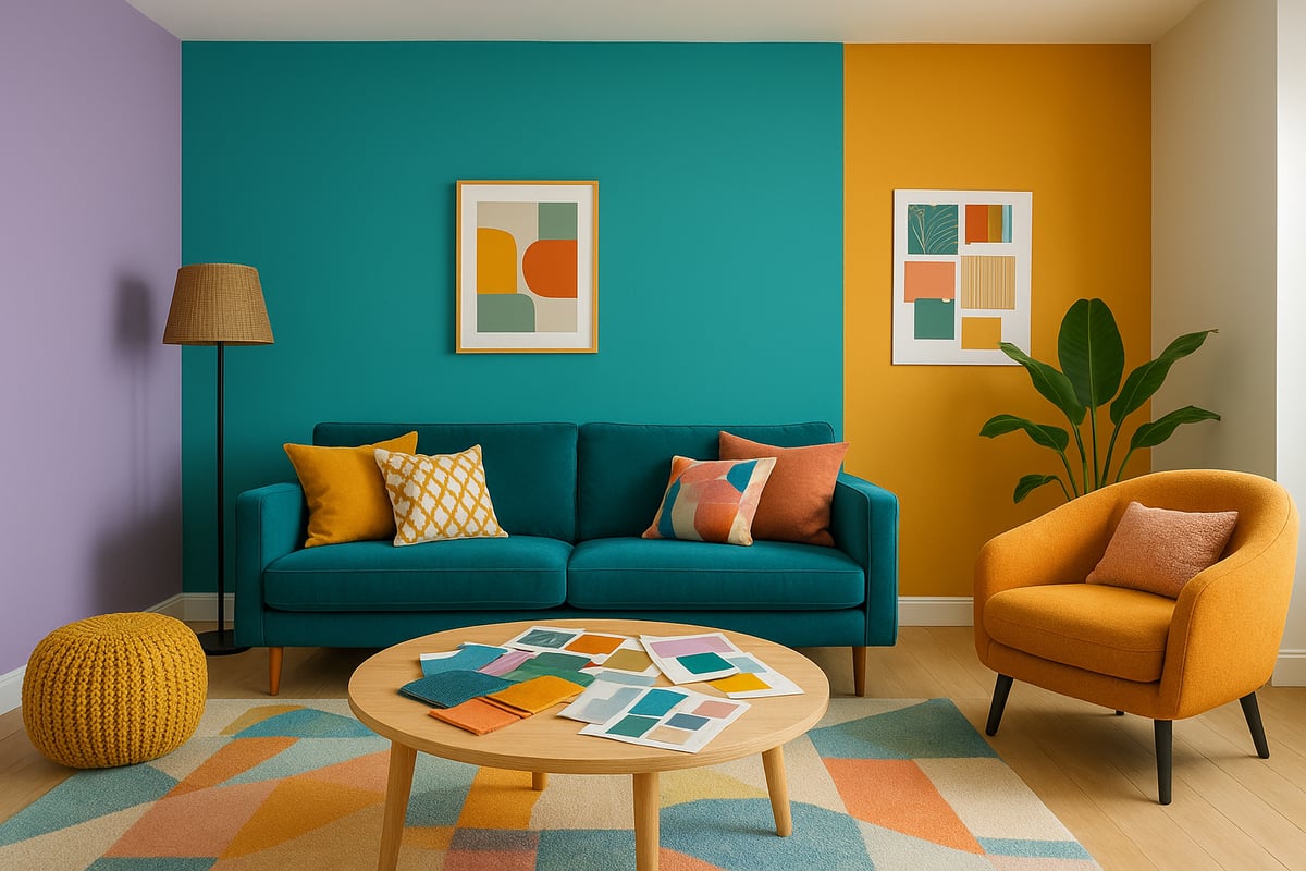
Feature Walls and Colour Blocking
Ever wanted your walls to shout (in a good way)? Feature walls are the megaphones of colour in the house. Pick a wall and drench it in a showstopper shade. Think ombre gradients that melt from pink to peach, or a geometric mural that zigzags across your living room.
Colour blocking isn’t just a fashion trend – it’s pure magic for transforming spaces. Try painting bold shapes in unexpected spots, like behind the sofa or around a reading nook. If commitment scares you more than Monday mornings, use peel-and-stick wallpaper for a no-regrets approach. Remember, even a small splash can spark big joy.
Painted Ceilings, Floors, and Unexpected Surfaces
Why let your ceiling be the forgotten fifth wall? Painting it adds instant drama and draws the eye up, making rooms feel taller and more dynamic. Go for a subtle blush or a full-on marine teal sky – it’s all fair game with colour in the house.
Floors are craving attention too. Think painted checkerboards in the kitchen or a sunlit ochre border in the hallway. Don’t stop there. Doors, trim, built-in shelves, even radiators can become pop-art moments. The 2025 Pinterest Predicts report says it best: unexpected surfaces are the new frontier for creative rebels.
Using Colour Through Furniture and Décor
Not ready to commit your walls to a love affair with colour in the house? No problem. Furniture and décor are your trusty wingmen. Swap in a velvet sofa in digital lavender, layer patterned rugs, or pile on art with juicy hues.
Accessories make it easy to change your vibe with the seasons (or your mood swings). Rotate cushion covers, throws, or lampshades for a quick refresh. For more inspiration and actionable tips, check out 10 ways to make your home pop with colour – it’s practically a rebel’s handbook.
Lighting and Colour Perception
Lighting is the sneaky sidekick that can make or break colour in the house. Sunlight brings out the best in bright hues, while warm bulbs make reds and yellows feel cosier. Cool bulbs can sharpen blues and greens for a crisp, modern edge.
Smart lighting systems let you shift the mood with a tap, so your tangerine dining room can mellow out for a dinner party or ramp up for brunch. Layered lighting isn’t just designer talk – 72% of pros use it to boost colour impact. Test your colours at different times of day for maximum wow.
DIY Projects for Personal Touches
Feeling crafty? DIY is where you can really let your colour in the house flag fly. Upcycle a tired chest of drawers with bold paint, or stencil a playful pattern on your hallway floor. Create custom art with leftover tester pots – who needs a gallery when your living room is your canvas?
Soft furnishings like hand-painted cushions or dip-dyed curtains add a rebellious twist with minimal effort. DIY projects aren’t just budget-friendly, they’re conversation starters. Your guests will wonder if you secretly hired a designer (spoiler: you didn’t, you’re just that creative).
Colour Harmony: Combining Hues with Confidence
Colour in the house is like mixing cocktails—when you get the blend right, it’s magic, but too much and you’ll have a headache. Ready to ditch the fear and start stirring up your own vibrant concoctions? Let’s break down the secrets to combining hues with confidence, so your home can finally match your colourful personality.
The Basics of Colour Theory
If you want to master colour in the house, start with the basics. The colour wheel is your best mate—think of it as the ultimate recipe guide for mixing shades. You’ve got your primaries (red, blue, yellow), secondaries (orange, green, purple), and tertiaries (those in-between show-offs).
Here’s a quick cheat sheet:
| Colour Relationship | What It Means | Result |
|---|---|---|
| Complementary | Opposite on the wheel | High contrast pop |
| Analogous | Next to each other | Harmonious blend |
| Triadic | Evenly spaced around wheel | Balanced vibrancy |
Play with online colour generators or apps to see how combos look before you commit. Trust me, using colour in the house is a lot less scary when you’ve got a plan.
Balancing Warm and Cool Tones
Mixing warm and cool tones in your colour in the house scheme is like inviting both the sun and the sea to your party. Warm hues (think terracotta or ochre) bring energy and cosiness, while cool shades (sage, marine teal) chill things out.
To keep things cohesive, pay attention to undertones—pair a warm neutral with a cool accent for balance. Designers are loving new neutrals for 2026, like soft greens and delicate blues, which you can explore in New Neutrals Designers Are Choosing for 2026. Try pairing a sunlit ochre wall with a cool blue sofa for instant harmony.
Creating Flow Between Rooms
When you’re thinking about colour in the house, don’t let each room feel like it’s at a different party. The trick? Create flow with transitional shades and repeat accent colours from space to space. For open-plan homes, use gradual palette shifts—maybe a bold feature wall in the lounge, with softer echoes of that hue in the hallway.
A little trick: pick one accent colour and let it pop up in art, cushions, or even a cheeky vase in every room. This way, your house feels connected, not chaotic. Visual continuity means your eye glides effortlessly from one room to the next.
Overcoming Colour Fear: Tips for the Hesitant
Scared of getting colour in the house wrong? You’re not alone. Start small—paint a door, jazz up the trim, or experiment with bold art. Layering is your friend: add a pop of colour with cushions or throws, then see how you feel.
Take inspiration from real-life colour makeovers that transform your home. Even the most beige-loving folks have embraced boldness with a little nudge. Remember, confidence grows with every colourful risk you take—so grab that paintbrush and rebel a little.
Expert Advice and Resources for Colourful Living
Ready to take your obsession with colour in the house to the next level? Sometimes all the Pinterest boards in the world can’t save you from decision paralysis, clashing hues, or that sneaky beige creeping back in. That’s where expert advice and the right resources swoop in, cape and all, to rescue your creative vision.
When to Consult a Professional Colour Consultant
Feeling overwhelmed by the endless possibilities for colour in the house? If your mood swings with every paint sample or you dread another round of “is this green too green,” it’s time to call in a pro. A colour consultant helps you avoid expensive mistakes, decode undertones, and create a scheme that feels perfectly you.
Common signs you need help:
- Indecision or clashing results
- Unique challenges like tricky lighting or open-plan spaces
- Wanting a bespoke look with zero stress
Expect a fun, collaborative process. You’ll get a personalised plan, swatch testing, and expert tricks. The science is real, too. Curious about how colour choices actually affect your emotions? Check out this Colour Perception in Immersive Virtual Reality Study for fascinating insights that’ll make you see colour in the house with fresh eyes.
The Colour Rebel Studio: Empowering Colour Confidence
Meet your new best mate in the world of colour in the house: The Colour Rebel Studio. Led by Jodie, this studio is all about kicking beige to the curb and helping you embrace bold, joyful living. Whether you want custom colour plans, daring pattern mixes, or a total home transformation, Jodie’s rebel energy is contagious.
Clients rave about:
- Bespoke colour and pattern schemes
- Surface pattern products that make walls sing
- A supportive membership for ongoing inspiration
Past transformations have turned dull spaces into vibrant sanctuaries that radiate personality. If you’re ready to rebel against boring, The Colour Rebel Studio is your secret weapon for fearless colour in the house.
Top Resources for Colour Inspiration and Tools
The world is bursting with inspiration for colour in the house. Want to stay ahead of the trend curve? Bookmark these resources:
| Resource Type | Recommendation |
|---|---|
| Book | "The Colour Scheme Bible" |
| Blog | House Beautiful |
| Social Media | Instagram: @thecolourrebel, @pantone |
| Online Tools | Colour palette generators, AR paint apps |
| Trend Watch | Benjamin Moore's 2026 Colour of the Year |
Dive into virtual room planners, scroll trend accounts, and experiment with digital tools. Every tool is a new way to play with colour in the house and boost your confidence.
So—you’ve made it this far and your brain’s fizzing with ideas about dopamine décor and bold, beautiful spaces. Good. You deserve a home that actually feels like you, not some bland “neutral” box. If you’re itching for more tips, tricks, and rebellious inspo to boost your colour confidence (and maybe scandalise your beige-loving relatives), I’ve got you. Let’s keep the creativity flowing—Sign up for daily colour confidence + rebel style inspo. Because rule number one around here Never play it safe with colour.
0 comments