

Did you know the colour of wardrobe you pick is the real secret sauce for a jaw-dropping room and a wardrobe that screams your style? Choosing the right shade is not just about looking trendy, it’s about creating a space (or outfit) that feels like you. This guide spills all the tea on how to master the art and science of wardrobe colour for 2026, blending colour psychology, top trends, and practical tips. Get ready to explore trending hues, colour moods, matching with décor, step-by-step selection, and expert advice. Ready to make confident, rebellious choices? Let’s dive in and find your perfect wardrobe shade.
The Power of Wardrobe Colour: Why Shade Matters
Ever glanced at your wardrobe and thought, “Why does this thing make my whole room feel off?” The truth is, the colour of wardrobe is not just a background player—it’s the lead singer belting out your room’s vibe and your personality. Get it right, and your space sings. Get it wrong, and you’re living in a discordant symphony.
The Mood-Altering Magic of Colour
Let’s talk mood. The colour of wardrobe you choose has the power to calm, energise, or even annoy you—no joke. Opt for blue, and you create a space that feels tranquil and serene. Red? That’s a shot of espresso for your senses, buzzing with energy. Colour psychology is no woo-woo trend. It’s science, darling. If you want to dive deeper, check out The Psychology of Color in Interior Design for some eye-opening insights.
Your wardrobe’s colour can set you up for a restful night or a power-charged morning. Why settle for “meh” when you could have “wow” every single day?
Light, Space, and the Illusionist’s Trick
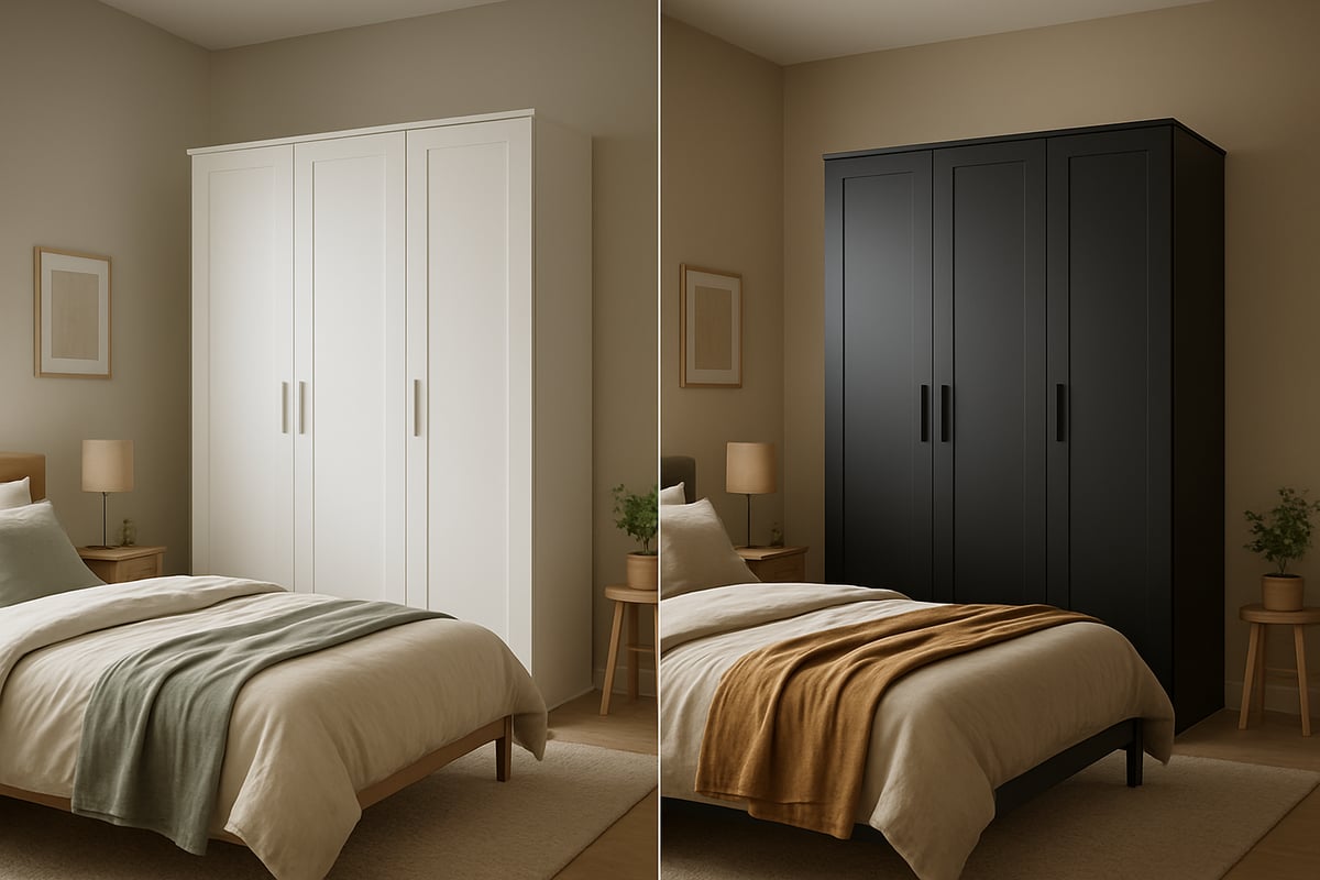
Here’s the thing: the colour of wardrobe can play mind games with your eyes. Light shades like white, soft grey, or pale taupe bounce light around, making small rooms look bigger and brighter. Got a poky bedroom? A white wardrobe is your new best mate.
On the flip side, darker hues—think navy or deep charcoal—dial up the drama and create a sense of intimacy. In a vast space, a black wardrobe acts like a grounding anchor. But cram that same black beast into a tiny box room, and you’ll feel like you’re living in a shoebox. Choose wisely.
Real People, Real Results
Don’t just take my word for it. Data from Dako Furniture reveals that 68% of homeowners feel more satisfied when the colour of wardrobe matches the mood they want for their room. That’s not a fluke. It’s proof that colour choice is about more than just aesthetics.
For example, a small bedroom with a glossy white wardrobe feels light and open. In contrast, a sprawling loft with a statement black wardrobe oozes modern sophistication. Both are right—if they suit your space and your style.
Style, Routine, and Daily Joy
The colour of wardrobe is the ultimate style statement, but it’s also practical. It reflects your personality, sets the tone for your routine, and even supports your habits. If you’re someone who needs calm to function, go for sage green or soft blue. Want a jolt of creativity every morning? Try teal or mustard.
Your wardrobe isn’t just storage. It’s a mood board you live with. So, choose a colour that makes you smile—every single day.
Timeless Versus Trendy: The Showdown
Let’s get real for a second. Chasing trends with the colour of wardrobe is like buying neon leggings because TikTok told you to—they’ll haunt you in a year. Timeless shades like white, grey, and natural wood never go out of style. They boost resale value and let you refresh your look with simple hardware swaps.
Here’s a quick cheat sheet:
| Timeless Colours | Trendy Colours | Risks |
|---|---|---|
| White, grey, taupe | Neon brights, black gloss | Quick to date, hard to style |
| Natural wood | Metallic finishes | Commitment fatigue |
Pick a base that lasts, then layer on personality with handles or accents.
Common Mistakes to Dodge
It’s easy to trip up with the colour of wardrobe. The biggest blunder? Clashing with your existing décor or following fleeting micro-trends. You want harmony, not chaos. Always sample your chosen colour in your actual room. And never, ever pick a shade just because it’s trending—choose what works for you and your space.
Your wardrobe, your rules. Make the colour count.
2026 Wardrobe Colour Trends: What’s In and What’s Out
Ready to rebel against boring wardrobes? The colour of wardrobe you choose in 2026 is about to become the ultimate style statement. Forget playing it safe—let’s dive into what’s hot, what’s classic, and what’s best left in the past.
The Hottest Colours for 2026
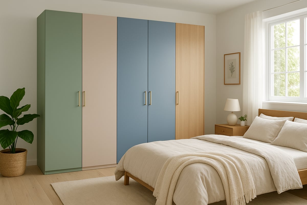
Let’s talk about the future—the colour of wardrobe is getting a joyful upgrade. For 2026, designers are obsessed with muted greens, especially sage and olive. These shades, inspired by biophilic design, bring the outdoors in and create a calming oasis.
Sophisticated blues are another rising star, from deep navy to gentle sky. Soft taupes and warm neutrals are everywhere, delivering comfort and versatility without feeling bland. There’s a real shift away from stark whites and harsh blacks. Instead, think soft, layered tones that play nicely with other colours and textures.
Want proof? Sage green wardrobes are flying off the shelves for their spa-like calm. According to Farrow & Ball's 2026 Trending Shades, these nature-inspired hues are set to dominate, making your colour of wardrobe both stylish and future-proof.
Designers agree: opt for colours that work with your mood and décor. The right shade can make your wardrobe the hero of the room, not just storage.
Timeless Classics That Endure
You can’t go wrong with the classics. The colour of wardrobe in white, grey, or natural wood finishes has serious staying power. Why? These shades are the chameleons of interior design—they flex with any trend, boost resale value, and make styling a breeze.
A whopping 72 percent of wardrobes sold in 2025 were in neutral shades. That’s no accident. Timeless palettes like crisp white or warm oak work in both modern flats and traditional homes. If you want to keep things fresh, update your classic wardrobe with new handles or go for a two-tone look (think white doors with oak trim).
Here’s a quick cheat sheet:
| Classic Shade | Works With | How to Refresh |
|---|---|---|
| White | Any style, any era | Brass hardware |
| Grey | Modern, minimal | Two-tone panels |
| Natural Wood | Traditional, cozy | New handles |
The colour of wardrobe you pick here is a long-term investment. Classics never get old—they just get better with time.
Colours to Avoid in 2026
Let’s be honest. Some trends are best left in the last decade. The colour of wardrobe in neon brights or glossy black? Not so chic in 2026. Overly saturated shades can make your space feel chaotic, especially in small rooms. Ultra-dark finishes can shrink a space faster than you can say “buyer’s remorse.”
Following micro-trends is tempting, but the risk is real: commitment fatigue and rapid décor dating. Experts advise saving bold choices for smaller accent pieces, not your main wardrobe. Want to play it safe? Steer clear of cool metallics and anything that screams “trend of the month.”
Take it from homeowners who regret their flashy choices—they’re now repainting or replacing. Those who picked versatile hues for their colour of wardrobe are still loving their look and sleeping easy. Sometimes, a little rebellion means ignoring the hype and choosing what truly fits your style.
Step-by-Step: How to Choose the Perfect Wardrobe Colour
Ready to wrangle the wild world of wardrobe colour? Choosing the right shade is not just about picking “something nice.” It’s a process, darling, and one that can totally transform your space and your mood. So, let’s break it down step by step, with a little cheek and a lot of confidence. For even more rebellious detail, check out this step-by-step wardrobe colour guide.
Assess Your Space and Lighting
First things first, you need to size up your zone. The colour of wardrobe can look wildly different depending on your room’s size, ceiling height, and lighting. Got a shoebox bedroom? Lighter shades like white or pale grey will play magician and make it feel bigger. Lofty ceilings or loads of space? You can get away with something moodier, like deep blue.
Lighting is the real game-changer. North-facing rooms tend to cool down colours, making them look bluer or greyer. South-facing spaces? They warm everything up. Don’t forget artificial lighting, either. That “perfect” taupe could turn muddy at night.
Try this:
| Room Lighting | Best Shades for Colour of Wardrobe | Why It Works |
|---|---|---|
| North-facing | Warm neutrals, creams | Adds warmth, avoids chill |
| South-facing | Cool greys, blues | Balances natural warmth |
| Dim/artificial | Light greys, whites | Brightens and expands |
Always test swatches at different times of day. The colour of wardrobe at dawn is not the same as at midnight!
Consider Your Existing Décor and Style
Let’s be honest, nobody wants a wardrobe that looks like it crash-landed from another planet. Start with an inventory: wall colour, flooring, key furniture, and any statement art. The colour of wardrobe should harmonise, not clash.
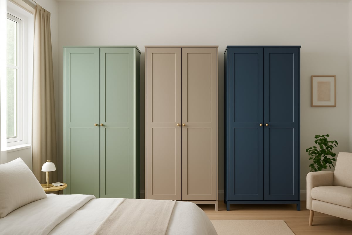
If most of your room is neutral, you have two options: keep the flow with another neutral, or go bold for a focal point. Love your navy bedding or brass lamp? Try a taupe wardrobe with gold handles for instant sophistication.
- Pair warm woods with beige or cream.
- Contrast navy wardrobes with metallic or blush accents.
- Avoid mixing too many undertones (cool with warm) unless you’re going for “eclectic chaos chic.”
Remember, the right colour of wardrobe can tie everything together like the best kind of outfit—one that looks effortless but took some sneaky planning.
Define the Mood and Functionality You Want
Now, let’s get personal. What vibe do you want your wardrobe to give off? The colour of wardrobe isn’t just about looks—it’s about how you want to feel every time you open those doors. Craving calm? Blues and greens are your best mates. Want a jolt of energy? Try muted yellows or even a deep terracotta.
Think about what you’ll actually use the wardrobe for. If it’s your daily “get ready” zone, a calming shade could make mornings less manic. Displaying a statement collection? Go for a backdrop that lets your treasures shine.
- Calming sanctuary: Sage, dusty blue, soft taupe.
- Energising space: Warm ochre, muted coral, gentle mustard.
- Versatile for any mood: Classic white, greige, or pale oak.
The colour of wardrobe should be as practical as it is pretty. Don’t pick a diva shade that looks gorgeous but drives you mad after six months.
Test and Visualize Colour Options
Here’s where the fun (and a little science) comes in. Never trust a paint chip alone. Test the colour of wardrobe with real samples—painted panels, swatches, or even digital AR tools that let you “try on” shades in your room.
- Create a mood board with fabric, flooring, and colour samples.
- Observe samples in morning, midday, and evening light.
- Use visualisation apps to see the full effect.
Did you know that 54% of buyers who test colours ahead of time are happier with the final result? Don’t skip this step. It’s like swiping left on disappointment. The colour of wardrobe can look dreamy in the shop but turn disaster at home if you don’t check it first. Try testing navy in both natural and artificial light for a sneaky surprise—sometimes it reads royal, sometimes almost black.
Make Your Final Selection with Confidence
You’ve narrowed it down—now it’s time to commit. Pick your top two or three shades and get feedback from housemates or a design pro if you’re feeling wobbly. If possible, order a sample door or panel and live with it for a week.
Choose a colour of wardrobe that feels right for your lifestyle, not just what’s trending on Instagram. Remember, versatile base shades make future updates a breeze. Once you’re sure, go for it. Confidence is always in style, and so is a wardrobe that feels unapologetically you.
Matching Wardrobe Colours to Room Styles and Personalities
Ready to let the colour of wardrobe do the heavy lifting for your room’s vibe? Whether you’re a minimalist, a classic soul, a boho rebel, or a city slicker, there’s a shade that shouts “you.” Let’s break the rules, not the bank, and match your wardrobe’s personality to your space. If you want to go even deeper into room harmony, check out this guide on choosing the right room colour scheme.
Contemporary and Minimalist Spaces
Minimalists, rejoice! The colour of wardrobe in these rooms is all about crisp whites, cool greys, and clean, matte finishes. Think Scandinavian simplicity—wardrobes that blend seamlessly without shouting for attention.
- Best shades: White, pale grey, and soft taupe.
- Examples: White gloss wardrobes with sleek handles in bright, airy spaces.
- Avoid: Fussy patterns or ornate details.
Keep things uncluttered. Use the colour of wardrobe to bounce light around, making the room feel bigger and brighter. If you’re itching for a splash of personality, sneak in a muted accent—think a blush pink throw or a navy vase. Subtle, but striking. The beauty here? Your wardrobe never upstages your style.
Traditional and Classic Interiors
Love a bit of nostalgia? The colour of wardrobe in classic spaces leans toward warm neutrals, creamy hues, and those gorgeous natural wood tones. These shades are timeless, never boring, and always up for a glow-up with updated hardware.
- Best shades: Cream, beige, and rich wood finishes.
- Examples: Cream wardrobes paired with antique brass handles or paneled doors for depth.
- Avoid: Super modern, glossy finishes that clash with period details.
Pair the colour of wardrobe with heritage features—think crown moulding or a Persian rug—for a look that’s both grand and grounded. Layering neutrals keeps things fresh, while a two-tone wardrobe adds just enough drama without tipping into chaos.
Playful, Maximalist, and Bohemian Vibes
Calling all colour rebels! The colour of wardrobe is your canvas—go wild. Jewel tones, saturated hues, and even patterns are fair game here. Forget subtle, embrace the bold.
- Best shades: Teal, emerald, dusty pink, or patterned doors.
- Examples: Teal wardrobe with gold hardware, surrounded by layered textiles and bold art.
- Avoid: Playing it too safe or using only neutrals.
Mix and match with confidence. The trick is to build a story: link shades from your wardrobe to pillows, throws, or a funky rug. Want to master the art of mixing? Let your personality lead and the room will follow. If you’re hesitant, try a bold wardrobe with neutral walls to keep things balanced.
Industrial and Urban Styles
The city never sleeps, and neither does your style. The colour of wardrobe in industrial or urban spaces is all about deep charcoals, matte black, and distressed wood. Pair these with exposed brick or rough concrete for instant loft vibes.
- Best shades: Charcoal, matte black, weathered oak.
- Examples: Matte black wardrobe with minimalist hardware, set against grey walls and metal accents.
- Avoid: Shiny finishes or overly colourful palettes.
Contrast is your friend. Use the colour of wardrobe to anchor the room, then soften the look with light bedding or a splash of greenery. Texture can do what colour sometimes can’t, so mix wood, metal, and fabric to keep things tactile and interesting. The result? Effortlessly cool, always in style.
Special Considerations: Small Spaces, Shared Rooms, and Longevity
Choosing the right colour of wardrobe is more than just a style decision—it is a game-changer for how your space feels, functions, and even ages. Small rooms, shared spaces, and the quest for longevity need extra thought and a dash of rebellion. Let’s break the “one shade fits all” myth and make your wardrobe work smarter, not harder.
Optimizing Colour for Small or Low-Light Rooms
When space is tight, the colour of wardrobe can turn a shoebox into a sanctuary. Lighter shades like white, light grey, and soft beige bounce light, making rooms feel airier and less claustrophobic. Want a trick to turbo-charge brightness? Go for a wardrobe with a semi-gloss or satin finish, which reflects light without being blinding.
- White wardrobes: Maximise brightness, especially in north-facing rooms.
- Light grey: Add modern calm, perfect for Scandi-inspired nooks.
- Soft beige: Bring warmth without closing in the walls.
Avoid dark or heavy hues that can swallow what little space you have. If you are feeling bold, try mirrored doors to double the illusion of space. Remember, the colour of wardrobe needs to work with your lighting—test samples at different times of day for the true effect.
Shared Bedrooms and Multifunctional Spaces
A shared room is a diplomatic minefield, so the colour of wardrobe must keep the peace. Stick to adaptable neutrals like beige, taupe, or gentle greys. These shades blend with most styles and keep things calm between warring tastes.
Want to add personality? Go two-tone. Use one colour per “zone” to give each person their own vibe while keeping harmony. Think beige and grey, navy and white, or blush and cream. This trick works wonders in shared kids’ rooms or studio flats where one wardrobe does it all.
Coordinate the colour of wardrobe with flexible décor—think changeable bedding, rugs, or art. This way, as tastes (or roommates) change, your wardrobe still fits right in.
Durability, Maintenance, and Future-Proofing
Let’s talk real life: sticky fingers, accidental bumps, and the ever-changing fashion circus. The colour of wardrobe needs to survive it all. Matte finishes hide fingerprints and scuffs, while high-gloss looks dramatic but shows every mark. Painted doors are easy to touch up, while wood-effect laminates shrug off daily abuse.
| Finish Type | Pros | Cons |
|---|---|---|
| Matte | Hides marks, timeless look | Can look flat in low light |
| High-gloss | Reflects light, modern | Shows fingerprints, smudges |
| Wood-effect | Durable, natural warmth | Less flexible to repaint |
If you are worried about trends fading fast, check out Outdated Color Trends for 2026 before you commit. The right colour of wardrobe should stand the test of time and stay chic, even when TikTok changes its mind.
Sustainability and Eco-Friendly Choices
Want to feel smug every time you open your wardrobe? Go green—literally and figuratively. The colour of wardrobe can support your eco goals when you pick low-VOC paints and sustainable materials like bamboo or FSC-certified wood. Shades like natural oak or muted earth tones age gracefully, looking better as the years roll by.
Upcycling an old wardrobe? Repainting is your friend. Choose colours that will still make you smile in five years, not just five minutes. Supporting brands with solid eco credentials is a win for your home and the planet. The colour of wardrobe is your chance to rebel against waste and beige boredom, all in one.
Expert Advice: Personal Colour Analysis and Professional Guidance
Choosing the right colour of wardrobe can feel like a wild guessing game. But with a dash of expert advice and a sprinkle of confidence, you can turn indecision into pure style magic. Let’s break it down: when to get help, how to go pro or DIY, and how to actually trust your gut when picking that perfect shade.
When to Consult a Colour Consultant or Designer
Ever stared at a paint chart until your eyes crossed? Sometimes, calling in a colour consultant is the best move for nailing the colour of wardrobe that truly works for your space. If your room has weird lighting, tricky undertones, or you just can’t agree with your partner, a pro can swoop in and save the day.
Colour consultants do more than wave swatches around. They’ll study your room’s natural light, your personal style, and how you want to feel every time you open those wardrobe doors. Whether you book an in-person session or go virtual, you’ll get a bespoke palette that actually fits your life, not just the latest trend.
Think of it as investing in happiness. A small upfront cost can save you from repainting (or regretting) later. One client, stuck with a gloomy guest room, found her space transformed after a pro suggested a soft blue for her colour of wardrobe—now, it’s her favourite nook in the house.
The Colour Rebel Studio: Empowering Confident Colour Choices
Meet The Colour Rebel Studio, founded by the brilliant Jodie. If you want your colour of wardrobe to shout “you” (without screaming for help), this is your secret weapon. Jodie blends colour psychology, trend savvy, and a rebellious eye for personality-driven design.
Here’s what you get: a personal wardrobe colour analysis, pattern pairing, and even virtual consults if you’re doing it from your sofa. It’s not about one-size-fits-all beige. Instead, you’ll discover the wardrobe colours that flatter your vibe, not just your walls.
Clients rave about how a tailored colour of wardrobe can turn a plain room into a happy, confidence-boosting sanctuary. Want to see how bold or subtle you can go? Jodie’s got you covered, making every step joyful and unapologetically you.
DIY vs. Professional: Making the Right Choice
Thinking of flying solo? DIY-ing your colour of wardrobe can be a fun, empowering adventure—if you love a challenge. There are loads of tools out there: swatches, visualisation apps, and online guides to help you avoid rookie mistakes.
But let’s be real, sometimes you need backup. If your space is complicated, or you’re paralysed by choice, a pro can fast-track your way to a killer result. Here’s a quick cheat sheet:
| DIY | Professional |
|---|---|
| More control | Expert eye |
| Budget-friendly | Saves time |
| Risk of mistakes | Personalised advice |
Some wardrobe makeovers are a breeze with a bit of online help, like mastering colour and pattern pairing. But for big, bold transformations, don’t be afraid to call in the cavalry.
Building Confidence in Your Colour Decisions
Ready to actually choose the colour of wardrobe and not panic halfway through? Here’s the secret: ditch the fear of “getting it wrong.” Style is about self-expression, not ticking someone else’s box.
Draw inspiration from showrooms, Insta feeds, and magazines. Live with your shortlist for a few days—see how it feels in morning light and midnight gloom. Still nervous? Read up on building confidence with bright colours for a pep talk.
Remember, the best colour of wardrobe is the one that makes you smile every morning. Trust your instincts, embrace your quirks, and don’t let anyone tell you life should be beige. Your space, your rules.
You’ve made it this far, so I know you’re ready to break up with bland and say yes to a wardrobe that actually reflects you not some forgettable catalogue page Let’s be honest your space deserves more than “safe” neutrals and you’re too fabulous to let fear of a colour “mistake” hold you back If you’re craving daily shots of colour confidence and rebellious style inspo to help you keep pushing past beige I’ve got just the thing Sign up for daily colour confidence + rebel style inspo Go on take the plunge Let’s make sure your next shade is anything but muted
0 comments