

Let's be honest: most Christmas cards are tragically safe. Snowflakes on cream. Generic red and green. Maybe a robin if someone's feeling wild. But here's the thing: Christmas is supposed to be a celebration, not a lesson in playing it safe. Colourful Christmas cards are your chance to send joy that actually jumps off the mantelpiece, grabs someone by the shoulders, and says "I thought about you." Because life's too short for beige greetings, especially during the most vibrant season of the year.
Why Colourful Christmas Cards Matter More Than You Think
Christmas cards aren't just paper rectangles you send out of obligation. They're tiny canvases of intention. When you choose colourful Christmas cards, you're making a statement about what matters to you: personality over perfection, joy over conformity.
The tradition started in 1843 when the first commercial Christmas card featured a vibrant family celebration. Not a minimalist snowflake in sight. Those Victorians understood something we've forgotten: celebrations deserve colour.
The Psychology of Colour in Holiday Greetings
Different colours trigger different emotional responses. That's not woo-woo nonsense, it's neuroscience meeting festive cheer.
Warm colours create specific moods:
- Red: Energy, passion, traditional festive warmth
- Orange: Playfulness, creativity, modern twist on tradition
- Pink: Joy, sweetness, unexpected holiday delight
- Gold: Luxury, celebration, special occasion vibes
Cool colours shift the atmosphere:
- Blue: Calm winter evenings, sophisticated celebrations
- Purple: Magic, mystery, non-traditional festive spirit
- Teal: Contemporary freshness, coastal Christmas vibes
- Green: Nature, renewal, beyond just evergreen trees
When you send colourful Christmas cards, you're not just checking a box. You're sharing an emotional experience. Understanding how colour works in your space applies equally to the cards you send into someone else's home.
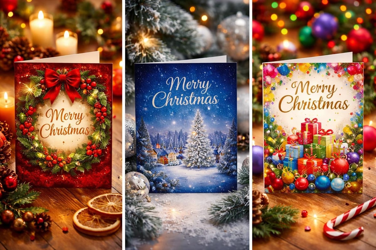
What Makes Christmas Cards Actually Colourful
Here's where most people get it wrong. They think one shade of red plus one shade of green equals "colourful." That's not colour confidence, that's colour cowardice wearing a festive hat.
True colourful Christmas cards embrace:
- Multiple hues working together (not just two traditional shades)
- Unexpected colour combinations (pink and orange for Christmas? Absolutely)
- Saturated tones (none of this washed-out pastel nonsense)
- Pattern and texture (because flat colour is just the beginning)
- Personality over tradition (your card, your rules)
Traditional vs. Rebellious Colour Palettes
| Traditional Palette | Rebellious Palette | Mood Shift |
|---|---|---|
| Red + Green | Fuchsia + Emerald + Gold | Classic warmth → Bold confidence |
| White + Silver | Cobalt + Coral + Lime | Clean simplicity → Energetic joy |
| Red + Gold | Orange + Pink + Purple | Formal elegance → Playful celebration |
| Green + Cream | Teal + Mustard + Burgundy | Safe neutrality → Curated sophistication |
The history of Christmas cards shows they've always reflected cultural boldness. Victorian cards featured everything from bizarre insects to dancing vegetables. We've somehow convinced ourselves modern cards need to be boring. They don't.
Current Trends in Colourful Christmas Cards for 2026
The greeting card world is finally catching up to what maximalists have known forever: more colour equals more joy. Recent design trends show a massive shift toward bold, unapologetic colour.
What's dominating 2026:
- Dopamine dressing for paper: Bright, mood-boosting colour combinations
- Maximalist patterns: Florals, geometrics, abstracts (sometimes all at once)
- Unexpected colour stories: Purple and orange, pink and red, teal and coral
- Metallic accents: Gold foil on electric blue, copper on forest green
- Retro revival: 70s-inspired palettes making a serious comeback
Design Elements That Make Cards Pop
The most memorable colourful Christmas cards layer multiple design elements. Think of it like getting dressed-building confidence with bright colours requires the same principles whether you're styling yourself or choosing a card.
Layer these elements:
- Base colour (your hero shade)
- Complementary accent (creates visual interest)
- Metallic or texture (adds dimension)
- Pattern or illustration (brings personality)
- Typography style (serif vs. sans-serif changes everything)

How to Choose Colourful Christmas Cards That Reflect You
Choosing cards shouldn't feel like a chore. It should feel like curating a tiny exhibition of your personality. Here's how to make choices you'll actually feel good about.
Match Cards to Your Personal Colour Story
If you've invested time in understanding your personal colour palette, use it. Your cards are an extension of your aesthetic. Someone who lives in a personality-packed space shouldn't send generic beige cards.
Consider your existing colour preferences:
- Do you gravitate toward warm or cool tones?
- Are your favourite colours bold or sophisticated?
- Does your home lean maximalist or curated?
- What colours make you genuinely happy?
Your answers guide your card choices. If you wear a lot of jewel tones, sapphire and ruby cards make sense. If your wardrobe is all citrus brights, orange and lime cards match your energy.
The Recipient Matters (But Not as Much as You Think)
Yes, consider who's receiving your colourful Christmas cards. Your traditional grandmother might appreciate a different palette than your art director friend. But here's the rebel truth: you're overthinking it.
Most people are delighted to receive ANY card that feels personal. The fact you chose something specific, something with personality, already sets you apart. Victorian Christmas cards featured dead robins and creepy clowns, and people still loved them.
Quick recipient guide:
| Recipient Type | Safe Colourful Choice | Rebellious Choice |
|---|---|---|
| Traditional family | Rich burgundy + forest green + gold | Jewel tones with unexpected pattern |
| Creative friends | Bold geometric multicolour | Neon brights with retro typography |
| Work colleagues | Sophisticated navy + copper | Vibrant teal + coral + metallic |
| Children | Primary colours with fun illustrations | Rainbow everything, obviously |
DIY vs. Designed: Creating Your Own Colourful Christmas Cards
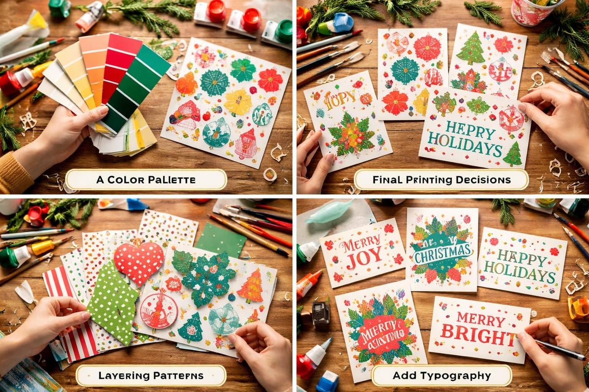
Making your own cards sounds charming until you're covered in glitter at 11pm on December 23rd. But if you're genuinely creative and have time, DIY colourful Christmas cards offer complete control over your colour story.
DIY Options That Actually Work
Realistic DIY approaches:
- Digital design tools: Canva, Adobe, or Procreate give you full colour control
- Printable templates: Download designs, customize colours, print at home
- Collage technique: Layer patterned papers in your chosen palette
- Hand-lettering: Simple typography on bold coloured cardstock
- Photo cards with colour overlays: Your photos plus vibrant graphic elements
The Charles Dickens Museum offers historic designs to colour, proving that DIY colourful Christmas cards have serious historical precedent.
When to Invest in Professional Design
Sometimes you need to outsource. Professional designers understand colour theory, printing techniques, and how to make something genuinely special. If you're sending cards for business or want something frameable, invest properly.
Signs you should hire a designer:
- You're sending 100+ cards
- The card represents your brand
- You want custom illustrations
- You have specific colour matching requirements
- You value your time more than DIY satisfaction
Just like working with a colour consultant transforms your space or wardrobe, working with a card designer transforms your holiday greetings.
Printing and Paper: Technical Stuff That Changes Everything
Colour on screen looks different than colour on paper. This matters more than you think when ordering colourful Christmas cards. The printing method and paper stock completely transform how your chosen colours appear.
Printing Methods Compared
| Method | Colour Vibrancy | Best For | Cost |
|---|---|---|---|
| Digital printing | Good | Small batches, photo cards | Low-Medium |
| Offset printing | Excellent | Large batches, flat colour | Medium-High |
| Letterpress | Unique texture | Luxury cards, subtle colour | High |
| Foil stamping | Metallic brilliance | Accent details, special touches | High |
Paper stock affects colour intensity:
- Matte: Sophisticated, absorbs colour deeply
- Glossy: Vibrant, reflects light, maximizes colour pop
- Textured: Adds dimension, softens colour slightly
- Recycled: Eco-friendly, natural aesthetic, less colour vibrancy
If you want truly vibrant colourful Christmas cards, glossy or semi-gloss stock delivers maximum impact. Matte works beautifully for sophisticated palettes but can dull brighter shades.
Beyond Cards: Extending Your Colour Story
Your Christmas cards shouldn't exist in isolation. They're part of your broader festive aesthetic. If you're sending colourful Christmas cards, consider how that colour confidence extends throughout your celebrations.
Create a cohesive festive colour story:
- Gift wrap in complementary colours
- Decorate your tree with matching ornaments
- Choose table settings that echo your card palette
- Style your mantel or shelf displays accordingly
This is where fearless interior design meets holiday celebrations. Your colourful Christmas cards become part of a larger vision.
Colour Coordination Without Overthinking
You don't need everything matching perfectly. That's boring and exhausting. Instead, choose 3-4 core colours from your cards and weave them through your festive setup.
Simple coordination approach:
- Pick your hero colour from your cards
- Choose two complementary shades
- Add one metallic or neutral
- Let these colours appear naturally throughout your space
- Don't stress about perfection
The Environmental Angle: Colourful AND Conscious
Caring about colour doesn't mean ignoring sustainability. The best colourful Christmas cards balance visual impact with environmental responsibility.
Eco-friendly options that don't sacrifice colour:
- Recycled paper stock (modern versions take colour beautifully)
- Vegetable-based inks (vivid without toxic chemicals)
- Plantable seed paper (your card grows into flowers)
- Digital cards with downloadable printables (zero waste option)
- Cards that double as ornaments or art prints (extended lifecycle)
Current design trends show eco-conscious choices increasingly incorporate bold colour rather than defaulting to kraft paper neutrals. You can save the planet AND send something visually exciting.
Making Your Cards Actually Get Noticed
Sending colourful Christmas cards means nothing if they disappear into a pile or get immediately recycled. Make yours display-worthy.
Display-Friendly Design Choices
Cards people actually keep:
- Stand-alone design (works without an envelope)
- Thick, quality cardstock (feels substantial)
- Frameable size (standard photo frame dimensions)
- Blank interior back (can double as mini art print)
- Unique shape or die-cut (stands out physically)
Think about where cards end up. Most people create a display on a mantelpiece, attach them to string, or prop them on shelves. Your colourful Christmas cards should look spectacular in those scenarios, not just in their envelope.
Timing and Presentation
When you send matters almost as much as what you send. Early December cards get prime mantel real estate. Mid-December arrivals join the pile. Late December cards often arrive after displays are established.
Strategic sending timeline:
- First week of December: Arrives fresh, gets prominent placement
- Second week: Still good positioning, joins the display
- Third week: Competitive, needs to stand out visually
- Week before Christmas: Often arrives too late for proper display
Your colourful Christmas cards have the best chance of being noticed when they arrive early and look distinctly different from everything else in the pile.
The Rebellion Against Boring Greetings
Here's the truth bomb: most people send boring cards because they're afraid of judgment. They choose safe because safe feels easier. But safe also feels forgettable.
Colourful Christmas cards are a small act of rebellion. They say "I refuse to blend in" and "I value joy over conformity." In a world that constantly pushes beige safety, that matters.
What colourful cards really communicate:
- You put thought into this
- You value the recipient enough to choose something special
- You're confident in your aesthetic choices
- You believe celebrations deserve colour
- You're not afraid to stand out
The same confidence that helps you break free from boring wardrobe choices applies to every creative decision you make. Christmas cards included.
Making It Happen This Year
Planning ahead transforms the whole experience. Scrambling at the last minute means settling for whatever's left at the shop. Intentional choosing means getting exactly what you want.
Your colourful Christmas card action plan:
- October: Start researching designs and colour palettes
- Early November: Order custom cards or gather DIY supplies
- Mid-November: Address envelopes, write messages
- Late November: First batch mailed to international recipients
- Early December: Domestic cards sent
- Mid-December: Final stragglers dispatched
This timeline removes stress and ensures your colourful Christmas cards arrive when they'll make the biggest impact.
Budgeting for Quality
Quality colourful Christmas cards cost more than supermarket multipacks. That's okay. You're not buying paper, you're investing in joy.
Budget considerations:
| Quantity | Budget Option | Mid-Range | Premium |
|---|---|---|---|
| 25 cards | £15-25 | £30-45 | £60-100 |
| 50 cards | £25-40 | £50-80 | £100-180 |
| 100 cards | £40-70 | £90-150 | £180-350 |
Price per card decreases with volume, but quality matters more than quantity. Sending 30 spectacular cards beats sending 100 forgettable ones.
Colourful Christmas cards transform a tired tradition into something genuinely joyful. They're small canvases of rebellion against the beige tyranny of "playing it safe." Just like your home and wardrobe deserve colour confidence, your festive greetings deserve the same boldness. If you're ready to bring that same fearless approach to your entire life, The Colour Rebel helps you transform spaces and wardrobes with the personality-packed colour they deserve. Because joy isn't neutral, and neither should you be.
0 comments