
Ready to leave bland, uninspired rooms behind? 2025 is your chance to break free and give your home a jolt of personality with home colour design that actually excites you.
Vibrant, expressive hues are taking over interiors, making it easier than ever to reflect your style. This guide spills the secrets of home colour design, from the psychology behind each shade to nailing the perfect palette for every room.
You’ll get the lowdown on the biggest 2025 colour trends, practical steps for choosing and applying colour, expert tips for mixing patterns, and how to sidestep common mistakes. Ready to create a space as bold as you are? Let’s dive in.
The Power of Colour in Home Design
Colour is your home’s secret weapon. It can lift your mood, boost your energy, or wrap you in a calming cocoon after a long day. With home colour design, you’re not just painting walls—you’re creating the backdrop for your best life.
Ever noticed how a splash of blue can make you feel instantly calmer, or how a pop of yellow perks up a gloomy morning? This isn’t wishful thinking—it’s colour psychology at work. Studies show colour can influence everything from productivity to wellbeing. Blue soothes frazzled nerves, while yellow sparks optimism. It’s why designers use home colour design to set the vibe, whether you want your kitchen to buzz with energy or your bedroom to whisper “relax.”
But colour isn’t just about mood. It’s the ultimate form of self-expression. Sick of beige? Good news: 2025 is the year to ditch safe choices and show off your personality. According to Houzz, a whopping 68% of homeowners say colour is their go-to for refreshing a tired space. Pinterest backs this up, with searches for “bold colour rooms” soaring.
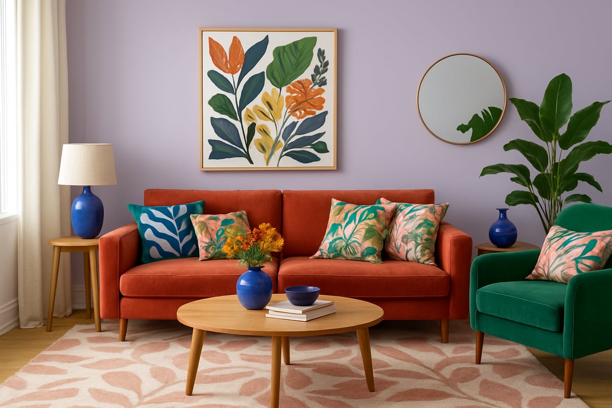
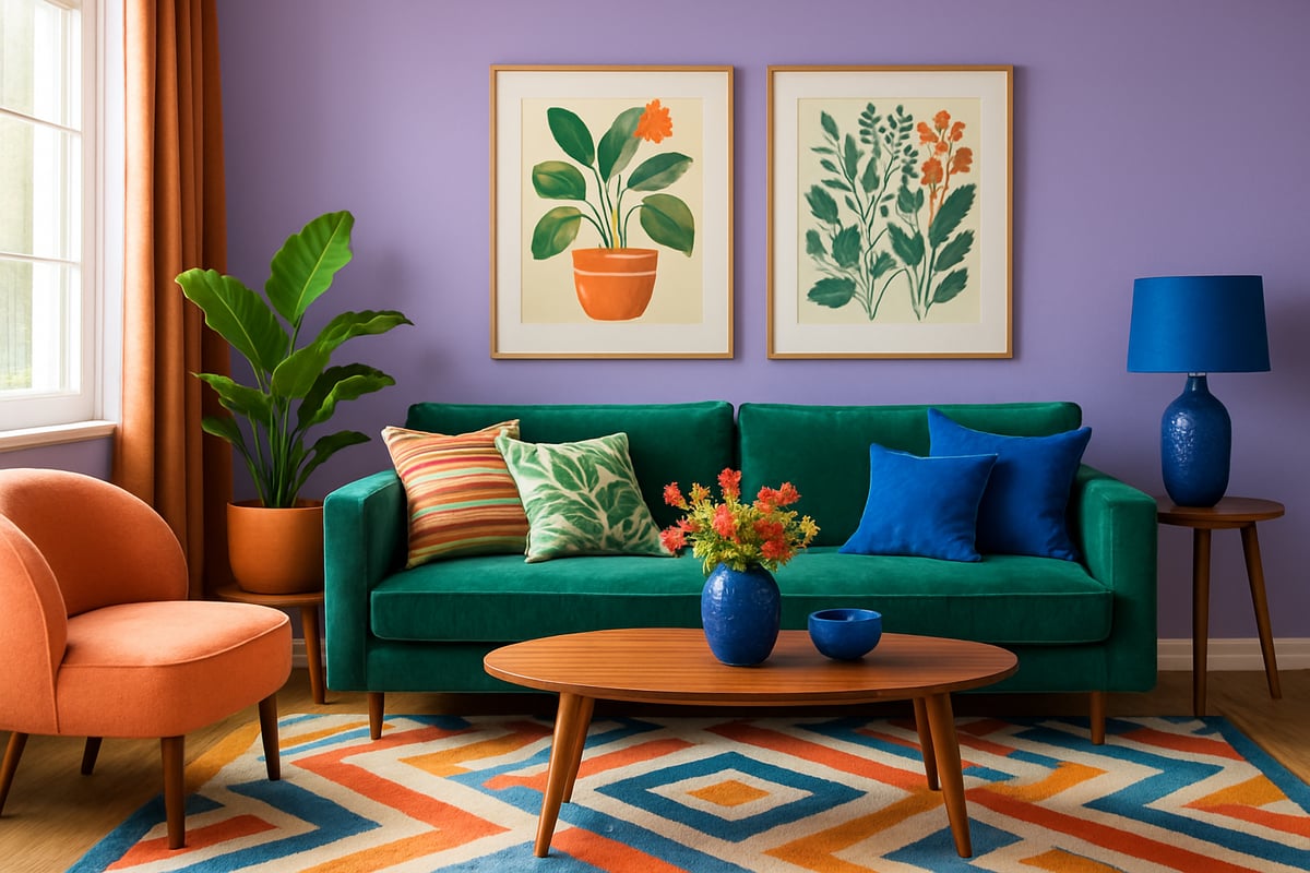
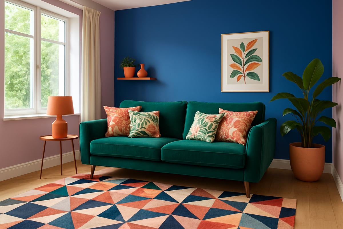
Neutrals have had their moment, but home colour design in 2025 is all about vibrant, expressive schemes. Picture rich greens, juicy terracottas, and that electric cobalt blue everyone’s raving about. Designers are seeing clients crave more drama—think maximalist, layered looks that tell your story, not someone else’s.
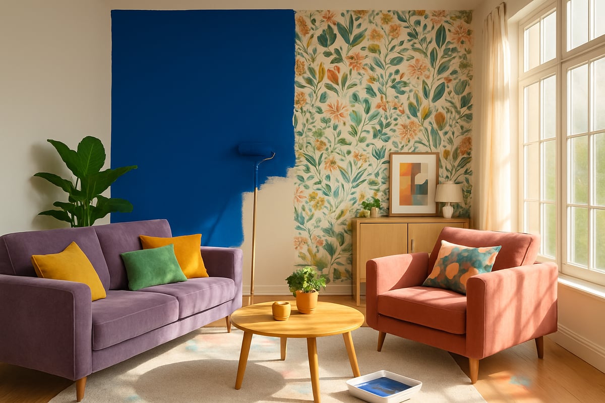
Want proof? Check out these jaw-dropping transformative home colour makeovers. Before: bland, uninspired rooms. After: vibrant, joyful spaces bursting with personality. It’s not magic, just smart home colour design—and a bit of bravery.
Colour can do more than look pretty. Clever use of hue can make a poky room feel palatial or turn a cavernous space into a cosy retreat. Lighter tones bounce light, expanding walls. Deep shades add intimacy and drama. Patterns and accents, when layered right, add depth and keep things playful.
The secret sauce? Cohesion. A home with a thoughtful colour flow feels intentional, not chaotic. Interior designers swear by linking accent colours across rooms—maybe a teal cushion in the lounge echoes a bold bathroom wall. It’s these touches that make home colour design so memorable and joyful.
So, if you’re ready to rebel against the ordinary, let colour lead the way. Your home deserves personality, energy, and a bit of cheeky confidence. Go on—make it unforgettable.
2025 Home Colour Trends: What’s In & What’s Out
Forget the old rules—2025 is rewriting the playbook for home colour design. Neutrals are on the back foot, and bold, personality-packed hues are having their moment. If you’re ready to ditch the dull and inject your space with some serious soul, these are the trends you need to know.
Trending Colours for 2025
Ready to paint your world with confidence? The hottest hues for home colour design in 2025 are anything but shy. Leading the pack are digital lavender—a dreamy, soft purple that’s both calming and futuristic—terracotta blush for a warm, earthy vibe, lush greens inspired by the outdoors, and a punchy cobalt blue that demands attention.
According to the 2025 Color Trends Forecast, these shades are dominating everything from walls to statement sofas. Pinterest searches for “bold colour rooms” have jumped 40 percent, proving we’re all craving more joy and personality at home.
Here’s a quick cheat sheet:
| Colour | Mood it Creates | Where to Use |
|---|---|---|
| Digital Lavender | Tranquil, modern | Bedrooms, lounges |
| Terracotta Blush | Warm, grounded | Kitchens, entryways |
| Rich Greens | Refreshing, natural | Living rooms, bathrooms |
| Cobalt Blue | Energising, bold | Home offices, dining areas |
These colours aren’t just pretty—they completely transform the vibe of any space. Real-life interiors are popping up everywhere with this palette, showing that home colour design is now all about fearless self-expression.
Colours to Phase Out
Wave goodbye to the plain and predictable. Greige, stark whites, and those chilly cool greys are losing their grip in home colour design circles. Why settle for lifeless shades when maximalism is making its comeback?
Design magazines agree: people want rooms that feel layered, lived-in, and bursting with character—not sterile showrooms. Minimalism is out, and maximalist, bold looks are in. The new mantra? If it doesn’t spark joy or tell your story, it’s out the door.
So, if your home colour design still relies on those “safe” neutrals, it might be time to shake things up. Ditch what no longer serves you and embrace the shades that make your heart sing.
Pattern & Texture Pairings
Patterns and textures are the secret weapons of 2025’s home colour design revolution. Gone are the days of playing it safe with solids. Now, it’s all about mixing things up for maximum impact.
Try these playful combos:
- Stripes paired with botanical prints for a lively twist
- Geometric wallpaper with velvet sofas in bold hues
- Layering chunky knits and natural fibres alongside colourful ceramics
The trick? Balance. Let your patterns and textures work together, not against each other. In home colour design, a mix of scales—think big, bold motifs with smaller, subtle ones—keeps things interesting without feeling chaotic.
Sustainable & Eco-Friendly Colour Choices
Home colour design in 2025 isn’t just about looking good—it’s about feeling good too. More people are demanding non-toxic, low-VOC paints that are kinder to your health and the planet.
Eco-conscious brands like Farrow & Ball are leading the way, offering gorgeous palettes without the nasties. Whether you’re painting a statement wall or going all-in on a new colour scheme, choosing sustainable options means your home can be bold and responsible at the same time.
Sustainable home colour design proves you don’t have to sacrifice style for substance. Now, your walls can look fabulous and reflect your values.
Step-by-Step Guide: Designing Your Home Colour Palette
Ready to ditch the beige and give your home colour design a rebellious twist? This is your moment. Follow these six cheeky steps to craft a palette that's bold, joyful, and unmistakably you. No more playing it safe—let's get your home popping with personality.
Step 1: Assess Your Space and Lighting
First things first—before you get carried away with paint swatches, take a good look at your space. Lighting is the real MVP of home colour design. Natural light, artificial bulbs, even the direction your windows face—all can change how colours look from dawn to dusk.
- North-facing rooms tend to feel cooler, so warm tones like terracotta or blush can add cosiness.
- South-facing rooms? They love bold, saturated hues.
- Use a lux meter or even your smartphone to see how much light each room gets.
- Always try large paint samples on different walls and check them at various times.
Remember, what looks dreamy in the shop might look drab at home if you skip this step. Your home colour design journey starts with the light.
Step 2: Define the Mood and Function of Each Room
Now, let’s play matchmaker. The right mood sets the stage for every room, and home colour design is your secret weapon. Want a kitchen that zings with energy? Go for vibrant yellows or punchy greens. Craving a restful bedroom? Soft blues and gentle lavenders do the trick.
A quick cheat sheet:
| Room | Mood | Top Colour Picks |
|---|---|---|
| Kitchen | Energising | Yellow, green |
| Living | Social, warm | Terracotta, blush |
| Bedroom | Restful, calm | Blue, lavender |
| Office | Focused, fresh | Green, soft neutrals |
According to Houzz, 55% of homeowners pick colours based on mood. So, get clear on the vibe before you grab a brush. That’s how you make home colour design work for you.
Step 3: Find Your Colour Inspiration
Feeling stuck? Inspiration is everywhere if you know where to look. Scroll through Pinterest, flick through design magazines, or take a stroll outdoors. The best home colour design ideas often start from a favourite painting, a snazzy scarf, or even your local park.
- Build a mood board with snaps that make you smile.
- Raid your wardrobe for hues you love to wear.
- Notice the colours in your favourite artwork—try translating those into wall paint or cushions.
Don’t overthink it. If a colour gives you a little thrill, it deserves a spot in your home colour design adventure.
Step 4: Build a Cohesive Colour Scheme
Let’s make sure your bold new palette actually works together. Home colour design is part art, part science. Grab your colour wheel and get playful.
- Analogous schemes (colours next to each other) are harmonious.
- Complementary schemes (opposites attract) create drama.
- Triadic schemes (three evenly spaced) are lively and bold.
Online tools like Coolors and Adobe Color can help you experiment. For a deeper dive, check out Choosing the Right Colour Scheme for expert tips. Use sample palettes to create flow between rooms, especially in open-plan spaces. Cohesion is the secret sauce of home colour design.
Step 5: Test and Sample Before You Commit
Resist the urge to grab the first paint tin you see. The golden rule of home colour design: always test before you commit. Paint swatches look totally different on your wall than they do on a tiny card.
- Paint large sample patches on every wall.
- Check them in morning, afternoon, and evening light.
- Use sample boards if you don’t want to mess up the wall.
This step saves time, money, and heartache. Trust me, your future self will thank you for being thorough with home colour design.
Step 6: Layer with Patterns and Accents
Now for the fun bit—layering! A rebellious home colour design loves patterns and accents. Think patterned cushions, graphic rugs, and statement art. Mix florals with stripes, or velvet with wicker, for a look that’s fearless and full of personality.
- Start with a bold base colour.
- Add patterned textiles or art in complementary hues.
- Balance busy patterns with blocks of solid colour.
Don’t be shy! Home colour design is about breaking rules and making your space feel like you. If you want a home that feels alive, let your accents do the talking.
Expert Tips for Mixing Colours and Patterns Like a Pro
Ready to unleash your inner colour rebel? Home colour design is not about playing it safe. It is about grabbing the paintbrush of life and making your space shout “This is me!” If you are tired of muted walls and bland patterns, you are in the right place.
Master the 60 30 10 Rule
Let us kick off with the golden rule of home colour design: the 60 30 10 approach. Think of your room as a cake. Sixty percent is your base colour, thirty percent is your secondary shade, and ten percent is your accent. This keeps things balanced, even when you go wild with hues. Choose your hero shade for the walls, a supporting colour for big furniture, and a punchy accent for cushions or art.
Mix Colours With Confidence
Mixing colours is a bit like making a killer playlist. You want some bangers, a few slow jams, and a surprise track or two. In home colour design, try combining complementary colours for energy or analogous shades for harmony. Do not be shy with bold contrasts. Use colour wheels or palette generators for inspiration. Most designers recommend starting with a base and layering accents, so your space feels intentional, not accidental.
Layer Patterns Like a Pro
Patterns are the secret weapon of home colour design. Start with a large scale motif, like a graphic wallpaper, then add mid sized patterns in textiles. Finish with small prints on cushions or throws. Remember, repetition is your friend. Choose a motif or colour that pops up in more than one spot. This keeps your room playful, not chaotic.
Let Designers Show You How It is Done
Want proof that maximalism works? Just peek at leading designers who blend stripes, florals, and geometrics in one space. Their secret? They always allow breathing space. A solid wall or plain rug gives your eyes a break. If you need a nudge, check out Making Your Home Pop with Colour for more rebellious ideas to spark your home colour design journey.
| Mistakes to Dodge | Quick Fix |
|---|---|
| Clashing undertones | Test swatches in every light |
| Too many accent walls | Limit to one per room |
| Pattern overload | Scale down and repeat motifs |
| No breathing space | Add neutrals or solids |
Pro Tips for Standout Spaces
Here is the real magic: use colour to highlight architectural features. Got fancy mouldings or a quirky alcove? Paint them in your accent shade. Avoid visual overload by editing your palette. Stick to three to five main colours for the whole house. Remember, home colour design is about joy, not stress. Be brave, have fun, and let your rooms tell your story.
The Colour Rebel: Bespoke Colour Consultancy for Bold Homes
Ready to rebel against beige? Meet The Colour Rebel Studio, your new secret weapon for home colour design that’s anything but ordinary. Led by certified Colour Consultant and Interior Designer Jodie, this is the place where creative chaos meets expert precision. If you’re craving a home bursting with personality, this is your first stop.
Jodie’s approach to home colour design is personal, playful, and unapologetically bold. Whether you want to dip a toe into vibrant patterns or cannonball straight into a technicolour dream, The Colour Rebel has you covered. Here’s what you can expect:
- Bespoke colour and pattern schemes tailored to your unique style
- Virtual and in-person consultations for maximum flexibility
- Homeware curation for those finishing touches that make a space sing
Every consultation is a two-way creative jam session. Jodie listens to your story, helps you pinpoint your style, and then translates it into a home colour design that feels like you—on your best day, after two cups of coffee.
But don’t just take our word for it. The proof is in the joyful, personality-packed homes left in The Colour Rebel’s wake. From a drab, greige living room transformed into a botanical wonderland, to a once-sterile kitchen now pulsing with energetic cobalt and lush green, these makeovers are pure magic. Want to see how fearless colour can lift your mood? Check out Fearless Interiors for Happier Homes for real-life tales of colour-fuelled happiness.
Why trust your home colour design to a pro like Jodie? Simple. You get confidence, creativity, and a result that’s tailored, not templated. No more second-guessing paint swatches at 10pm. No more regret over a “trend” that never felt like you. Instead, you get expert eyes, a steady hand, and a cheerleader who encourages you to break the rules (and then helps you make it look intentional).
The Colour Rebel isn’t just a service, it’s a community. Members get ongoing inspiration, exclusive resources, and weekly doses of colourful mischief. You’ll never feel stuck or uninspired again.
Ready to start your home colour design revolution? Book a consultation or dive into The Colour Rebel’s resource library. Investing in a professional isn’t just about saving money or time, it’s about unlocking your home’s full, joyful potential—with a little less stress and a lot more colour.
Avoiding Common Colour Design Mistakes in 2025
Ready to dive in and sidestep the most cringe-worthy home colour design mistakes? Good. Because nothing kills a room’s vibe faster than a colour blunder you can’t unsee. Here’s your no-nonsense guide to keeping your home colour design bold, beautiful, and mistake-free.
Overlooking Lighting and Undertones
Ever chosen a gorgeous paint sample, slapped it on the wall, and wondered why it suddenly looks like a sad, washed-out version of itself? That’s what happens when you ignore lighting and undertones. In home colour design, the same shade can morph from dreamy to drab depending on whether your bulbs are warm or cool, or if your windows face north or south.
Even worse, undertones can sneak up and turn your “perfect” blue into an accidental mint green. Want proof that colours mess with your mood? The Impact of Environmental Colors on Human Behavior study shows that different hues and lighting conditions can spark everything from calm to chaos.
Quick fixes:
- Always test paint in your actual space.
- Check samples at different times of day.
- Beware of sneaky undertones—compare several swatches side by side.
Get this right, and your home colour design will always feel intentional, not accidental.
Ignoring the Power of Neutrals as Anchors
Think you need to ditch neutrals to make your home colour design pop? Think again. Neutrals are like the bassline in your favourite song—they hold everything together. Off-whites, taupes, and soft blacks are stealing the show in 2025, and for good reason.
According to the Interior Design and Color Trends Report 2025, these shades are being used not as the main event, but as the perfect backdrop for bold moves. Neutrals give your eyes a place to rest and make vibrant hues sing, not scream.
Try this:
- Use neutral trims with statement walls.
- Layer in natural textures for extra depth.
- Anchor bright patterns with a soft, grounding base.
Your home colour design doesn’t have to be a riot to feel rebellious—sometimes, the quietest voice is the most powerful.
Overcomplicating with Too Many Colours
We get it, you’re excited. But throwing every shade of the rainbow at your home colour design is the fastest route to chaos, not confidence. More isn’t always better—sometimes it’s just more.
The trick? Edit ruthlessly. Stick to three to five main colours throughout your home. This keeps things bold, but never busy.
Top tips:
- Pick one hero colour and let it lead.
- Use supporting hues for accents and accessories.
- Repeat colours in different rooms for that “I totally planned this” look.
Remember, the best home colour design doesn’t try to do everything at once. It knows when to shout, and when to whisper.
Forgetting About Flow Between Rooms
Ever walked from one room to another and felt like you just changed TV channels? That’s what happens when your home colour design lacks flow. Each space should have its own personality, but there needs to be a thread tying them together.
Open-plan living makes this even more crucial. Echo an accent colour in art, cushions, or rugs from room to room. Create visual links with matching undertones or similar patterns.
Practical moves:
- Use a shared neutral or accent shade throughout.
- Carry a pattern or motif from one space to the next.
- Let flooring or textiles act as the bridge.
When your home colour design flows, your whole house feels intentional—not like a patchwork quilt of random choices.
Skipping the Sample Process
If you’re picking paint straight from a swatch card, we need to talk. The sample process isn’t optional in home colour design—it’s your secret weapon. Colours change with light, flooring, and even the weather.
Patch-test your chosen hues in multiple spots and check them morning, noon, and night. Make a sample board if you’re feeling fancy. Trust us, this step saves time, money, and sanity.
Quick checklist:
- Buy tester pots, not just swatches.
- Paint large patches on every wall.
- Live with the samples for a few days before deciding.
With a little patience, your home colour design will look pro-level—no regrets, no repainting, just pure joy.
You’ve made it this far, which means you’re clearly not afraid to ditch the dull and embrace a bit of colour chaos—love that for you. Designing a space that shouts your personality is brave, rebellious, and honestly way more fun than playing it safe. If you’re ready for more bold moves, cheeky inspo, and a daily nudge to keep things vibrant, I’ve got just the thing. Let’s make sure your 2025 home isn’t just on trend, but totally unforgettable. Because joy isn’t neutral. And your life was never meant to be muted
Because joy isn’t neutral. And your life was never meant to be muted
0 comments