
Imagine walking into your home and instantly feeling energised by a burst of colour. That’s not just a fantasy—2025 is your year to make it real.
Let’s be honest, bland walls are out and bold choices are in. This guide is your secret weapon for mastering home interior colour design. We’ll break down the latest trends, spill the psychology behind colour, and hand you step-by-step plans to create a home that feels personal and on point.
Ready to ditch the beige and embrace your inner colour rebel? Dive in for expert-approved palettes, planning tips, and the confidence to design a space you’ll actually love.
Understanding Colour Psychology in Home Design
Colour isn’t just paint on a wall. It’s the secret sauce behind every mood, every vibe, and every “wow, your place feels amazing!” moment in home interior colour design. Let’s pull back the curtain and see how colour shapes our spaces, our minds, and even our daily routines.
The Emotional Impact of Colour
Ever walked into a room and instantly felt calm, energised, or like you wanted to run for the hills? That’s colour psychology at play in home interior colour design. Colours have the power to shift moods faster than a double espresso.
Blues and soft greens bring a sense of calm, perfect for bedrooms or chill-out zones. Yellow sparks energy and optimism, making it a winner for kitchens or breakfast nooks. Greens strike a balance, ideal for spaces where you want harmony. Fun fact: studies reveal blue bedrooms can improve sleep quality by up to 20%. That’s not just a splash of paint, it’s a ticket to better rest.
When plotting your next home interior colour design, always ask: what feeling do I want in this room? Your answer is the first clue to your perfect palette.
Colour Associations and Cultural Influences
Colour isn’t a one-size-fits-all deal. In home interior colour design, your background, culture, and memories shape how you see every shade. For example, red screams luck in China but might shout romance or passion in the West.
Here’s a cheeky table to sum it up:
| Colour | Western Meaning | Chinese Meaning |
|---|---|---|
| Red | Passion, love | Luck, happiness |
| White | Purity, peace | Mourning |
| Yellow | Joy, warmth | Royalty |
Did you know 85% of people say colour is their top reason for buying something? That’s power. So, when you’re deep into your home interior colour design, think about what these shades mean to you. And if you fancy breaking all the rules, explore ideas like the Unexpected Red Theory, where a bold pop of red can elevate any space, no matter your style.
The Science of Light and Colour in Interiors
Lighting is the sneaky trickster of home interior colour design. The same paint can look completely different in daylight versus under a ceiling spotlight. North-facing rooms tend to feel cooler, so warm tones (think buttery yellows or gentle terracottas) can balance the chill. South-facing spaces love bold, deep shades.
Natural light shifts all day, so test your paint samples morning, noon, and night. Don’t trust a tiny swatch. Slap it on the wall and see what happens. That’s how you dodge surprises and make sure your home interior colour design looks lush in every light.
Common Colour Mistakes and How to Avoid Them
Let’s be honest, we’ve all made a questionable paint choice and regretted it. In home interior colour design, the biggest trap is chasing trends until your home looks like a time capsule. Overusing the “it” colour can date your space fast.
Other pitfalls? Ignoring undertones and mixing hues that clash, creating more chaos than comfort. Shockingly, 40% of homeowners regret at least one colour decision. Want to avoid the pain? Plan with intention, not impulse. Test your colours, check them in all lights, and trust your gut over what’s trending. That way, your home interior colour design stays joyful and uniquely you.
2025 Colour Trends: What’s In and What’s Out
Ready to ditch boring and embrace bold? The world of home interior colour design in 2025 is a riot of personality, warmth, and unapologetic joy. Whether you’re a maximalist at heart or a lover of modern classics, this year’s palette is bursting with fresh inspiration and rebellious spirit.
Top Trending Colours for 2025
Let’s talk showstoppers. The 2025 home interior colour design scene is ruled by digital lavender, warm terracotta, tranquil teal, and buttery yellow. These hues aren’t just “in”—they’re everywhere, from designer mood boards to high street paint charts. According to 2025 Interior Design Color Trends, digital lavender alone has seen a 30 percent surge in professional schemes, while buttery yellow is lighting up kitchens and hallways.
- Digital Lavender: Soft, dreamy, and futuristic.
- Warm Terracotta: Earthy, grounding, and welcoming.
- Tranquil Teal: Sophisticated, calming, and versatile.
- Buttery Yellow: Cheerful, uplifting, and playful.
These colours empower you to create a home interior colour design that’s bang on trend without sacrificing your personal flair.
Outgoing Trends and What to Avoid
Wave goodbye to all-grey everything. The era of sterile, colourless spaces is officially over in home interior colour design. Millennial pink? She’s had her moment. Google searches for “grey living room” are down 18 percent year-on-year, and honestly, nobody misses the blandness.
- Overused neutrals = instant snooze.
- Too much grey = looks like a rainy Monday.
- Millennial pink overload = time to move on.
The new rule? If your home interior colour design feels cold or characterless, it’s time to spice things up. Go for warmth, vibrancy, and a dash of mischief.
Combining 2025 Trends with Timeless Classics
Trends are fun, but nobody wants a living room that feels outdated by Christmas. The secret to lasting style in home interior colour design? Mix 2025’s hottest shades with tried-and-true neutrals. Picture tranquil teal paired with crisp white, or buttery yellow layered over beige.
| Trend Colour | Timeless Pairing |
|---|---|
| Tranquil Teal | Classic White |
| Warm Terracotta | Soft Beige |
| Digital Lavender | Neutral Grey |
| Buttery Yellow | Natural Linen |
Layering these combos gives your home interior colour design staying power, so you can refresh accents without a full re-do.
Sustainable and Eco-Friendly Colour Choices
Colour shouldn’t cost the earth—literally. This year, eco-savvy home interior colour design is all about natural pigments and low-VOC paints. According to Houzz, 60 percent of homeowners now prioritise green options when painting.
- Look for low-VOC or plant-based formulas.
- Choose brands with recycled packaging.
- Opt for shades inspired by nature—think clay, sage, and sky blue.
A sustainable home interior colour design means you breathe easier, and your conscience stays as clean as your walls.
Patterns and Colour Blocking in 2025
Maximalism is back, and it’s turning up the volume. Patterns, checkerboard floors, and bold colour-blocked walls are the new must-haves in home interior colour design. Accent walls? Yes, but make them vibrant. Mix stripes with florals, or try zoning spaces with blocks of contrasting hues.
- Checkerboard tiles in entryways.
- Colour-zoned corners for reading or working.
- Vibrant accent walls for drama.
Patterns break up monotony and let your personality shine through every inch of your home interior colour design.
Step-by-Step Guide to Planning Your Home Colour Scheme
Ready to kickstart your home interior colour design journey? Good. Here’s the no-nonsense, totally doable roadmap to transform your space from drab to dazzling. Forget beige doubts—let’s get colourful, one clever step at a time.
Step 1: Assess Your Space and Lighting
Start by looking around your home with a rebel’s eye. Assess each room’s size, shape, and the way light moves throughout the day. North-facing rooms can feel chilly, so they crave warmth—think buttery yellow or soft terracotta. South-facing spaces enjoy richer light, letting you experiment with deeper tones.
For a savvy home interior colour design, pay attention to shadows and sunlight. Grab your phone, take snaps at different times, and notice the subtle shifts. Lighting is the ultimate trickster. It can turn a dreamy blue into a mood-killer grey in a blink. So, before you get paint-happy, know your space like you know your favourite playlist.
Step 2: Define Your Mood and Function
Let’s get intentional. Every room in your home should make you feel something. Is your bedroom your sanctuary of calm, or a cocoon of cosiness? Do you want your kitchen to buzz with energy, or feel like a sunny retreat?
Write down how you want each space to function and feel. For a successful home interior colour design, match mood to purpose. Bedrooms beg for tranquil, restful hues like blue or lavender. Kitchens and dining spaces thrive on energy—hello, zesty yellow or lively green. The secret? Let your lifestyle lead the way, not just the latest trend.
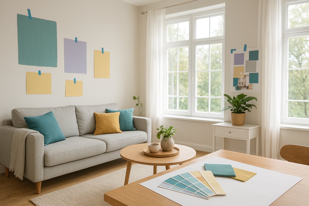
Step 3: Gather Inspiration and Samples
Time to get nosy and collect all the inspiration you can find. Flick through magazines, binge on Pinterest, or stalk Instagram for drool-worthy rooms. Create a mood board—digital or old-school, your call. Gather fabric swatches, paint chips, and even snaps of your favourite hotel lobbies.
Most rebels who nail their home interior colour design start with a pile of samples and a wild imagination. Want actionable advice? Dive into How to Choose the Right Colour Scheme for practical, step-by-step ideas. Remember: planning is play, so experiment with combos you’d never expect to love.
Step 4: Test Colours in Real Conditions
Put your swatches to the test—literally. Slap those samples on the wall, not just on a card. Try out your top contenders in several spots, and check them morning, noon, and night. That “perfect” blush pink might look peachy at dawn and muddy by dusk.
A clever home interior colour design doesn’t rely on guesswork. Trust your eyes and gut, not just the tin label. And don’t rush! Live with samples for a few days. If you still grin every time you walk in, you’ve found a winner. If not, back to the drawing board—no shame in that.
Step 5: Build a Cohesive Palette
Now, let’s tie it all together. A home that flows feels intentional, not like a circus tent. Pick a few anchor shades—maybe a neutral or two—and let your bolder colours pop as accents. Think of it like curating a playlist: some songs are bangers, others are chill, but together they’re magic.
For a seamless home interior colour design, repeat accent colours in art, cushions, or rugs. Use the table below to keep your flow on point:
| Room | Main Colour | Accent Shade |
|---|---|---|
| Living Room | Tranquil Teal | Warm Terracotta |
| Bedroom | Digital Lavender | Soft Grey |
| Kitchen | Buttery Yellow | Sage Green |
A little repeat goes a long way, trust me.
Step 6: Balance Neutrals and Statement Shades
Don’t be afraid of neutrals—they’re the bread to your statement shade’s jam. Use soft whites, gentle greys, or creamy tones as your base. Then, bring in the drama with bold furniture, a painted door, or a pop of colour in your tiles.
A balanced home interior colour design feels fresh, not frantic. If you want to go wild, try a coloured ceiling or a patterned rug. Too safe? Add a punchy chair or outrageous art. Remember, neutrals let your personality shine without overwhelming your senses.
Step 7: Finalise and Document Your Plan
You’ve done the dreaming, now get practical. Write down every colour, brand, code, and finish you’ve chosen. Snap photos of your samples and mood boards. This step is your insurance policy—no more standing in the paint aisle, panicking about which “off-white” you picked.
Documenting your home interior colour design plan slashes mistakes and keeps your vision sharp. Keep your notes handy for future tweaks or touch-ups. You’ll thank yourself (and so will your bank account) when it’s time for the next refresh.
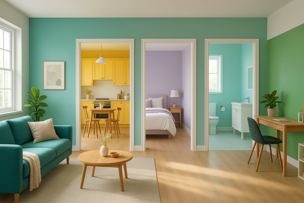
Room-by-Room Colour Strategies for Every Space
Ready to wave goodbye to beige boredom? Let’s break the rules and splash some joy around, one room at a time. With home interior colour design, every space gets its own moment to shine. Here’s your cheat sheet for turning each room into a masterpiece of personality, practicality, and pure colour confidence.
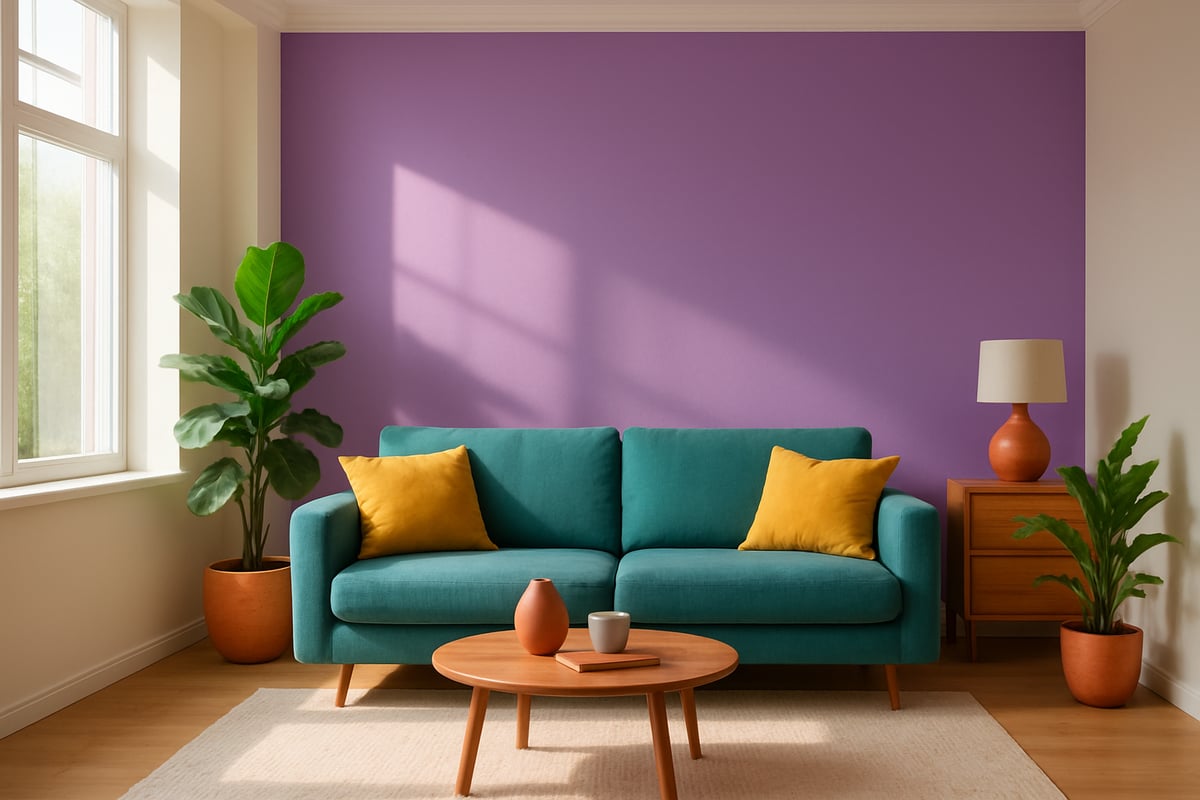
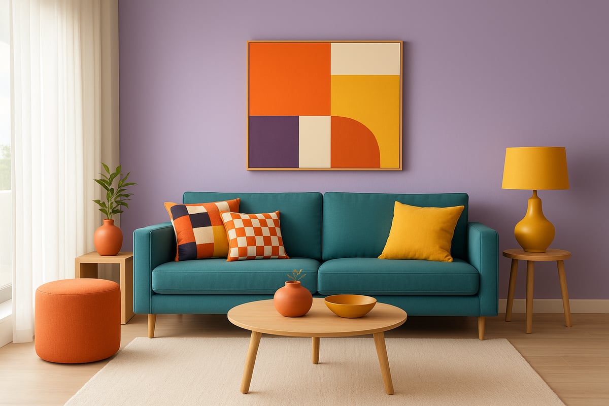
Living Room: Creating a Welcoming Hub
The living room is your home’s hello hug. Warm terracotta and tranquil teal are top picks for 2025, making guests feel instantly welcome. Try a tranquil teal feature wall paired with neutral sofas and a cheeky splash of digital lavender in your cushions or art. For extra personality, add patterned throws or a bold rug. Want more creative inspiration? Check out Make Your Home Pop with Colour for playful ideas that push your home interior colour design to the next level.
Kitchen: Energise and Inspire
Kitchens crave energy and a bit of sass. Buttery yellow is the secret ingredient for kitchens that feel sunny, sociable, and ready for anything. Pair it with sage green cabinets or open shelving for a modern, earthy twist. These shades don’t just look good – studies link yellow kitchens to increased appetite and lively conversation. When planning your home interior colour design, remember the kitchen is the heart of the home, so let your taste shine as boldly as your paint.
Bedroom: Calm and Comfort
Sleep is sacred, so your bedroom deserves a colour hug. Soft blues, dreamy lavenders, and muted greens create a sanctuary for rest and romance. Sixty percent of homeowners say cool tones help them sleep better, so why not jump on that bandwagon? Home interior colour design for the bedroom is all about embracing comfort. Layer in plush textiles and soft lighting to complete the cocoon effect. Your future self will thank you on Monday mornings.
Bathroom: Fresh and Clean
Bathrooms are your home’s spa zone, so keep it crisp and uplifting. Crisp whites, aqua, and soft pastels give a fresh, clean vibe. Want a quick upgrade? Aqua feature tiles or a pastel accent wall can make even the smallest bathroom feel like a five-star retreat. When thinking about home interior colour design for bathrooms, pick finishes that are moisture resistant and easy to clean. Good news: you don’t need a giant tub to feel pampered.
Home Office: Focus and Productivity
Forget dull beige boxes – your home office deserves a shot of focus. Greens and blues are proven winners for boosting concentration and productivity. University of Exeter says green offices can increase productivity by 15 percent. Choose leafy green walls or navy blue accents to power up your workday. In home interior colour design, the right palette can keep you sharp and inspired, even when the WiFi isn’t cooperating. Add a colourful chair or desk lamp for a pop of fun.
Children’s Rooms: Playful and Flexible
Kids’ rooms are a licence to break the rules. Go bold with playful patterns, colour blocking, and adaptable palettes that grow with them. Try colour zoning – a sunny yellow play area and a calming blue sleep zone. Home interior colour design here should flex with changing tastes and wild imaginations. Use removable decals, patterned bedding, and a rainbow of storage bins for low-commitment colour. Who says only grown-ups get all the fun?
Expert Tips for Colour Confidence and Personalisation
Ready to break up with boring and flirt with fabulous? It’s time to kick your home interior colour design into high gear. Whether you’re a maximalist at heart or a nervous newbie, these expert tips will have you mixing, matching, and strutting your stuff with colour confidence. Let’s get rebellious.
Layering Colours and Patterns Like a Pro
Layering is the secret sauce of home interior colour design. Think of it as building a killer outfit: stripes meet florals, bolds flirt with neutrals, and suddenly your space feels alive. The trick is to pick a hero colour, then add supporting hues and patterns that don’t fight for attention.
- Choose one dominant shade as your anchor.
- Mix patterns in different scales (like chunky checks with petite polka dots).
- Repeat colours in accessories for harmony.
Need inspiration? Check out these From Drab to Fab: Colour Makeovers for real-life transformations that prove layering is pure magic.
Using Colour to Highlight Architectural Features
Why let your home’s best bits blend in? Home interior colour design is your ticket to showing off those quirky alcoves, dreamy cornices, or that cheeky curved archway. Use colour to make the ordinary extraordinary.
- Paint an accent wall to pull focus.
- Try a bold hue on your ceiling for a surprise twist.
- Frame doors or skirting boards in a contrasting shade.
This approach turns your home into a gallery, with every feature getting its moment in the spotlight. Your guests won’t know where to look first.
Avoiding Colour Fatigue and Overwhelm
Been burned by a too-bold choice? You’re not alone. The trick to lasting love with home interior colour design is moderation and flexibility. Start small, layer in accents, and don’t be afraid to rotate pieces as your mood changes.
- Dip your toe in with colourful cushions or art.
- Use removable wallpaper for commitment issues.
- Swap accessories seasonally.
Remember, even rebels need a little rest. Overdoing it can lead to colour fatigue, so give your eyes (and your soul) some breathing space.
When to Work with a Colour Consultant
Sometimes you need a wingman. If home interior colour design feels like a minefield, a consultant can save you from costly mistakes and second-guessing. They’ll decode undertones, balance boldness, and tailor schemes to your quirks.
- Perfect for open-plan chaos or tricky lighting.
- Get confidence and clarity with expert advice.
- Save time and avoid expensive regrets.
Curious about what it’s like? Dive into Interior Colour Consultancy Services for a peek at how the pros work their magic, from virtual consults to in-person support.
The Colour Rebel Studio: Bespoke Colour Consultancy Services
Meet your new secret weapon: The Colour Rebel Studio. Led by certified Colour Consultant Jodie, this studio empowers you to embrace bold home interior colour design choices with confidence. Expect personalised schemes, guidance that’s never stuffy, and support that fits your life—virtual or face-to-face.
You’ll get clarity, joy, and a home that shouts “you” from every corner. Plus, there’s a vibrant community, heaps of inspiration, and workshops to keep your creative spark alive. Who says you can’t have a home as unique as your playlist?
Practical Application: Painting, Decorating, and Maintaining Colour
Ready to wield your paintbrush like a rebel and make your home interior colour design truly shine? Let’s roll up our sleeves, grab those swatches, and turn all those dreamy palettes into a living, breathing reality. Whether you’re a DIY daredevil or calling in the pros, here’s your no-nonsense, step-by-step guide to painting, decorating, and keeping your colours looking fresh.
Choosing the Right Paint Finishes and Materials
When it comes to home interior colour design, choosing the right paint finish is half the battle. Matte, satin, and gloss each have their moment in the spotlight. Matte hides imperfections but needs a gentle touch, while satin is your go-to for busy hallways—easy to clean, tough as old boots. Gloss? It’s bold, shiny, and loves a bit of drama on doors or trim.
Let’s break it down:
| Finish | Best For | Pros | Cons |
|---|---|---|---|
| Matte | Bedrooms, ceilings | Hides flaws, soft look | Marks easily |
| Satin | Hallways, kitchens | Durable, easy to clean | Shows wall flaws |
| Gloss | Doors, trim | Super shiny, durable | Highlights bumps |
According to the Interior Design Color Trends Report 2025, homeowners are leaning into finishes that balance style with practicality. For your home interior colour design, always match your finish to the room’s function for maximum impact.
Tools and Techniques for Flawless Application
You wouldn’t bake a cake with a fork, so don’t paint your walls with the wrong tools. For home interior colour design perfection, you need quality brushes for corners, rollers for coverage, and painter’s tape for those crisp lines. Prepping is your secret weapon—wash, sand, fill, and prime before you let loose with colour.
Quick checklist:
- Clean and prep surfaces
- Use painter’s tape for neat edges
- Invest in good brushes and rollers
- Stir paint thoroughly
Did you know that proper prep slashes repainting needs by 40%? That’s more time for you to enjoy your bold home interior colour design, less time fixing disasters.
DIY vs. Professional Painting: What to Consider
Let’s be honest—DIY can be brilliant, but it’s not always the best move for every home interior colour design adventure. If you’re tackling a tiny powder room or adding a pop of colour with accessories, you’ve got this. But massive open-plan spaces or intricate patterns? Sometimes it pays to call in the experts.
Consider:
- Your budget (DIY is cheaper, but mistakes aren’t)
- The size and complexity of the job
- Your patience (and pain tolerance for paint fumes)
If your home interior colour design dreams involve mural-worthy feature walls or complex colour blocking, a pro painter is worth every penny.
Maintaining Vibrant Colour Over Time
So, you’ve finished your masterpiece—how do you keep those colours looking as fresh as your attitude? Regular dusting and gentle cleaning are a must. For sunny rooms, opt for UV-resistant paints to prevent fading. Keep a small pot of your chosen shade handy for quick touch-ups when life inevitably leaves its mark.
A vibrant home interior colour design isn’t a one-and-done job. It’s a living, evolving thing. Embrace the maintenance, and your space will keep turning heads for years.
Updating Colour Without Full Redecoration
Not ready to commit to a full repaint every season? No problem. Home interior colour design is about flexibility. Swap out cushions, throws, and curtains to echo the latest trends. Rotate artwork or add bold rugs for instant impact with zero mess.
Top tips:
- Layer colourful textiles for seasonal updates
- Hang new prints for a fresh vibe
- Try removable wallpaper or decals
Your space can look brand new with just a few rebellious tweaks—no paintbrush required.
Troubleshooting Common Colour Problems
Even the best-laid home interior colour design plans can hit a snag. Patchy coverage? Try a primer or a second coat. Mismatched undertones making your room feel “off”? Take a step back, and check your samples in different lights. Paint peeling or bubbling? Moisture is the usual suspect—fix leaks before redecorating.
Simple solutions:
- Always prime over dark or bold colours
- Use colour-matching services for touch-ups
- Patch-test in hidden spots
Remember, mistakes are just another excuse to experiment. No beige regrets here.
Safe and Sustainable Decorating Practices
A true rebel cares for their home and the planet. When plotting your home interior colour design, choose low-VOC or natural paints—good for your lungs and the environment. Recycle empty tins and donate leftover paint if you can. Eco-friendly paint sales are booming, now making up 35% of the UK market.
For those craving even more eco inspiration, the 2025 Home Color Forecast highlights earthy tones and sustainable choices as must-haves for a healthy, happy space.
Eco checklist:
- Use low-VOC or natural paints
- Recycle or donate leftovers
- Choose sustainable tools (like bamboo brushes)
With a little planning, your home interior colour design can be bold, beautiful, and brilliantly green.
Ready to toss the neutrals and give your home the personality it’s craving? You’ve just armed yourself with all the colour tricks and bold insights you need to transform every room in 2025. But hey, why stop here? If you want daily boosts of colour confidence and a cheeky dose of rebel style for your space (and your inbox), I’ve got just the thing. Let’s keep the momentum (and the joy) going—Sign up for daily colour confidence + rebel style inspo. Because honestly, you deserve a home as vibrant as you are.
0 comments