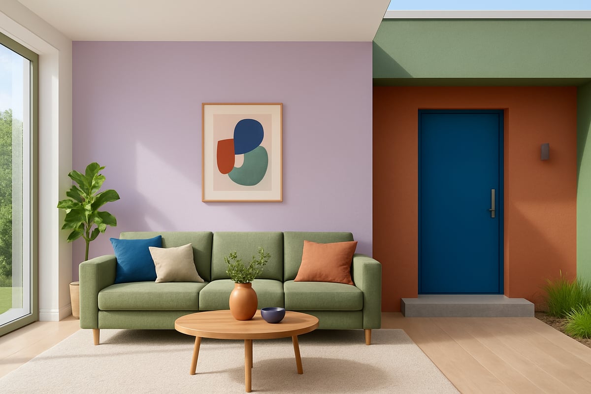
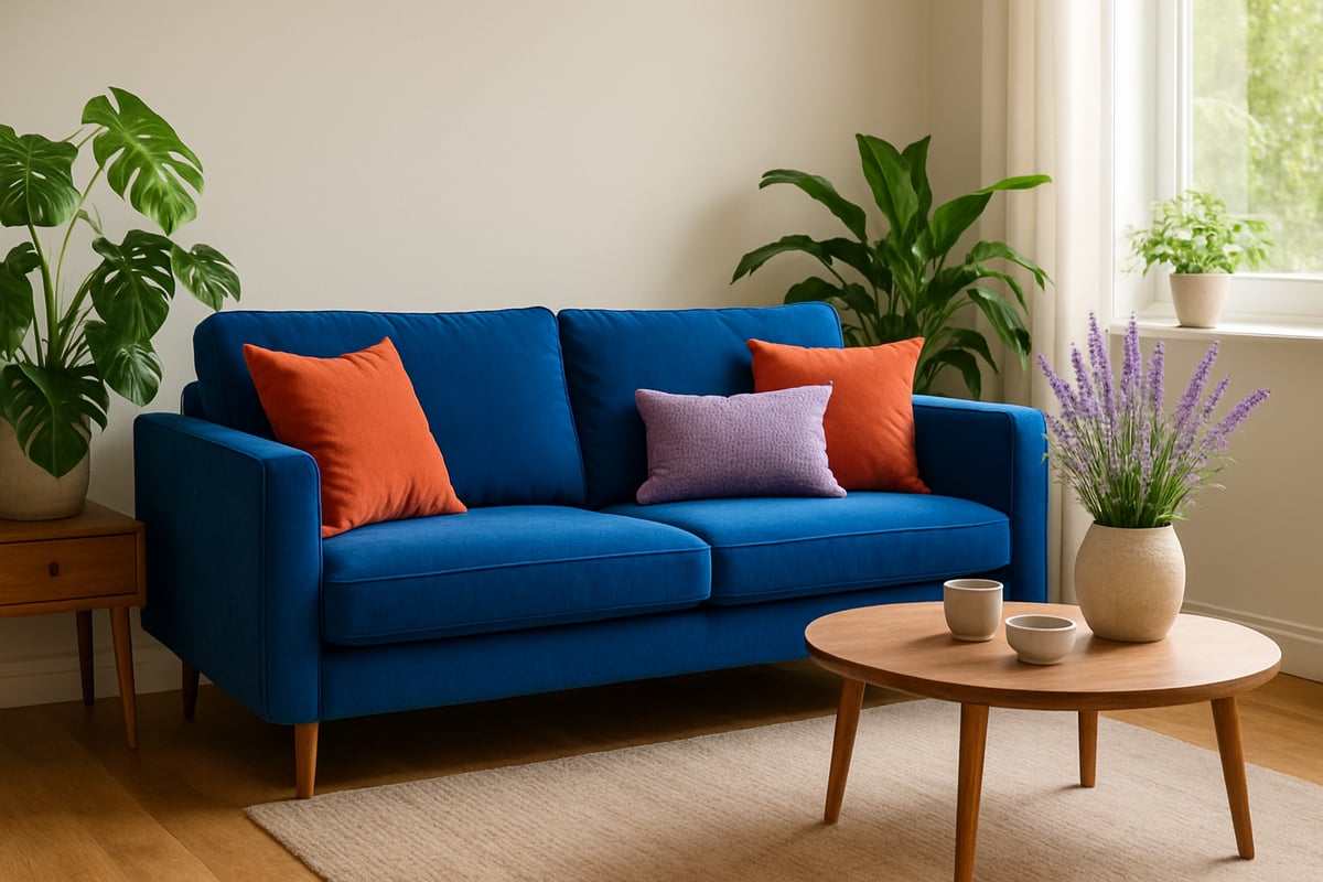
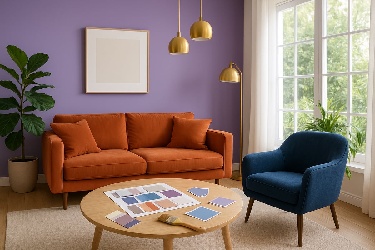
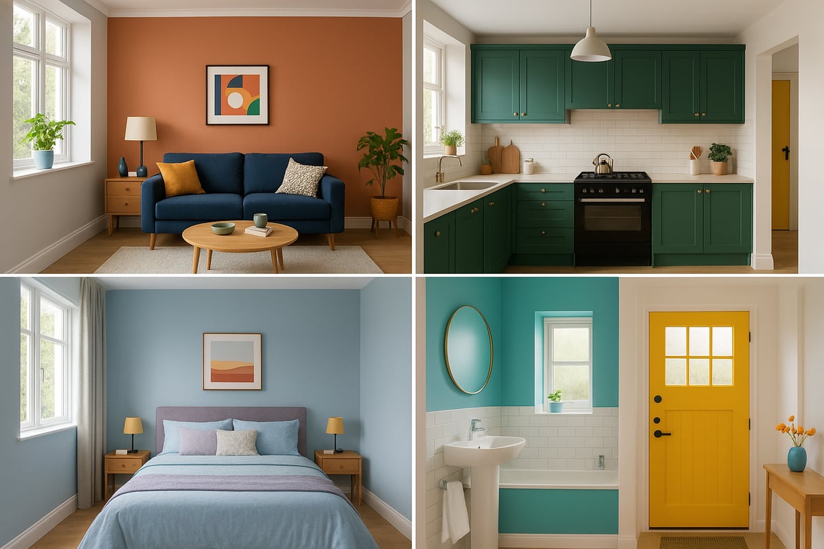
Ready for a revolution? The right house colour is your secret weapon. It can turn a tired space into a showstopper and even boost your home’s value in 2025. No more playing it safe with boring beige or washed-out neutrals.
This guide is your ticket to mastering house colour like a pro. Whether you’re a total newbie or just sick of second-guessing paint samples, you’ll learn how to pick, mix, and nail the perfect palette.
We’ll dive into 2025’s hottest house colour trends, break down the psychology of colour, and give you step-by-step advice for every room and curb. Plus, we’ll make sure you dodge the rookie mistakes that trip up most beginners.
Ready to ditch the dull and unleash your home’s full potential? Let’s get rebellious with colour.
Understanding House Colour Trends for 2025
Ready to break up with boring beige? Let’s dive into the wild world of house colour trends for 2025. This year, it’s all about expressing yourself, bringing nature indoors, and flexing those eco-friendly muscles. The rules are changing, and your home is the canvas.

The Evolution of Colour Trends
House colour trends have had quite the glow-up over the past decade. Gone are the days when endless greys and flat neutrals ruled every wall. Now, thanks to global events, a focus on wellness, and the magic of technology, colour is bolder, richer, and far more personal.
Did you know 68% of designers say “wellness” and “nature-inspired” palettes are driving today’s choices? That’s straight from Houzz 2024. The shift is real. Think about it — people want their homes to feel like a hug, not a waiting room. Once, everyone copied the same bland look. Now, house colour is a rebellion, with expressive hues replacing safe neutrals.
Take the leap from cool greys to warm terracotta or lush greens. It’s not just a trend — it’s a lifestyle upgrade. Your home deserves more personality, and 2025 is the year to give it.
2025’s Hottest Colour Palettes
Get ready for a palette party! 2025’s house colour scene is bursting with bold blues, earthy greens, spicy terracotta, and the show-stopping digital lavender. Pantone’s Colour of the Year 2025 is making waves, inspiring everything from accent walls to kitchen cabinets.
Pairing is the name of the game. Digital lavender pops against warm neutrals, while earthy greens ground open-plan spaces. Want a quick cheat sheet? Here’s a look at what’s trending:
| Hue | Vibe | Perfect Pairing |
|---|---|---|
| Bold Blue | Dramatic | Off-white, terracotta |
| Earthy Green | Restorative | Brass, wood tones |
| Terracotta | Inviting | Navy, cream |
| Digital Lavender | Playful | Beige, tan |
Designers and homeowners alike are leaning into these combos for max effect. For more on what’s hot (and why), check out the 2025 House Color Trends Report for expert insights and stats.
Influences Shaping Colour Choices
Let’s talk about what’s behind the house colour revolution. Wellness is top of mind, with biophilic design bringing the outdoors in. Cultural influences are shaking things up, too, with a global mix of patterns and palettes.
Social media is the real trendsetter. Instagram and Pinterest searches for “colourful interiors” have jumped 40% year-over-year. Influencers are showing off maximalist colour schemes, and Gen Z homeowners are leading the charge. Think bold, energetic, and unapologetic.
What’s driving your house colour choices? Is it a craving for calm, or a need to stand out? Either way, the world is your paintbox. The only limit is your imagination.
Sustainability and Eco-Conscious Colouring
Sustainability isn’t just a buzzword — it’s changing house colour for good. Eco-friendly paints, low-VOC formulas, and natural pigments are now the gold standard. Brands are offering an endless range of nature-inspired shades, so you can go green — literally and figuratively.
Looking for inspiration? Try brands that champion low-VOC paints in earthy greens or soft blues. Your walls will look good, and you’ll breathe easier. In 2025, choosing a house colour isn’t just about style, it’s a statement of values.
House colour can transform your space, your mood, and even your carbon footprint. Go bold, go green, and let your home tell your story.
The Psychology of Colour: How Colour Affects Mood and Space
Colour is more than just eye candy. The right house colour can shift your mood, make a space feel bigger or cosier, and even boost your sense of well-being. Think of it as emotional wallpaper for your walls—one quick change, and suddenly you’re living in a whole new vibe. Ready to discover how your palette choices can turn every room into a sanctuary, a party zone, or a personal retreat? Let’s get colourful and clever.

Colour and Human Emotion
Ever wonder why some rooms make you want to curl up with a cuppa, while others make you want to dance? It’s all down to house colour and its sneaky power over our brains. Scientific studies reveal that blue rooms can literally slow your heart rate, making them ideal for stress-heads who need a breather. Meanwhile, yellow is like a shot of espresso for your soul, sparking optimism and creativity.
Here’s a quick cheat sheet:
| Colour | Mood Effect | Best For |
|---|---|---|
| Blue | Calming, lowers stress | Bedrooms, studies |
| Yellow | Uplifting, energising | Kitchens, halls |
| Green | Restful, restorative | Bedrooms, lounges |
| Red | Stimulating, passionate | Dining, accents |
For example, painting your bedroom in soft green can help you wind down after a wild day. Want more proof? Check out how fearless interiors and colour happiness are totally linked, according to colour experts.
Room-by-Room Colour Psychology
Let’s take a tour, room by room. Your living room? Warm neutrals create a chatty, come-in-and-sit vibe, but a splash of bold colour—think a terracotta wall or navy sofa—injects pure energy. In the kitchen, zingy greens or cheerful yellows can wake up your appetite and creativity. Imagine sage cabinets or a sunny breakfast nook.
Bedrooms are your escape pod, so go for tranquil blues or dreamy lavenders. These hues tell your brain it’s time to relax, not check emails. Bathrooms love clean whites and aquas, making every shower feel like a spa day.
Real talk: One couple swapped their gloomy grey lounge for a house colour palette of lively blue and warm beige. The result? Family movie nights suddenly got a lot more fun.
Light, Space, and Perception
House colour isn’t just about mood. It’s a magician when it comes to space. Lighter tones can make a poky room feel as big as Buckingham Palace. Deep, rich shades like emerald or charcoal can shrink a vast space into a snug den.
Lighting is the secret sauce. North-facing rooms can look chilly, so pale yellows or blush pinks add warmth. South-facing spaces bask in sunlight, letting you play with bolder hues. Don’t forget mirrors—they bounce light around and double the impact of your chosen house colour.
Try this: Paint a test patch on the wall and watch how it transforms from morning to night. You’ll see why paint chips are liars and why real-life testing is a must.
Cultural and Personal Associations
Let’s get personal. Your favourite house colour might remind you of nan’s kitchen, a holiday in Morocco, or that time you painted your nails fire-engine red. Culture also gets in on the act. Red spells luck in China, but can feel too much in a small British loo.
Some people crave the calm of blue because it’s the colour of summer skies. Others want the drama of black for a touch of rockstar glam. At the end of the day, your own stories and memories should guide your choices—forget what the neighbours think.
So, whether you fancy a cheerful yellow hallway or a moody green bedroom, remember: colour is personal, powerful, and never boring.
Step-by-Step Guide: Choosing Your House Colour Palette
Ready to stop second-guessing and finally pick a house colour palette you adore? Here’s your no-nonsense, rebel-approved roadmap. From light tricks to swatch drama, this guide is your ticket to a home that looks like you hired a designer—without the beige or the boring. Let’s get your house colour journey started.

Step 1: Assess Your Space and Lighting
First things first: don’t let your house colour dreams get crushed by bad lighting. Natural light is your palette’s best friend—or worst enemy. A north-facing room can turn a cheerful yellow into a sulky beige faster than you can say “buyer’s remorse.” South-facing? Expect warm, golden tones that make colours pop.
Test paint swatches on each wall, and check them morning, noon, and night. Artificial lights can also throw a curveball. LED bulbs might make your house colour look cool and blue, while warm bulbs can make everything seem cozier.
- North vs south-facing rooms matter
- Test at different times of day
- Swatches on multiple walls
Don’t skip this step unless you fancy repainting every six months.
Step 2: Define Your Style and Goals
Are you a minimalist craving calm, or a maximalist dying for drama? The right house colour reflects your personality and supports the room’s purpose. Think about what you want to feel in each space—energised, relaxed, or ready to host the best dinner parties?
Jot down words that describe your vibe: modern, traditional, eclectic, or maybe “Pinterest but with more attitude.” Then match those words to colour moods. For example, a minimalist house colour palette might mean soft whites, gentle greys, and subtle greens. Maximalists, go wild—pair bold blues with spicy oranges if you dare.
- Decide on your style (be honest)
- Set mood and function goals
- Match colours to your vision
This is your house colour story, not your mum’s.
Step 3: Research and Gather Inspiration
Time to unleash your inner detective. Scroll through Pinterest, binge interior design Instagrams, and rip pages out of magazines without guilt. Build a digital or physical mood board of everything that makes your heart race.
Grab samples, paint chips, and fabric swatches. Compare how they play together. Mix and match until you find combos that spark joy—yes, Marie Kondo would approve.
- Use mood boards for clarity
- Collect samples that speak to you
- Don’t copy, remix
Your house colour inspiration should feel personal, not like a copy-paste job.
Step 4: Narrow Down Your Colour Choices
Now comes the fun (and slightly stressful) bit. Pick your main house colour (the star), a secondary shade (the trusty sidekick), and a bold accent (the scene-stealer). Use the classic 60-30-10 rule: 60% dominant, 30% supporting, 10% accent.
Here’s a quick table for balance:
| Purpose | % of Space | Example Colour |
|---|---|---|
| Main | 60% | Soft sage green |
| Secondary | 30% | Warm off-white |
| Accent | 10% | Digital lavender |
Need help? Check out this guide to choosing the right colour scheme for more tips on creating a palette that actually works.
Don’t overload your house colour palette—less chaos, more harmony.
Step 5: Test Colours in Real Life
Paint chips lie. Digital mockups fib. The only way to know if your house colour choices are “wow” or “why?” is to slap some sample pots on every wall. Watch how the shades change in morning sunlight, afternoon gloom, or under your favourite lamp.
Take notes. What looks stunning in daylight might shriek under LEDs. And that perfect grey? It might just be blue at 9pm.
- Paint sample patches
- Observe day and night
- Trust your gut, not just the tin
Testing is your secret weapon for house colour confidence.
Step 6: Finalize and Plan Your Palette
You’ve survived the swatch trials. Now, lock in your house colour picks. Double-check that the colours flow from room to room like a well-mixed cocktail—no jarring surprises as you wander through.
Consider using the same accent colour throughout your home for a sense of unity. Plan out where each shade will go, and make a map if you’re a visual person.
- Confirm your choices before buying
- Plan transitions for flow
- Keep a cheat sheet of your palette
Consistency is the unsung hero of killer house colour design.
Step 7: Prepare for Application
Before you go wild with the roller, prep is key. Clean your walls, patch up holes, and make sure everything is smooth. Pick the right finish: matte for hiding flaws, satin for easy cleaning, semi-gloss for trims and doors. Here’s a quick comparison:
| Finish | Best For | Vibe |
|---|---|---|
| Matte | Walls, ceilings | Soft, chic |
| Satin | High-traffic | Sleek, durable |
| Semi-gloss | Trim, doors | Bold, crisp |
Don’t rush this stage. Good prep means your house colour masterpiece lasts longer and looks sharper.
You’re officially ready to transform your home. Grab your brushes, cue the playlist, and let your house colour revolution begin.
Colour Selection for Every Room: Practical Tips and Examples
Choosing the perfect house colour is a bit like picking your outfit for a first date. You want to make a statement, but you also want to feel comfortable. Let’s break down the best palette ideas for every space so you can rebel against beige and craft a home that’s pure joy from the hallway to the loo.

Living Room Colour Strategies
The living room is the heart of your home and the perfect canvas to show off your house colour confidence. Popular choices this year are warm neutrals paired with bold feature walls or layered textures that spark conversation.
Try combining terracotta with navy for a cozy, modern look. Or, if you’re feeling brave, splash out with a patterned rug or a statement sofa. According to the latest Houzz survey, 55% of homeowners are reaching for blues and greens, making these shades a safe bet if you’re after a timeless yet trendy house colour.
- Terracotta and navy: warm yet sophisticated
- Olive green with natural woods: biophilic and grounding
- Crisp white with colourful art: easy to update
Remember, your living room should reflect your energy—no more bland boxes.
Kitchen and Dining Room Palettes
Kitchens are for more than burnt toast and questionable leftovers—they’re the stage for bold house colour moves. Energise the space with citrus yellow, sage green, or classic off-white for a fresh and lively vibe.
Two-tone kitchens are catching fire in 2025. Picture green cabinetry with brass hardware and creamy upper cabinets for contrast. This combo feels both fresh and classic. Add a pop with a colourful backsplash or playful stools.
- Citrus yellow: sparks appetite and creativity
- Sage green: calming but far from boring
- Off-white: keeps things bright, lets accessories shine
Don’t shy away from mixing textures. Metallics, tiles, and timber add depth to any house colour scheme.
Bedroom Retreats: Calm and Comfort
Your bedroom should be a sanctuary, not a snooze fest—unless you want it to be! The best house colour choices here are restful shades like dusty pinks, tranquil blues, and gentle lavenders.
Layering cool tones creates a serene, cocoon-like atmosphere. Consider pairing a soft blue wall with lavender bedding and a blush accent chair. Data shows 60% of buyers prefer cool palettes in bedrooms, so you’re not just pleasing yourself; you’re future-proofing.
- Dusty pink: soft and inviting
- Tranquil blue: proven to lower heart rate
- Soft lavender: adds a dreamy, modern twist
Add texture with throws and cushions for extra comfort.
Bathroom Colour Solutions
Bathrooms are your spa-at-home, so your house colour choices should scream “fresh” and “airy.” Clean whites, aquas, and playful pastels dominate the trend charts.
Aqua walls paired with white tiles look crisp, modern, and help bounce light around. If you’re feeling playful, try a pastel pink vanity or a patterned wallpaper in the powder room for a dash of drama.
- Aqua: refreshing and bright
- White: timeless and easy to pair
- Pastels: unexpected pop in a small space
Statement wallpapers are huge in 2025—think bold, not bland.
Entryways and Hallways
First impressions matter, and your entryway is the home’s handshake. Welcoming house colour choices like warm greys, cheerful yellows, and bold artwork set the tone for what’s inside.
A contrasting front door in a zesty shade instantly boosts curb appeal. Carry that energy inside with colourful runners or gallery walls. Not sure how to inject personality? Check out these 10 ways to add colour personality for ideas that’ll make your hallway unforgettable.
- Warm grey: versatile and inviting
- Cheerful yellow: brightens even gloomy British days
- Contrasting doors: instant wow factor
Use colour to guide the flow between rooms, making your whole house colour story cohesive.
Exterior House Colour: Boosting Curb Appeal in 2025
Want your house to shout “look at me” before you even open the door? The right house colour is your home’s first handshake with the world. It can skyrocket your curb appeal, crank up your property’s value, and stop the neighbours in their tracks. Let’s break down how to make your exterior pop in 2025.
Understanding Exterior Colour Impact
A well-chosen house colour does a lot more than just “look nice.” It’s your home’s suit and tie. First impressions count, especially when you’re selling. According to Zillow, homes with updated exteriors fetch 2 to 5 percent more. Imagine that on your sale price! A bold trim on a pale facade? That’s instant sophistication, and buyers adore it.
Whether you want to blend in or stand out, your house colour is your secret weapon. It sets the tone for what’s inside, hints at your style, and can even sway your mood when you pull into the drive.
Top Exterior Colour Trends for 2025
2025 is ditching dull for daring. This year’s house colour trends are all about personality with a nod to nature. Think sage green, charcoal, off-white, and muted blue—palettes that feel fresh, grounded, and a bit rebellious. Sage green siding with white trim is everywhere, especially in leafy suburbs. Charcoal brings drama, while off-white keeps it crisp.
Coastal homes lean blue, urban pads go for bolder contrasts. Want to see more real-life transformations? Check out these Colourful home makeovers for inspiration that’ll make you want to grab a paintbrush. For a full download on trending palettes, the Color Trends 2025 Presentation is a goldmine.
| Trending Shade | Vibe | Best Pairing |
|---|---|---|
| Sage Green | Calming, modern | White, natural wood |
| Charcoal | Bold, contemporary | Brass, pale grey |
| Off-white | Timeless, fresh | Black, navy |
| Muted Blue | Coastal, relaxed | Cream, sand |
Choosing Colours for Architecture and Surroundings
Not all homes wear the same house colour equally well. Your architecture is basically your home’s personality—Victorian, mid-century, or ultra-modern, each has its own best shades. Got loads of greenery? Earthy tones like sage and taupe blend beautifully. Urban townhouse? Go bold or go home with deep charcoals and pops of colour.
Remember, your neighbourhood counts too. Don’t let your house colour clash with the street. Instead, let it complement the landscape and bring out your home’s best features.
Durable and Eco-Friendly Paint Choices
Choosing a house colour isn’t just about looks—it’s about lasting power. Go for weather-resistant paints if you want your colour to survive British drizzle or blazing sun. The eco-conscious crowd is loving low-VOC paints and natural pigments. Brands now offer sustainable finishes in every trending shade, so you can go green and look good doing it.
Maintenance matters as well. Matte finishes hide flaws but need more touch-ups, while satin or gloss is easier to clean. Make sure your house colour stays fabulous for years, not just a season.
Finishing Touches: Doors, Trim, and Accents
Here’s where you can really flex your creative muscles. Want your entry to feel like a warm hug? Try a bright red or cobalt blue door. Shutters and trim in contrasting colours can frame your house like a piece of art. Don’t forget the hardware—brass or matte black can turn the ordinary into the extraordinary.
For more jaw-dropping ideas, those Colourful home makeovers prove that even small touches can totally transform your house colour story. Make your front door the envy of the street and let your home’s personality shine.
Common Mistakes Beginners Make (and How to Avoid Them)
Let’s be honest: everyone thinks picking a house colour is a doddle—until their living room looks like a circus tent or a moody dungeon. If you want confidence, not chaos, here’s how to dodge the most common pitfalls and create a home that feels as good as it looks.
Falling for Fads: Trends vs. Timelessness
It’s easy to get swept up by the latest house colour trend—hello, digital lavender! But what looks fresh now might feel stale next year. Overcommitting to trends can leave you repainting sooner than you’d like, not to mention draining your wallet and patience.
Instead, blend trendy shades with timeless classics. Use bold hues on accents, not entire walls. When in doubt, ask yourself: will I still love this house colour when the hype fades? The goal is a home that reflects you, not just the year’s hottest palette.
Lighting: The Sneaky Saboteur
Lighting is the ultimate trickster in the world of house colour. Natural light, artificial bulbs, and room orientation all conspire to change how colours appear. That trendy grey might look cool in the shop but turn icy blue at home, especially in north-facing rooms.
Always test your house colour in every light—morning, afternoon, and evening. Paint swatches on different walls and see how they shift. Remember, what flatters a south-facing lounge might wash out a cosy bedroom. Don’t let lighting pull a fast one on your style.
Colour Chaos: Too Many Hues, Not Enough Flow
We get it, you love colour. But throwing every shade at your walls is a recipe for visual clutter, not a stylish sanctuary. One of the biggest mistakes is cramming too many house colour choices into a single space, leaving rooms feeling disconnected and overwhelming.
Stick to the 60-30-10 rule: 60% main colour, 30% secondary, 10% accent. Use consistent accent hues to tie rooms together. Want more guidance? Check out Interior Design Color Psychology: Best Hues for Every Room for inspiration on creating cohesive, mood-boosting spaces.
Testing, Finishes, and Those Pesky Undertones
Skipping the sample phase is like buying shoes without trying them on—risky business. Paint chips lie. Always test your chosen house colour on the wall, not just on paper. Watch out for undertones: that perfect beige might turn pink or green depending on light and surroundings.
Don’t forget paint finish. Matte is forgiving on walls, while gloss shines on trims and doors. If your chosen house colour looks off, try adjusting undertones or finishes before panicking. A little troubleshooting beats a full repaint any day.
Quick Fix Table: House Colour Troubleshooting
| Problem | Likely Cause | Solution |
|---|---|---|
| Colour looks wrong | Lighting/Undertone | Test at different times, adjust |
| Too busy/cluttered | Too many colours | Limit palette, use 60-30-10 rule |
| Paint looks streaky | Wrong finish/prep | Try a different finish, prep well |
| Rooms feel disjointed | Lacking flow | Repeat accent colour throughout |
No one gets it perfect the first time. Trust your gut, test everything, and remember: a house colour mistake is just another layer of experience (and paint).
You’ve made it this far, so clearly you’re ready to give your space (and yourself) a technicolour upgrade. We’ve tackled the big questions—what’s trending, how colour shapes your mood, and how not to accidentally paint your hallway the colour of despair. You don’t need to play it safe with beige when you could be living in full, rebel colour. Ready to ditch the dull and show your true colours every single day? Go on, treat your inbox to a splash of mischief and inspiration—Sign up for daily colour confidence + rebel style inspo.


0 comments