

Your home should make you feel something. Not "just fine" or "it's nice, I suppose," but properly alive. Yet most of us tiptoe around interior colour in home design like we're defusing a bomb. One wrong shade of teal and suddenly we're convinced we've ruined everything forever. Spoiler: you haven't. Colour isn't dangerous. It's transformative, mood-boosting, and genuinely joyful when you stop treating your walls like they're made of eggshells. Let's break down how to bring proper personality into your space without overthinking every single decision.
Why Interior Colour in Home Design Actually Matters
Colour affects how you feel in a space. Not in some woo-woo way, but scientifically. Understanding the psychology of colour reveals how different hues influence mood, energy, and even behaviour. Blues calm you down, yellows wake you up, reds spark conversation (or arguments, depending on the shade). Your home's colour palette is doing things to your brain whether you planned it or not.
Here's what colour does in your home:
- Creates emotional anchors for different rooms
- Influences how large or small a space feels
- Sets the energy level (cozy versus energizing)
- Reflects your actual personality instead of hiding it
Most people play it safe because they're terrified of making mistakes. But the real mistake? Living in a space that feels like a show home instead of your home. Interior colour in home environments should amplify who you are, not erase you.
The Beige Trap (And How to Escape It)
Neutrals aren't evil. They're just boring when that's all you've got. The "safe" palette of greys, whites, and taupes has dominated for years because it's easier to sell a house that looks like everyone else's. But you're not staging a property listing. You're building a life.
Breaking free starts with one bold choice. Paint one wall. Add a jewel-toned sofa. Hang curtains in a colour that makes you smile. If you're stuck on interior design choices, start small but start somewhere.
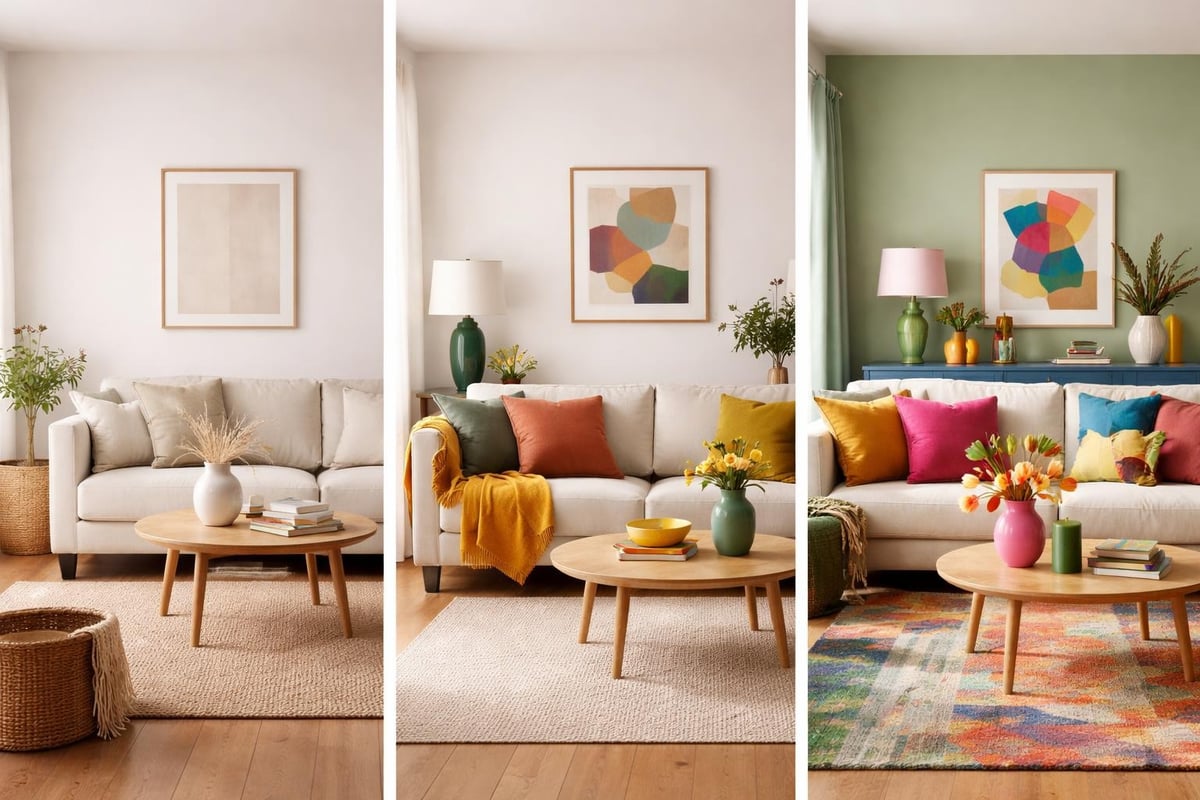
Choosing Interior Colour in Home Spaces Room by Room
Different rooms need different energy. Your bedroom shouldn't feel like your kitchen. Your office shouldn't mimic your bathroom. Understanding what each space needs makes choosing interior colour in home design significantly easier.
| Room Type | Mood Goal | Colour Direction | Example Shades |
|---|---|---|---|
| Living Room | Welcoming, social | Warm, conversational tones | Terracotta, sage, warm mustard |
| Bedroom | Calming, restorative | Soft or moody depth | Deep navy, blush pink, forest green |
| Kitchen | Energizing, functional | Bright or grounding | Chartreuse, cobalt, rich burgundy |
| Bathroom | Refreshing, spa-like | Clean with personality | Aqua, lavender, crisp white with colour accents |
| Office | Focused, inspiring | Stimulating but not chaotic | Teal, burnt orange, sophisticated plum |
Living Rooms That Actually Live
Your living room should feel like the best version of a dinner party: welcoming, slightly exciting, and comfortable enough that no one wants to leave. Benjamin Moore's coziest living room colours range from soft neutrals to moody tones, proving that "cozy" doesn't mean "colourless."
Consider layering colours instead of committing to one statement shade. A burnt orange wall paired with teal cushions and a mustard throw creates depth without chaos. Interior colour in home living spaces works best when you give colours friends to play with.
Living room colour layering tips:
- Start with your largest surface (usually walls)
- Add contrasting soft furnishings
- Introduce metallics or wood tones for grounding
- Layer in patterns that pull the palette together
Bedrooms: Bold or Soft (But Never Boring)
You spend a third of your life in bed. Make the room around it interesting. Deep, saturated colours create cocoon-like comfort. Soft pastels bring gentle energy. What doesn't work? Magnolia walls with beige bedding because "it's calming." That's not calming. That's anaesthetic.
Anderson Cooper's pastel pink living room demonstrates how soft doesn't mean timid. Pink can be sophisticated, playful, or romantic depending on how you use it. The same applies to your bedroom. Colour tells a story. Make sure it's yours.
Trendy Versus Timeless: What Actually Works
Trends come and go faster than you can repaint a feature wall. The colours predicted for 2025 included soft yellows, deep reds, and Yves Klein blue. Fast forward to 2026, and chartreuse is having a moment, while cobalt blue makes fashion and interiors waves.
Here's the truth: trends matter less than whether you love the colour. Choose shades that energize you, not shades that some Pinterest board says are "in." Interior colour in home design should outlast trend cycles because you picked colours that resonate with your personality.
Classic Colours That Never Quit
Some shades transcend trends because they're emotionally resonant. Deep greens, rich blues, warm terracottas, and bold corals have staying power. They've been used for centuries in different forms because they tap into something fundamental about how colour makes us feel.
Simon Helberg's moody olive green entryway showcases how traditional shades feel fresh when styled with personality. The colour itself isn't new. The confidence is.
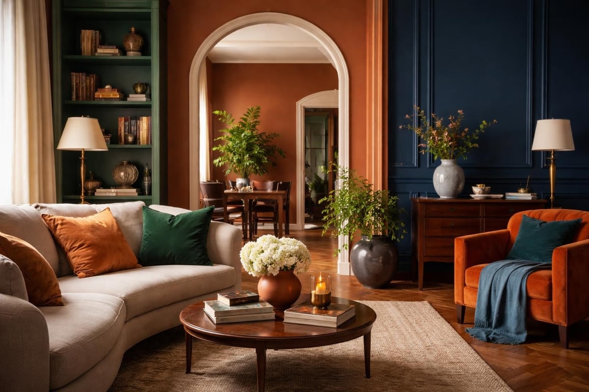
How to Test Interior Colour in Home Before Committing
Paint samples exist for a reason. Use them. Testing colour on your actual walls, in your actual light, with your actual furniture is non-negotiable. That gorgeous teal you saw online might look completely different in north-facing light versus south-facing brightness.
Proper colour testing process:
- Buy sample pots of your top three choices
- Paint large swatches (at least 60cm x 60cm) on different walls
- Live with them for at least 48 hours
- Observe how they look at different times of day
- Notice how they make you feel (genuinely, not theoretically)
Lighting changes everything. Morning light differs from afternoon glow. Artificial light at night adds another variable. Interior colour in home spaces needs to work in all these conditions, not just the Instagram-perfect golden hour.
The Natural Light Factor
North-facing rooms get cooler, softer light. South-facing spaces flood with warmth. East gets morning brightness, west gets afternoon glow. Your colour choices need to account for this, or you'll end up with a shade that looks stunning at 3pm and depressing at 8am.
Warm colours (reds, oranges, yellows) can heat up already-warm rooms or balance cool light. Cool colours (blues, greens, purples) calm down overly bright spaces or add freshness to dim areas. Test in your specific light before making final decisions.
Mixing Patterns and Colours Without Creating Chaos
Pattern scares people even more than colour. The fear of looking like a psychedelic nightmare keeps too many homes pattern-free. But patterns add texture, interest, and personality that solid colours alone can't achieve. The trick is knowing how to layer them without triggering visual overload.
| Pattern Type | How to Use | Works Well With |
|---|---|---|
| Large florals | Statement pieces (curtains, accent wall) | Smaller geometric patterns |
| Geometric prints | Cushions, rugs, smaller areas | Organic shapes, solid blocks |
| Stripes | Directional interest, room-shaping | Florals, dots, abstract designs |
| Abstract/organic | Art, throws, feature items | Structured geometrics, solids |
Start with a colour story first. Pick three to five colours that work together. Then introduce patterns that contain those colours in different proportions. A floral with pink, green, and gold pairs beautifully with geometric cushions using the same palette.
Learning to mix patterns with confidence applies equally to interiors and wardrobes. The principles remain consistent: shared colour palette, varied scale, balanced visual weight.
Scale Matters More Than You Think
Mixing pattern scales prevents visual competition. Pair large-scale florals with small-scale geometrics. Combine bold stripes with delicate prints. When everything's the same size, it fights for attention. Varied scales create harmony.
Interior colour in home design gets exponentially more interesting when you add pattern. Just remember: if it makes you smile, it's working. If it gives you a headache, adjust.
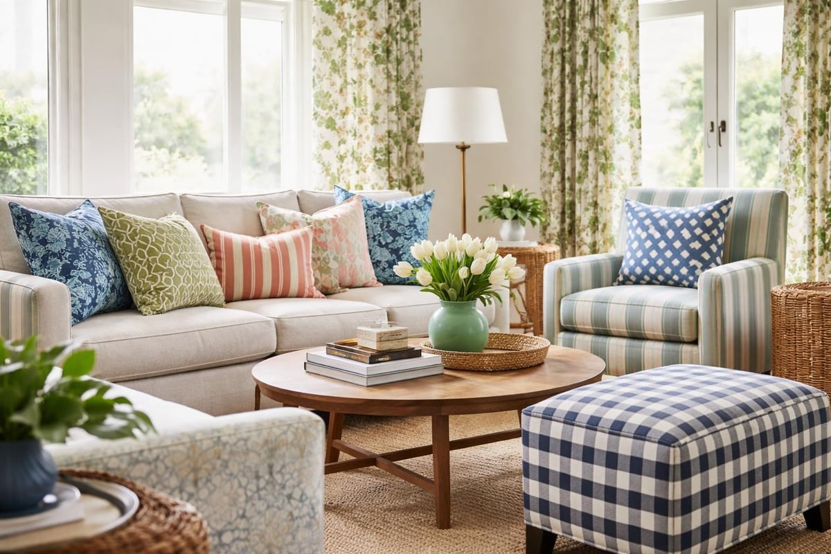
Common Colour Mistakes (And How to Fix Them)
Everyone makes colour mistakes. The difference is whether you panic and paint over them immediately or learn what went wrong. Most "mistakes" aren't actually failures but mismatches between expectation and reality.
Top colour mishaps and solutions:
- Too dark and oppressive: Add lighter accents, better lighting, or embrace the moody vibe fully
- Too bright and overwhelming: Balance with neutrals, reduce pattern, or commit harder to the boldness
- Clashes with existing furniture: Either change the colour or change the furniture (seriously)
- Looked great in the tin, terrible on walls: This is why samples exist. Always test first
The biggest mistake? Giving up on colour entirely because one shade didn't work. Interior colour in home spaces improves with experimentation, not avoidance.
When to Pivot (Not Panic)
Sometimes a colour genuinely doesn't work. The room feels wrong. You hate being in there. That's okay. Paint over it. Choose something else. One failed colour choice doesn't mean you're bad at colour. It means you're learning what works in your specific space.
Making your home pop with personality involves trial, adjustment, and occasional do-overs. Every interior designer has painted rooms twice. You're in good company.
Accent Colours: Small Changes, Big Impact
Not ready to paint entire rooms? Start with accent colours. These high-impact, low-commitment additions transform spaces without requiring a full renovation.
Easy accent colour additions:
- Cushions and throws in bold shades
- Artwork featuring vibrant colours
- Painted furniture pieces (chair, side table, bookshelf)
- Colourful lampshades or light fixtures
- Statement rugs anchoring the space
- Plants (yes, green counts as colour)
Accent colours let you test drive shades before committing to walls. They're also easier to change seasonally or when your taste evolves. Interior colour in home design doesn't require permanent decisions. Flexibility keeps spaces feeling fresh.
The Psychological Game of Colour Confidence
The real barrier to using interior colour in home spaces? Fear. Fear of judgment. Fear of mistakes. Fear of being "too much." But here's the thing: your home isn't for other people. It's for you.
The psychology behind interior colours explains how hues affect mood, but it doesn't dictate which colours you must use. If burnt orange makes you happy, science's opinion on orange matters less than your emotional response.
Building colour confidence starts with permission. Permission to try. Permission to fail. Permission to live surrounded by shades that spark joy instead of shades that simply exist.
Start Small, Think Big
You don't need to repaint your entire house tomorrow. Start with one room. One wall. One piece of furniture. Small colour wins build momentum. Before you know it, you're the person with the jewel-toned dining room and emerald bathroom, wondering why you ever lived in beige.
Choosing the right colour scheme becomes easier with practice. Each room you tackle teaches you more about what works in your home, with your light, for your life.
Seasonal Colour Shifts Without Repainting
Your colour palette doesn't need to stay static year-round. Seasonal shifts through accessories keep spaces feeling current without major overhauls.
| Season | Colour Direction | How to Implement |
|---|---|---|
| Spring | Fresh, bright, optimistic | Pastels, bright whites, yellow accents |
| Summer | Vibrant, energetic, bold | Corals, turquoise, sunshine tones |
| Autumn | Rich, grounding, warm | Burnt orange, deep burgundy, forest green |
| Winter | Cozy, dramatic, sophisticated | Navy, plum, metallics, deep jewel tones |
Swap cushion covers, rotate artwork, change throws. These small adjustments keep interior colour in home design feeling dynamic without constant renovation. Your base palette stays consistent while accents shift with the seasons.
Why Fearless Interiors Create Happier Homes
Safe is comfortable until it becomes stifling. Fearless interiors make you happier at home because they reflect who you actually are, not who you think you should be. Bold colour choices signal confidence. They tell visitors (and yourself) that you're not afraid to take up space.
Living with colour you love changes how you experience home. You notice your surroundings more. You feel energized walking into rooms. You stop apologizing for choices that make you happy. Interior colour in home environments becomes a daily reminder that joy matters more than playing it safe.
Permission to Be Extra
Your home can be maximalist, minimalist, or somewhere in between. What it shouldn't be is apologetic. If you want hot pink walls, paint them pink. If chartreuse speaks to you, embrace it. The people who matter won't judge you for having opinions about colour.
This isn't about being trendy or impressing anyone. It's about creating spaces that genuinely make you feel something other than "meh." Life's too short for beige everything.
Bringing It All Together Without Losing Your Mind
Interior colour in home design doesn't require a degree in colour theory. It requires curiosity, a willingness to experiment, and the understanding that paint is temporary. Wood stain lasts forever. Paint? That's Tuesday's project when you decide the blue was actually too blue.
Your colour action plan:
- Identify which room needs colour most urgently
- Test samples in real conditions (light, time of day, adjacent rooms)
- Start with one bold choice (wall colour, furniture piece, major artwork)
- Layer in complementary shades through accessories
- Live with it for a month before making major changes
- Adjust based on how the space actually feels, not how you think it should feel
The process matters less than the outcome. Your home should feel like yours. Colour makes that happen faster than any other design element.
Transforming your home from drab to fab starts with one colour decision made confidently. Everything else builds from there.
Your walls are waiting for you to have an opinion about them. Interior colour in home spaces transforms not just how rooms look but how they feel, which ultimately changes how you feel living in them. Whether you start with a single accent wall or commit to a full-room colour immersion, the goal remains the same: create spaces that energize you instead of erasing you. If you're ready to ditch the beige and build colour confidence in your home, The Colour Rebel offers bespoke colour consultancy that turns overwhelming choices into joyful, personality-packed spaces. Because life's too vibrant to live in neutral.
0 comments