

Ready to shake off the beige and bring some serious energy into your home? The future of interiors is bursting with colour, and 2026 is about to turn up the volume. Imagine walking into a space that doesn’t just look good but feels like a jolt of joy every single day.
Curious about which shades will rule the year, and how to actually use them without turning your house into a circus tent? This guide is your go-to for mastering the interior colour scheme set to define 2026. Get ready to learn the latest trends, uncover the secrets behind colour psychology, and pick up expert tips to make your rooms sing.
Whether you want a living room that sparks conversation, a bedroom that soothes, or a kitchen that energises your mornings, you’re in the right place. Let’s break the rules, ditch the neutrals, and create a home that’s bold, beautiful, and totally you.
2026 Interior Colour Trends: What’s In and What’s Out
Ready to ditch the beige and step into the future of colour? The 2026 interior colour scheme is all about unapologetic self-expression, playful rebellion, and a touch of retro magic. If your walls could talk, they’d be begging for a makeover. So, what’s hot and what’s not as we head into the boldest year for interiors yet?
The Rise of Bold, Expressive Colour Palettes
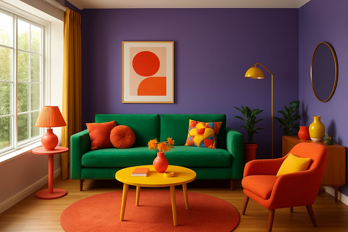
Wave goodbye to safe grey and bland neutral interiors. The interior colour scheme for 2026 is taking a sharp turn toward saturated, expressive hues that pack a punch. Why? Because people are craving joy, optimism, and a little drama after years of playing it safe.
What’s trending? Let’s break it down:
| Top Colours for 2026 | Mood/Effect |
|---|---|
| Digital Lavender | Calming, futuristic |
| Vivid Greens | Energising, natural |
| Warm Terracotta | Grounding, earthy |
| Optimistic Yellows | Uplifting, cheerful |
According to 2026 interior color trends, trend forecasters and paint giants like Pantone, Dulux, and Benjamin Moore are all singing from the same colourful hymn sheet. Maximalist palettes are gaining ground, with more homeowners choosing statement walls, bold furniture, and playful accessories.
Retro is back but with a twist. Think 70s jewel tones and 90s pastels—only now they’re paired with unexpected contrasts and sleek, modern finishes. The once-unstoppable grey and beige schemes are finally losing steam, making room for personality-packed interiors.
Technology is also stirring the paint pot. AI-powered design tools and virtual reality apps let you preview wild colour combos before you commit. Meanwhile, the rise of sustainable, earth-inspired shades reflects our growing eco-awareness. Nature’s palette—lush greens, sunbaked ochres, and tranquil blues—is inspiring choices that feel both fresh and future-proof.
So, if your dream interior colour scheme involves more than fifty shades of grey, it’s time to rebel.
Influences Shaping 2026 Colour Schemes
What’s driving this colourful revolution? Social media, for starters. Instagram and Pinterest are flooded with daring interiors, sparking a wave of copycat courage. Searches for “bold colour interiors” on Houzz and Pinterest have soared, proving that people are ready to break up with beige.
Cultural trends are also leaving their mark. Biophilic design is huge, with homeowners using their interior colour scheme to bring the outdoors in. Wellness is another biggie—think soothing greens and calming blues designed to turn your home into a sanctuary. Escapism is everywhere, with playful palettes making rooms feel like a holiday from the everyday.
Let’s talk generations. Gen Z and Millennials are leading the charge, favouring vibrant hues over muted tones. They want their spaces to reflect their personalities and aren’t afraid to take risks. It’s no wonder expert designers are predicting an even bolder future for the interior colour scheme.
Still, it’s not all about shock value. Experts recommend using colour strategically—balancing bold with neutral, and layering textures for depth. The goal is to create spaces that feel joyful, personal, and effortlessly cool.
Ready to join the rebellion? Your interior colour scheme is your secret weapon for a home that’s anything but ordinary.
The Psychology of Colour in Interior Design
Ever walked into a room and instantly felt your shoulders drop, or your energy spike? That’s no accident. The right interior colour scheme is like a secret remote for your emotions. Whether you want to create a zen den or a high-energy hub, understanding how colour works in your space is the first step to designing a home that actually feels as good as it looks.
How Colour Affects Mood, Productivity, and Wellbeing
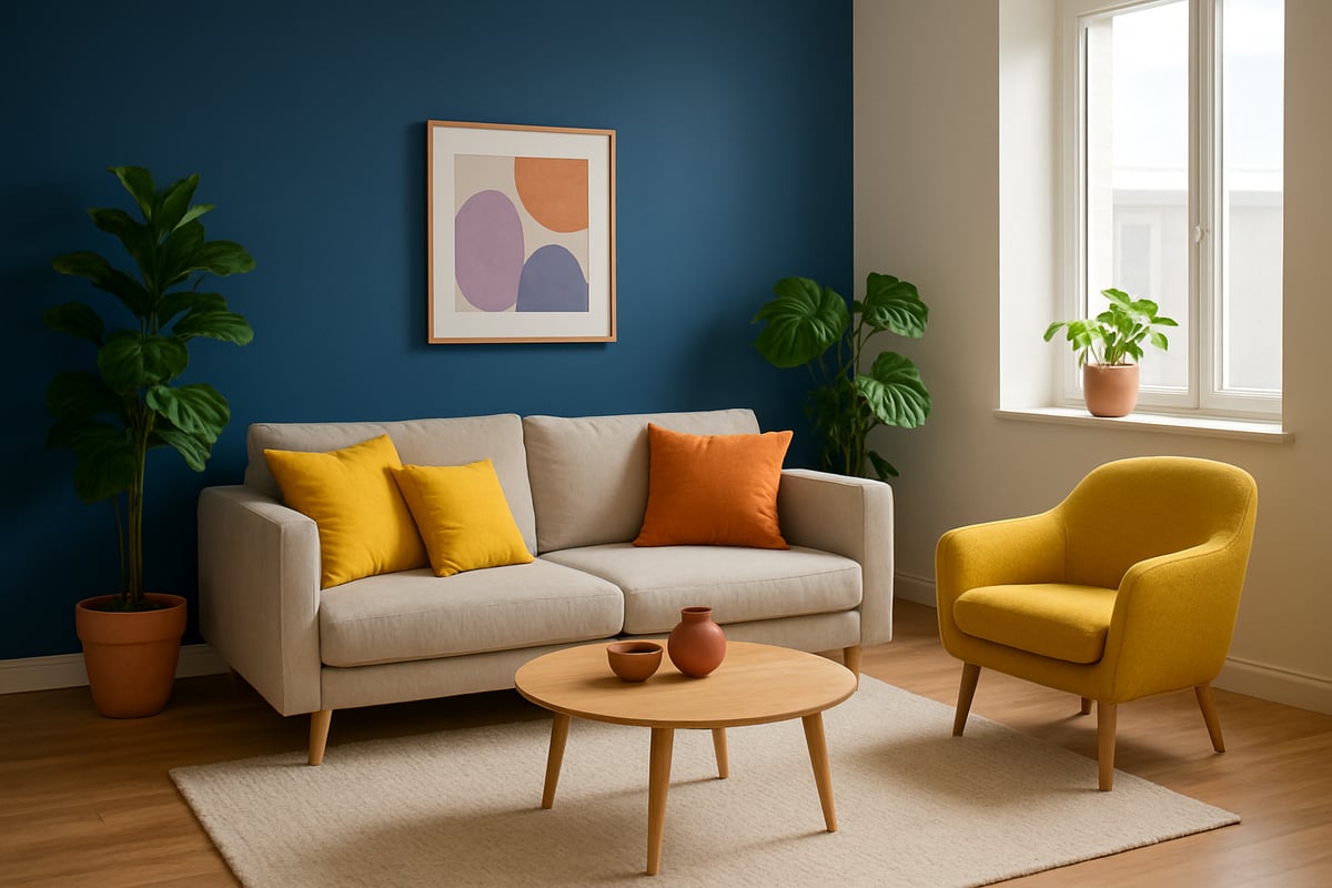
Think your favourite colour is just a preference? Think again. Science says your interior colour scheme can make you feel calm, focused, or even ready to party. Blue tones are ace for calm and focus—perfect for bedrooms or home offices. Yellow brings optimism and energy, making it a top choice for kitchens or creative corners. Green strikes a balance, ideal for spaces where you want harmony and a touch of nature. Red is a bold move, firing up energy and passion, but use it with care unless you want your lounge to feel like a boxing ring.
Studies have shown that colour influences everything from mood to cognitive performance. People working in blue rooms report higher concentration, while yellow accents in a workspace can boost creativity. If you want the science behind these claims, check out this fascinating study on color-emotion associations in art, which delves into how certain shades evoke specific emotions—crucial knowledge for curating your interior colour scheme.
But don’t forget the wildcard: light. Natural light can make colours sing or sulk, totally transforming your interior colour scheme throughout the day. Always test paint samples in different spots and at various times—what looks dreamy in the morning can turn dreary by sunset.
Here’s a quick cheat sheet for matching rooms to mood-boosting hues:
| Room | Feeling | Colour Recommendation |
|---|---|---|
| Bedroom | Calm | Deep blue, soft green |
| Kitchen | Energy | Yellow, warm terracotta |
| Office | Focus | Blue, green, mint |
| Living Room | Sociable | Teal, optimistic yellow |
Don’t fall into the trap of overwhelming small spaces with dark shades or ignoring undertones—those sneaky tints can make or break your interior colour scheme.
Personalisation: Matching Colour to Personality and Lifestyle
Here’s where choosing an interior colour scheme gets personal. Are you an extrovert who thrives on bold, punchy hues, or an introvert who prefers a palette that whispers, not shouts? Your colour comfort zone is your safe place, but sometimes, a little rebellion pays off. Fancy a softer look? Pastels, gentle greens, and muted blues will set the mood. Ready to make a statement? Go for digital lavender, zesty coral, or even a fiery red accent wall.
Think about your lifestyle. Got kids or pets? Opt for wipeable finishes and colours that hide the chaos. Sharing a home? Find a palette everyone can live with—maybe a neutral base with each person’s favourite accent. If you’re a creative, sprinkle in unexpected pops of colour to keep inspiration flowing. If you’re a minimalist, try layering subtle tones for depth.
Don’t be afraid to mix comfort with aspiration. Maybe your heart says calm, but your Pinterest board screams bold. Test new colours with small accessories or a feature wall before going all-in on your next interior colour scheme. Remember, your home should reflect you—not a trend, not your mum’s advice, and definitely not what the neighbours think.
It’s your space, your rules. So go forth and make your interior colour scheme as unique and fabulous as you are.
Step-by-Step Guide: Planning Your 2026 Interior Colour Scheme
Ready to ditch the bland and bring your dream interior colour scheme to life? Good. Let’s roll up our sleeves and break it down into six bold, rebellious steps. Whether you’re a maximalist at heart or just flirting with more colour, this is your ticket to a space that feels unapologetically you.
Step 1: Assess Your Space and Lighting
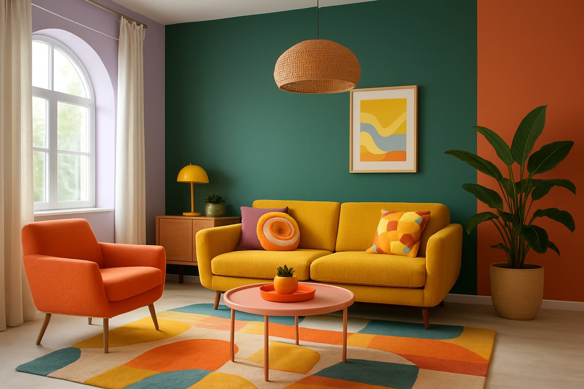
First up, get to know your space like it’s your new best mate. The right interior colour scheme starts with understanding light. Grab a notebook, your phone’s camera, and watch how sunlight moves through each room during the day. Make a note of gloomy corners and sun-drenched nooks.
Don’t forget artificial lighting. That overhead pendant or moody lamp will change how colours look after dark. Next, spot the fixed elements: flooring, big sofas, kitchen counters. These won’t budge easily, so your interior colour scheme needs to play nicely with them.
Digital tools and sample swatches are your secret weapons. Snap pics, use apps, and tape up samples on every wall. Trust us, your future self will thank you.
Step 2: Define Your Mood and Function
Now, let’s get personal. What do you want each room to feel like? Your interior colour scheme should match both your vibe and the room’s job. Is your living room a party palace or a chill zone? Does your bedroom need to whisper calm or shout creativity?
List every room. Next to each, jot down its main purpose and the mood you crave. For a home office, think energetic yellows or mint for focus. For bedrooms, deep blues or digital lavender are restful superstars.
Remember, your interior colour scheme isn’t just about what looks good. It’s about what feels right. Let your personality run wild, not just your paintbrush.
Step 3: Explore Trend Palettes and Inspiration
Time to dive into the fun stuff. Scroll through 2026’s trending palettes from top paint brands. Think digital lavender, earthy greens, and a cheeky pop of terracotta. Flick through design magazines, binge on Pinterest boards, and hit up showrooms for real-life inspo.
Retro-revival? Nature-inspired? Pick a theme that makes your heart skip. Don’t just copy—adapt. Your interior colour scheme should steal the spotlight, not blend into the crowd.
Need a step-by-step on picking the perfect palette? Check out How to Choose the Right Colour Scheme for a rebel-approved walkthrough that’ll have you mixing trends and personal flair like a pro.
Step 4: Test and Refine Colour Choices
This is your dress rehearsal—don’t skip it. Paint big swatches of your chosen colours on every wall. Watch how they morph in morning sun, afternoon shade, and under your favourite lamp. Your interior colour scheme might look dreamy at noon but turn into a moody grump at dusk.
Check for sneaky undertones that clash with your tiles or sofa. Light reflectance is another trickster—bright rooms bounce colour, while dim ones swallow it up. Adjust as you go.
If it feels off, tweak it. There’s no shame in changing your mind. The only rule? Love it. Your interior colour scheme should make you smile every time you walk in.
Step 5: Create a Cohesive Flow Throughout the Home
Time to connect the dots. A killer interior colour scheme isn’t just about one fabulous room, it’s about the whole vibe. Use a signature hue—maybe that optimistic yellow or digital lavender—to link open-plan spaces.
Accent colours are your best mates for transitions. Try a bold hallway leading to a calm bedroom, or repeat a favourite shade in different rooms for unity. Use textiles, art, and accessories to weave the palette throughout.
Keep it simple. Too many colours will make your home feel like a carnival (unless that’s your thing—no judgement). Aim for harmony, not chaos.
Step 6: Finalise and Implement
You’ve planned, tested, and tweaked. Now, commit. Order your paint, textiles, and statement accessories. Decide if you’re DIY-ing or calling in the pros. Sometimes, a professional touch is worth every penny for a flawless interior colour scheme.
Watch for classic pitfalls: overcomplicating your palette, forgetting about finishes, or letting FOMO push you into a colour you secretly hate. Stick to your gut.
As you roll on that first coat or fluff that new cushion, remember: your interior colour scheme is a rebellion against beige. Own it, love it, and let your space tell your story.
Expert Tips for Combining Colours and Patterns
Ready to ditch the bland and bring your interior colour scheme to life? Let’s kick beige to the kerb and unleash your inner colour rebel. Combining colours and patterns is not about memorising dusty rules, it’s about harnessing a few clever tricks and then breaking them with flair. If you want a space that feels like you, not a hotel lobby, you’re in the right place.
Mastering Colour Harmony: Rules and Exceptions
Forget everything you’ve been told about playing it safe with your interior colour scheme. The secret? Learn the “rules”—then bend them until your space radiates personality.
First up, the colour wheel. It’s your best mate for understanding how colours relate and clash. Here’s a quick cheat sheet:
| Scheme Type | Description | Mood Created | Example Pairing |
|---|---|---|---|
| Complementary | Opposite sides of the wheel | High contrast, bold | Digital lavender with green |
| Analogous | Next to each other on the wheel | Harmonious, relaxed | Teal, blue, and green |
| Triadic | Evenly spaced around the wheel | Balanced, lively | Mustard, teal, and magenta |
Ready to mix things up? Try pairing a digital lavender wall with a forest green sofa for a modern, gutsy vibe. Balance bold moves with a grounding neutral—think deep teal walls with a soft cream rug.
Patterns add instant personality to your interior colour scheme, but don’t overdo it. Mix a geometric rug with floral cushions, but keep at least one colour in common to tie it all together. Recent Houzz surveys show more of us are confidently mixing patterns and loving the results.
Texture is your secret weapon. Layer velvet, linen, and metallics for depth. Stick to the “60 30 10” rule: 60 percent dominant colour, 30 percent secondary, 10 percent accent. This keeps your palette punchy without feeling chaotic.
Mistakes to avoid? Clashing undertones, too many accents, or ignoring how light shifts your chosen hues. Want more rebellious tips for a knockout interior colour scheme? Check out 10 Ways to Make Your Home Pop with Colour for cheeky, actionable ideas.
The Colour Rebel: Empowering Confident Colour Choices
If you’re tired of “safe” interiors, The Colour Rebel Studio is your new partner in crime. Led by certified expert Jodie, this studio dishes out bespoke interior colour scheme advice that’s big on personality and joy. No more playing small—Jodie helps you mix patterns, layer textures, and create a scheme that feels unapologetically you.
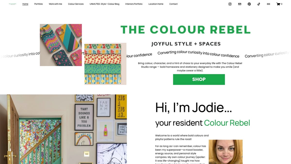
You get personalised planning, pattern mixing guidance, and access to maximalist homewares that turn drab rooms into energy-filled sanctuaries. Whether you want your interior colour scheme to be bold and playful or subtly expressive, this is the place to go for fearless transformation.
The Colour Rebel approach is about more than just paint—it's about confidence. With expert support, you’ll break free from neutral monotony and give every room a story. Life’s too short for dull interiors, so let your interior colour scheme shout with joy.
Room-by-Room Colour Schemes for 2026
Let’s break it down. The perfect interior colour scheme isn’t one-size-fits-all. Each room deserves its own personality, right? Here’s how to make every corner pop, fizz, and soothe, all in tune with the boldest trends of 2026.
Living Room: Creating a Welcoming, Expressive Hub
Ready to ditch the “safe” look? The living room is your chance to go bold with your interior colour scheme. 2026 is all about rich jewel tones, earthy greens, and splashes of optimistic yellow. Picture this: deep teal walls, a mustard velvet sofa, and a gallery wall that makes your guests gasp.
- Trending: emerald, teal, mustard, terracotta.
- Pair statement walls with neutral furniture to avoid colour overload.
- Mix in bold artwork for a rebellious vibe.
Pinterest searches for “bold living room colour” shot up 40% in 2025. Want to see the transformation in real homes? Check out these jaw-dropping colour makeovers for proof that colour confidence pays off. Make your living room the conversation starter it should be.
Kitchen and Dining: Energising Social Spaces
The kitchen is where the action happens, so why not let your interior colour scheme fuel the fun? Warm terracotta, sage green, and digital lavender are making a splash in 2026. These hues work wonders for open-plan layouts, defining zones like breakfast nooks or prep areas.
- Popular combos: sage cabinets with copper handles, terracotta splashbacks, lavender accessories.
- Use colour to mark out eating, cooking, and socialising spaces.
- Keep it cohesive with flooring or textiles in similar tones.
For inspiration, peek at the 2026 Colors of the Year to see which shades are topping designers’ lists. Your kitchen can be both functional and fabulous.
Bedroom: Designing for Rest and Retreat
Want a sanctuary that actually helps you switch off? Your bedroom’s interior colour scheme is the secret. 2026’s calming champions: dusky pinks, midnight blue, and soft greens. These shades are proven to boost relaxation and even improve sleep quality.
- Accent wall in digital lavender for a dreamy touch.
- Layer in neutral bedding, plush throws, and textured cushions.
- Soft lighting keeps the mood mellow.
Studies show blue tones can help you drift off faster. So, ditch the bland and let your bedroom become the restful escape you crave. Your dreams will thank you.
Bathroom: Small Space, Big Impact
Bathrooms may be small, but your interior colour scheme can pack a punch. Playful pastels and bold patterned tiles are stealing the show for 2026. Want to make your bathroom feel bigger? Try powder blue walls with geometric tiles.
- Pastel pink, mint, or blue for a fresh, airy vibe.
- Bold tiles add personality without crowding the space.
- Use mirrors to bounce light and colour around.
A splash of colour here turns a forgettable corner into a daily mood boost. Go on—let your bathroom surprise you.
Home Office: Boosting Focus and Creativity
Working from home? Your interior colour scheme can supercharge your productivity. Think energising hues like yellow, coral, or mint. A yellow accent wall paired with minimalist décor sparks creativity without chaos.
- Add pops of colour through stationery or wall art.
- Keep clutter low for a clean, inspiring space.
- Mix in plants for a dose of green energy.
A 2025 survey showed homeowners feel 30% happier in colourful workspaces. So, banish beige and let your office reflect your boldest self. You’ll actually want to get things done.
Sustainable and Future-Proof Colour Choices
If you’re ready to future-proof your home and the planet, let’s talk about the rebellious rise of sustainable choices in your interior colour scheme. Vibrant spaces don’t have to cost the earth—literally. In 2026, eco-friendly paints and materials are stealing the show, giving you a guilt-free excuse to splash your walls in joyful hues.
Eco-Friendly Paints and Materials
Sick of stale air and chemical smells? You’re not alone. Low-VOC and non-toxic paints are now the backbone of a truly modern interior colour scheme. Brands are racing to create paints that are as kind to your lungs as they are to your walls. According to Statista, the market for sustainable paint is booming—finally, a trend worth celebrating.
Here’s a quick look at eco-friendly options:
| Paint Type | Benefits | Best For |
|---|---|---|
| Low-VOC | Improves air quality | All rooms |
| Plant-Based | Renewable sources | Bedrooms, nurseries |
| Recycled Paint | Reduces landfill | Accent walls |
Swapping out mass-produced décor for upcycled or recycled treasures is another easy win. A reclaimed wood table or vintage lamp adds character and keeps waste out of landfill. It’s like giving your home a history lesson with every piece.
The best part? A sustainable interior colour scheme doesn’t mean boring. Earth-inspired palettes—think mossy greens, sun-baked terracotta, and optimistic yellows—are everywhere. They’re proof that eco can be anything but beige.
Timeless vs. Trend-Driven: Striking the Right Balance
Let’s be honest, nobody wants a home that feels like yesterday’s news. But chasing every trend can give you colour fatigue faster than you can say “millennial pink.” The secret sauce? Mix classic with contemporary in your interior colour scheme.
Imagine pairing a timeless navy with a spicy apricot accent. You get longevity with a side of sass. Science agrees, by the way. Studies exploring color harmony in design show that universal and dominant palettes can keep spaces feeling fresh for years.
Here are my rules for a future-proof look:
- Invest in versatile base colours: navy, soft white, rich green.
- Use trend-driven hues as accents—think cushions, rugs, or art.
- Update seasonally, not annually. Your home isn’t a fast-fashion runway.
This approach lets your personality shine, while dodging the trap of a dated interior colour scheme. Plus, you’ll save money and the planet by avoiding constant redecorating.
Adapting to Evolving Lifestyles and Needs
Life changes. So should your interior colour scheme. Whether you’re growing your family, working from home, or just fancy a refresh, flexibility is your friend.
Try removable wallpaper or statement textiles for instant updates. Swapping out throw pillows or art is like giving your space a new outfit—no commitment issues here. If you’re prepping for resale, stick to universally appealing schemes with a pop of personality.
For those craving a truly bespoke touch, professional guidance can save time and stress. Services like Interior Colour Services offer expert help, ensuring your scheme evolves with you, not against you.
Your home should reflect your life—ever-changing, colourful, and never neutral.
Alright we’ve spilled the tea on 2026’s boldest colour moves and how to turn your home from “meh” to marvellous—now it’s your turn to join the rebellion. Ready to swap safe beige for something that actually sparks joy every day You don’t have to do it alone. I’ll send you daily doses of colour confidence and rebel style inspo right to your inbox—no neutral nonsense allowed. Let’s make sure your next “before and after” is jaw dropping not yawn inducing. Want in Sign up for daily colour confidence rebel style inspo
0 comments