

Picture this: it’s 2026, and your space isn’t just a backdrop, it’s your personal statement in glorious technicolour. Forget neutral, forget boring. This is the year interior design and colour finally break free from the beige brigade.
Ready to rebel against the ordinary? This guide spills the secrets to mastering interior design and colour like an insider. Dive in to discover the wild evolution of colour theory, the punchiest palettes for 2026, expert rules (and how to break them), sustainable swaps, and easy steps to transform any room.
Let’s make your home as bold, joyful, and unapologetic as you are.
The Evolution of Colour in Interior Design
Step aside, neutral. The world of interior design and colour is having a total glow-up. Over the last decade, interiors have ditched the safety of beige and white for unapologetic self-expression. Curious how we got here? Let’s break it down.
The Shift from Neutrals to Bold Statements
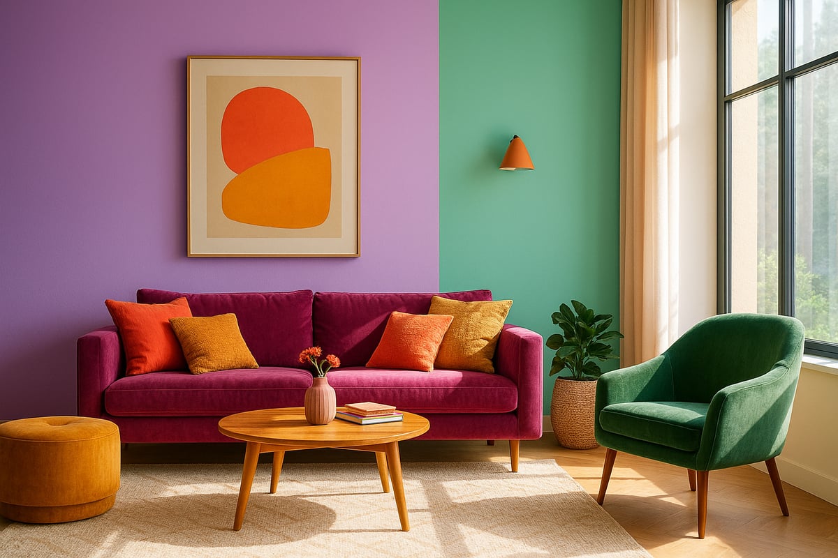
Remember when every interior design and colour trend was about white walls and "timeless" neutrals? Those days are fading fast. In the last ten years, homeowners and designers have started craving more drama and personality.
A 2023 Houzz survey revealed that 70% of designers predicted a move away from all-white interiors. People want living spaces that energise, comfort, or surprise them. This shift means more vibrant hues, daring contrasts, and unexpected accents popping up everywhere.
Why settle for bland when you can have a home that actually makes you smile? The era of "safe" is over. Welcome to the bold new world of interior design and colour.
Influences Shaping Colour Trends
What’s driving this explosion of colour? A cocktail of global events, tech advances, and pop culture. Remember the pandemic? It sparked a craving for comfort, warmth, and a bit of optimism in our homes.
Tech now brings futuristic palettes inspired by digital art and gaming. Meanwhile, social media spreads trends faster than you can say "colour blocking." Pop stars, fashion weeks, and even viral TikToks all play a hand in shaping what’s hot.
Interior design and colour choices are now about more than just looks. They’re a reaction to what’s happening in the world—good, bad, or totally bonkers.
The Science Behind Colour Psychology
Let’s get a bit nerdy. Colours mess with your brain—in a good way. Blue tones? Think calm and focus. Yellows? They spark creativity and joy, according to the American Psychological Association.
Designers are finally tapping into this science to create homes that feel as good as they look. Want to know why bold interiors are linked to happiness? Check out Fearless interiors and happiness at home for a deep dive into the emotional perks of daring design moves.
So, interior design and colour aren’t just about aesthetics. They’re about mood, productivity, and well-being too.
Cultural and Regional Variations
Colour isn’t one-size-fits-all. Across the globe, interior design and colour choices reflect local culture, climate, and tradition.
In Scandinavia and Australia, earthy hues like ochre and terracotta are on the rise, bringing the outdoors in. Meanwhile, bold jewel tones and vibrant patterns are gaining ground in urban UK and US homes.
These regional quirks make the world of interior design and colour endlessly exciting. What’s trendy in Tokyo might be totally different in Stockholm.
Digital Tools and AI in Colour Selection
Gone are the days of guessing what a paint swatch will look like. Now, digital tools and AI make interior design and colour selection a breeze.
Apps let you preview palettes in your actual room. AI predicts what colours will trend next, based on social media and global buying patterns. According to Interior Design Magazine, 40% of designers now use digital visualisation tools to help clients experiment risk-free.
Tech is making colour confidence easier for everyone, not just the pros.
The Rise of Personalisation
The biggest trend in interior design and colour? You. People are ditching cookie-cutter looks for spaces that scream personality.
Custom palettes are the new must-have. Want a sunlit coral kitchen or a digital lavender lounge? Go for it. Designers encourage homeowners to use colour as self-expression, not just decoration.
If you want a home that feels truly yours, interior design and colour trends in 2026 are all about making bold, joyful choices.
2026’s Defining Colour Palettes and Patterns
Ready to ditch those tired neutral walls? Let’s jump into the rainbow pool of 2026 and see what’s making waves in interior design and colour. This year, your home isn’t just a background, it’s the main character. Get ready for palettes and patterns that demand attention, spark joy, and pack personality.
Top Colour Palettes for 2026
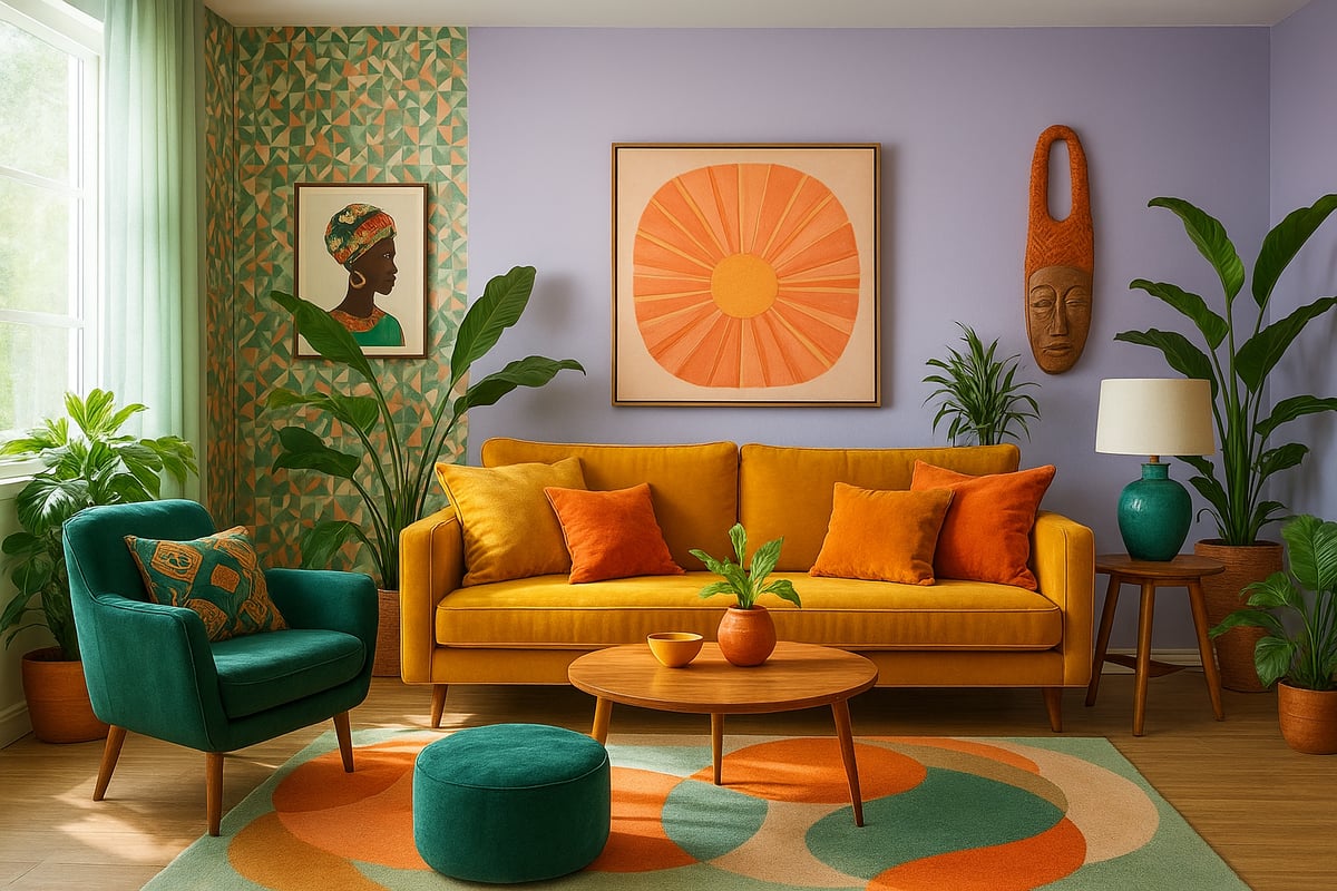
Wave goodbye to beige. The future is all about unapologetic colour. 2026’s star hues include digital lavender, neo mint, sunlit coral, and bold ochres. These shades aren’t just trending, they’re setting the standard for interior design and colour forward spaces.
Here’s how these look in action:
| Room | Main Hue | Accent Shade | Pattern/Finish |
|---|---|---|---|
| Living Room | Digital Lavender | Ochre, Neo Mint | Geometric Wallpaper |
| Bedroom | Neo Mint | Sunlit Coral | Velvet Textiles |
| Kitchen | Sunlit Coral | Digital Lavender | Gloss Cabinets |
Curious what the pros are predicting? Check out the 2026 Interior Color Trends for more bold ideas.
The Resurgence of Pattern and Maximalism
Minimalism had its moment, but maximalism is back, baby. Think oversized florals, punchy stripes, and wallpapers that flirt with your senses. Statista reports a 55% leap in patterned wallpaper sales, proving that interior design and colour are all about making statements.
Want to rebel? Mix patterns with wild abandon. Try animal print cushions with geometric rugs. Layering is your secret weapon. The only rule? If it makes you grin, it belongs.
Harmonising Contrasts: How to Mix Colours Effectively
Let’s face it, balance is everything. You want your interior design and colour choices to feel bold, not bonkers. Enter the 60 30 10 rule: 60% main colour, 30% secondary, 10% wild accent. This keeps things punchy, not chaotic.
- Start with a dominant base.
- Add a supporting hue.
- Finish with a colour that pops.
Pro tip: If you love clashing prints, anchor them with a neutral (but not boring) backdrop. That way, your space feels curated, not clownish.
Texture and Finish: Beyond Flat Colour
Flat walls? Yawn. 2026 is all about touchable surfaces. Mix matte walls with glossy tiles, or throw in velvet furnishings in jewel tones. Texture is the unsung hero of interior design and colour, adding depth and drama.
Picture this: a digital lavender wall, glossy mint tiles, and a velvet ochre sofa. Each finish catches the light differently, creating a layered, luxurious vibe. Don’t be afraid to play—your fingers will thank you.
Nature-Inspired Palettes
Biophilic design is more than a buzzword. It’s a lifestyle. Earthy greens, oceanic blues, and sunlit corals bring the outdoors in. No wonder 68% of homeowners crave nature-inspired interior design and colour, according to Houzz.
Try leafy wallpaper, river stone tiles, or plant filled corners. These palettes make your space feel fresh, alive, and a little bit wild. Who says your living room can’t be a jungle?
Cultural and Social Influences on Patterns
Patterns in 2026 are globetrotters. Afrocentric motifs, Asian inspired prints, and folk patterns are bursting onto the scene. Your interior design and colour scheme can now tell a story about heritage, travel, or even your favourite festival.
This global mashup means more options to express your personality. Whether it’s a bold kimono print or a tribal rug, let your home be your passport to the world.
Future-Proofing Your Colour Choices
Trends are fun, but you don’t want a full repaint every year. The secret to future proof interior design and colour? Invest in adaptable base tones—think digital lavender or deep green—then swap out accents as your mood (or TikTok) changes.
- Choose timeless base colours.
- Use accessories for trend pops.
- Change patterns and cushions seasonally.
This way, your space stays fresh without the faff. Joyful, rebellious, and always ready for what’s next.
Insider Design Principles for a Cohesive Colour Story
If you want your home to sing (or at least not scream), you need more than just a pretty paint chart. Creating a cohesive interior design and colour story is about blending creativity, science, and a dash of rebellion. Let’s break down the secrets that designers use—so you can turn your space into a bold, joyful masterpiece.
The Foundations of Colour Harmony
Let’s start with the basics: the colour wheel. If you’ve ever stared at paint samples until your eyes crossed, you’ve felt the confusion. Luckily, interior design and colour harmony has a cheat sheet. Designers use three main schemes:
| Scheme | Description | Example |
|---|---|---|
| Complementary | Opposites attract | Blue & orange |
| Analogous | Neighbours on the wheel | Blue & green |
| Triadic | Three evenly spaced hues | Red, yellow, blue |
Analogous schemes, like blues and greens, are perfect for creating tranquil bedrooms—think spa retreat, not hospital waiting room. Complementary combos bring energy, while triadic schemes add playful balance. The secret? Stick to one main scheme per space for a truly cohesive interior design and colour vibe.
Creating Flow Between Rooms
Ever walked into a house where each room feels like a different planet? Hard pass. The real magic in interior design and colour is about flow. Carry accent colours from one room to the next, even if the main shades shift. Paint a door frame in your living room’s accent hue, or repeat a bold cushion colour in the hallway rug. This simple trick ties everything together without feeling like a copy-paste job. Consistency is key, but a little surprise keeps things interesting.
Balancing Boldness and Restraint
We all love a punchy wall, but too much and you’ll feel like you’re living inside a bag of Skittles. The golden rule in interior design and colour? Go bold in moderation. Nearly half of designers (47%) say to use statement shades as accents, not the main event. Pick one hero wall, a funky sofa, or a wild rug—and let the rest breathe. Your eyes (and your sanity) will thank you. Think of it as adding chilli to a dish: just enough for a kick, never enough to make you cry.
Lighting’s Impact on Colour
Here’s the tea: lighting changes everything. That gorgeous teal might look lush in the shop, but under your kitchen’s harsh LEDs, it could turn into swamp water. Interior design and colour choices must play nice with both natural and artificial light. South-facing rooms love warm undertones, while cool shades can feel icy in north-facing spaces. Always test your samples in different lights before you commit. If you skip this step, prepare for surprises—and not the good kind.
Layering with Textiles, Art, and Accessories
Accessories are the secret weapon of interior design and colour mastery. Rugs, cushions, throws, and artwork let you introduce or reinforce your palette without commitment issues. Want to shake things up for spring? Swap out your cushions and throws for a seasonal refresh. Here’s a quick cheat sheet:
- Start with a neutral base.
- Add pops of your chosen palette.
- Layer in art or patterned textiles for personality.
It’s like accessorising an outfit: you wouldn’t wear all your jewellery at once, but a statement piece or two makes you shine.
Mistakes to Avoid in Colour Design
Even rebels make mistakes. Avoid these classic blunders in interior design and colour:
- Clashing hues that fight for attention.
- Ignoring undertones (that beige might be pinker than you think).
- Trend overload—don’t let Instagram dictate every choice.
- Skipping sample testing (always try before you buy).
- Changing everything at once—gradual updates are your friend.
The best interiors are confident, not chaotic. Trust your instincts, but don’t skip the planning.
The Colour Rebel Studio: Empowering Confident Colour Choices
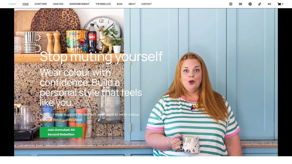
Feeling overwhelmed? Sometimes you need a wingwoman. The Colour Rebel Studio specialises in helping you embrace bold interior design and colour choices with confidence. Whether you want a bespoke consultation, maximalist surface pattern design, or licensing options, Jodie’s team is all about joyful, personality-packed solutions. If you’re ready to ditch beige and live in technicolour, check out their Interiors colour consultation services for expert guidance that feels like a pep talk, not a lecture.
A cohesive colour story is possible for every home. All it takes is a little know-how, a bit of bravery, and the right partner in (colourful) crime.
Sustainable and Ethical Colour Design Innovations
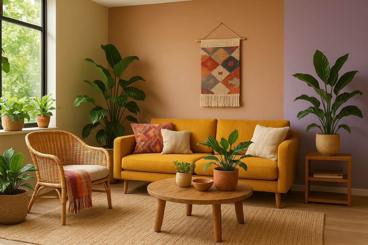
Ready to ditch beige guilt and give your home a conscience? You can rebel against boring interiors and do good for the planet. Sustainable and ethical choices are shaking up the interior design and colour world, proving style and responsibility can go hand in hand.
Eco-Friendly Paints and Materials
Let’s talk paint. Not all tins are created equal. Low-VOC, plant-based, and recycled paint options are now flooding the market, making it easier than ever to keep your air clean and your conscience clear. Major paint brands have jumped aboard the green train, launching sustainable lines in 2025.
Here’s a quick cheat sheet for eco paint choices:
| Paint Type | Benefits | Drawback |
|---|---|---|
| Low-VOC | Better air quality | Sometimes pricier |
| Plant-based | Renewable ingredients | Fewer colour options |
| Recycled | Reduces landfill waste | Limited availability |
Curious about which shades are leading the eco revolution? The 2026 Color Forecast highlights the balance of technology-inspired and nature-inspired tones dominating interior design and colour this year.
Ethical Sourcing of Colourful Decor
It’s not just what you put on your walls, but what you drape, toss, and hang that matters. Fair-trade textiles and artisan-crafted patterns are stealing the spotlight in interior design and colour. Statista says 35% of consumers now consider ethical sourcing when shopping for home goodies.
Why settle for mass-produced blandness when you can have handwoven joy? Look for certifications or buy direct from makers. Your sofa cushions can tell a story, not just hold your snacks.
Upcycling and Repurposing with Colour
Upcycling is the new black in interior design and colour. Got a tired chair or a chipped table? Slap on some bold, eco-friendly paint or reupholster with vivid, sustainable fabrics. Suddenly, you’ve got a showstopper that’s as unique as you are.
Some upcycling ideas to try:
- Paint mismatched dining chairs in trending hues.
- Recover an old ottoman with a funky, recycled fabric.
- Stencil a geometric pattern on a rescued chest of drawers.
You’ll save cash, save the planet, and create something no one else has.
The Role of Technology in Reducing Waste
Tech isn’t just for smart fridges. Digital sampling and virtual staging tools are now essentials in interior design and colour. Augmented reality apps let you see exactly how a colour or pattern will look before you buy, so you won’t end up with a pile of regret in the garage.
Less waste, less impulse buying, and more confidence in your choices. Who knew your phone could help save the world, one wall at a time?
Supporting Local and Independent Makers
Want a home that feels truly yours? Support local and independent makers. Collaborating with neighbourhood artists for custom murals or choosing small-batch paint and homewares means your space gets a dose of personality, and your money goes to real people, not faceless corporations.
Plus, locally made products often have a lower carbon footprint. It’s a win for you, your community, and the planet.
Longevity and Durability in Colour Choices
Let’s get real: trends come and go, but no one wants to repaint every year. When planning your interior design and colour scheme, opt for washable paints and fade-resistant fabrics. These choices keep your space looking fresh, no matter how many wild dinner parties or toddler tantrums roll through.
Future-proofing isn’t boring, it’s clever rebellion. You’ll keep your interiors vibrant and your conscience clear for years to come.
Step-by-Step Guide: Transforming Your Space with 2026’s Colour Trends
Ready to break up with boring beige and start your interior design and colour rebellion? Here’s your no-nonsense, joy-packed guide to transforming any space using 2026’s boldest trends. No more playing it safe—let’s paint outside the lines and make your home the talk of the timeline.
Step 1: Assess Your Current Space and Lighting
Before you splash wild colours everywhere, take a rebellious pause. Look at your current interior design and colour scheme. What’s working? What’s so 2022 it hurts?
Check your natural light—are you basking or brooding? South-facing rooms love warm tones, while north-facing ones might need a boost of sunny coral. Don’t forget to clock architectural features: quirky alcoves, high ceilings, or that awkward radiator can all be opportunities for colour drama.
Grab this quick checklist:
- Walk each room at different times of day.
- Note sunlight patterns and shadowy corners.
- List existing colours and finishes (walls, floors, furniture).
- Identify design elements you want to highlight or hide.
A sharp assessment now means your future interior design and colour choices will sing, not clash.
Step 2: Define Your Colour Vision and Goals
Now, time to dream big. What do you want your space to feel like? Zen retreat, creative studio, or party central? Setting intentions is the rebel move that separates “meh” from “marvellous.”
Think about mood, function, and your personal style. Want calm? Lean into blues and greens. Crave energy? Go for bold ochres or sunlit coral. Remember, your interior design and colour plan should reflect who you are, not what the neighbours expect.
Jot down words that describe your vision. Then, match them with colour families that deliver those vibes. This step is all about you, so own it.
Step 3: Curate Your Palette and Patterns
Here comes the fun bit: picking your colours and patterns. For 2026, digital lavender, neo-mint, sunlit coral, and ochre are stealing the spotlight. But don’t just copy—curate.
Start with a primary hue (think: walls), then layer in supporting shades and pops of pattern. Use the 60-30-10 rule for balance: 60% main colour, 30% secondary, and 10% wild-card accent. Want more help? Check out How to choose the right colour scheme for a step-by-step breakdown.
Patterns are back, so don’t shy away from bold wallpaper or graphic rugs. Just keep the palette tight for cohesion. Your interior design and colour choices should always feel deliberate, never random.
Step 4: Test Samples and Visualise the Outcome
Don’t trust a paint chip or a phone screen. Rebels test in real life. Grab paint and fabric swatches, and stick them up in your space. Look at them under morning, midday, and evening light.
Use digital tools or apps to visualise the whole room before you commit. If you’re a maximalist, test patterns together to see if they clash or complement.
Take your time. Testing is the secret sauce in interior design and colour transformation. You’ll thank yourself when your lavender isn’t suddenly lilac in the wrong light.
Step 5: Implement with Paint, Furnishings, and Accessories
Ready, steady, paint! Start with your walls, then move on to textiles and décor. For instant impact, create a statement wall or add bold patterned cushions.
When layering, mix textures—velvet, gloss, matte, you name it. This adds depth and keeps your interior design and colour story from falling flat.
Pro tip: Don’t try to do it all in a day. Work in stages. Stand back after each change and admire your handiwork. Sometimes a single ochre chair can transform a room.
Step 6: Layer and Personalise
This is where the magic happens. Bring in art, plants, and those quirky treasures that scream “you.” Want inspiration? Peek at Make your home pop with personality for ideas to dial up the joy.
Layering isn’t just about stuff—it’s about storytelling. Use your interior design and colour scheme as a canvas for memories, passions, and cheeky surprises.
Switch out accessories seasonally or whenever the mood strikes. There’s no rulebook, only rebellion.
Step 7: Maintain and Refresh Over Time
Trends change, life happens, and sometimes you spill coffee on your coral rug. Keep your space fresh with easy updates. Rotate cushions, swap art, or repaint a single wall for a quick mood shift.
Use washable paints and durable fabrics so your interior design and colour choices survive the chaos of real life. Schedule a seasonal refresh—think of it as a spa day for your home.
Remember, your space should grow with you. Stay bold, stay brave, and never settle for neutral.
Ready to ditch the bland and let your home actually look like you live there? You’ve seen how 2026’s colour trends are about confidence, personality, and a little playful rebellion. If you’re itching for more than just another “safe” beige, you’re in the right place. Let’s flood your inbox with daily bursts of colour confidence and rebel style inspo—because nobody ever said, “Wow, I love how muted your life is.” Go on, get bold. Sign up for daily colour confidence + rebel style inspo
0 comments