

Stepping into interior design can feel like standing at the edge of a swimming pool, wondering whether to dip a toe or cannonball straight in. Most people choose the toe. They paint one wall grey, add a "statement" cushion in slightly darker grey, and call it daring. But here's the thing: diving into interior colour doesn't require perfection or a design degree. It requires permission to mess up, experiment, and remember that paint is reversible. Your home should make you smile when you walk through the door, not fade into the background like elevator music.
Why Going Into Interior Design Starts With Colour Psychology
When you're moving into interior transformations, understanding colour psychology saves you from expensive mistakes. It's not about memorizing rules. It's about recognizing that colours genuinely affect your mood, energy, and even how quickly you want to leave a room.
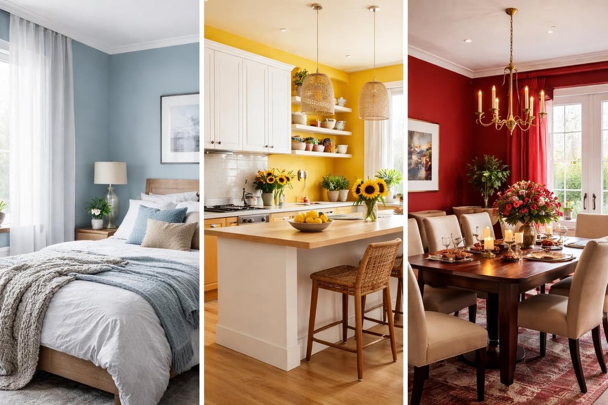
The psychology of colour shows us that blues calm the nervous system, yellows boost creativity, and reds increase energy levels. Before you choose a colour for any room, ask yourself: what do I want to feel here? Relaxed? Energized? Focused?
Here's what different colour families actually do:
- Blues and greens: Lower blood pressure, reduce anxiety, create calm
- Yellows and oranges: Stimulate conversation, boost mood, encourage creativity
- Reds and pinks: Increase energy, stimulate appetite, create warmth
- Purples: Inspire luxury, spirituality, and introspection
- Neutrals with warm undertones: Provide grounding without draining personality
The mistake people make when diving into interior colour is treating every room the same. Your bedroom needs different energy than your kitchen. Your home office shouldn't feel like your living room. When choosing the right colour scheme for any room, think function first, aesthetics second.
The Actual Formula for Selecting Room Colours
Stop scrolling Pinterest hoping the perfect colour will announce itself. Use this instead:
- Identify the room's purpose (sleep, work, socialize, cook)
- Note the natural light (north-facing rooms need warm tones, south-facing can handle cool)
- Consider existing fixed elements (flooring, countertops, built-ins you can't change)
- Choose your dominant colour (60% of the room)
- Select your secondary colour (30% of the room)
- Pick your accent colour (10% for personality pops)
This 60-30-10 rule isn't creative prison. It's scaffolding that prevents your fearless choices from becoming chaotic ones.
Breaking Into Interior Trends Without Losing Yourself
Every year brings new trends. Right now, we're seeing butter-yellow walls making a comeback and kitchen colours shifting away from stark whites toward more nuanced tones. Trends are useful research, not commandments.
The problem with jumping into interior trends blindly is you end up with a home that looks like a catalogue but feels like a hotel. Your space should reflect your personality, not a mood board from 2026.
| Trend Element | How to Use It | How to Skip It |
|---|---|---|
| Slipper chairs | Add one in your bedroom reading nook | Don't buy six just because they're trending |
| Textured rugs | Layer for sensory richness in bedrooms | Avoid if you prefer minimal, clean floors |
| Colorful islands | Paint your existing island | Don't renovate your entire kitchen |
| Antique mirrors | Source one statement piece for your entryway | Skip the full vintage overhaul |
The vintage slipper chair trend works beautifully in small spaces, but only if you actually need seating. The 'texture-maxxing' bedroom flooring trend adds sensory depth, but not if you hate the feeling of rugs underfoot.
When you're moving into interior updates, cherry-pick what genuinely improves your daily life. Everything else is noise.
How to Test Colours Before Commitment
Sample pots exist for a reason. Buy them. Use them. Paint large squares on multiple walls. Live with them for at least a week before deciding.
Here's what most people miss: colours change dramatically throughout the day. That sage green that looks perfect at noon might turn muddy at 4pm when the light shifts. Your gorgeous navy might look black at night under artificial lighting.
Testing checklist:
- Paint samples at eye level, not near the floor
- View them in morning, afternoon, and evening light
- Check them under your actual light bulbs (warm vs cool makes a massive difference)
- Look at them alongside your existing furniture and fabrics
- Live with them for at least seven days
If you're stuck on interior design choices, simplifying your decision-making process starts with eliminating options that don't pass the week-long test.
Making Bold Moves When Diving Into Interior Colour
Going into interior design with bold colour requires calculated risk, not recklessness. The difference between a space that feels confidently vibrant and one that feels like a circus tent comes down to intention.
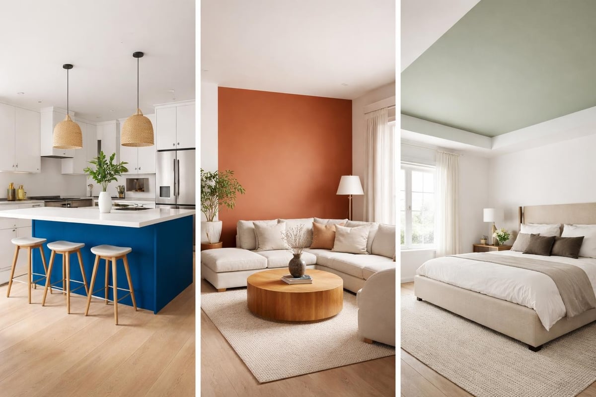
Bold doesn't mean bright everywhere. It means thoughtful colour placement that creates impact without overwhelm. Think Jennifer Flavin Stallone's powder blue kitchen island, which proves that one saturated element in a neutral space creates maximum impact.
Where to go bold without regret:
- One feature wall in a room with three neutral walls
- All kitchen cabinets in a single colour (commit fully or don't bother)
- Ceiling colour (the most underused surface in any room)
- Built-in shelving painted in contrast to wall colour
- Furniture pieces that can move with you
Where professional renovation services like Kreeative Renovations & Design Co. excel is executing bold colour choices with precision, especially when you're dealing with built-ins, cabinetry, or structural elements that need expert craftsmanship.
The Colour Combinations That Actually Work
Forget the colour wheel you learned in school. Real-world colour pairing is simpler and more forgiving than design theory suggests.
Foolproof combinations for any room:
- Warm neutral + saturated jewel tone (cream walls + emerald sofa)
- Cool neutral + warm accent (grey walls + terracotta accessories)
- Monochromatic with texture variation (all blues from navy to sky, different materials)
- Nature-inspired trio (sage + terracotta + cream)
- Complementary contrast (teal + coral, purple + yellow)
The secret to making your home pop with personality isn't finding rare colours. It's using common colours uncommonly well.
When stepping into interior colour combinations, match the intensity of your colours. Pair pastels with pastels, saturated with saturated. Mixing intensity levels creates visual confusion, not interest.
Bringing Pattern Into Interior Spaces
Solid colours are the foundation. Patterns are the personality. When you're going into interior pattern mixing, start small and build confidence.
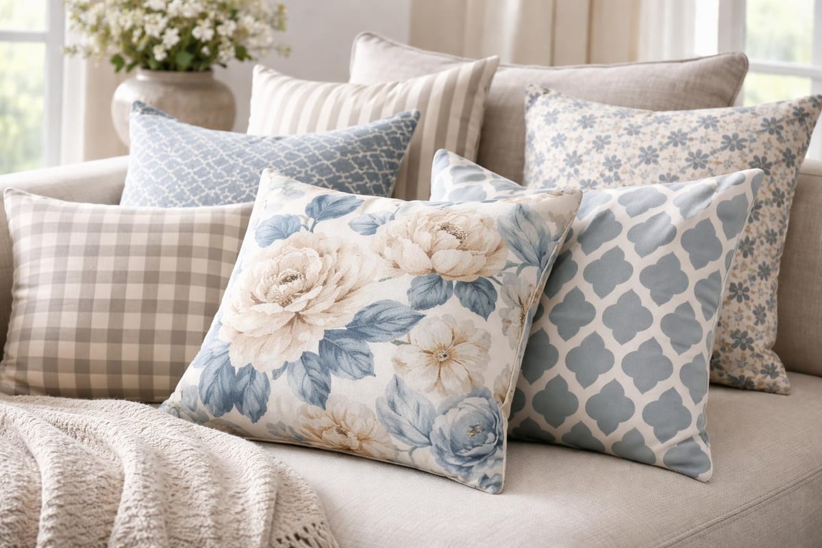
The maximalist approach to pattern doesn't mean visual chaos. It means layering multiple patterns that share a colour story. Your florals, geometrics, and stripes can coexist peacefully if they speak the same colour language.
Pattern mixing hierarchy:
- Large-scale pattern: Your statement (big florals, dramatic geometrics)
- Medium-scale pattern: Your support act (mid-sized prints, moderate stripes)
- Small-scale pattern: Your texture (tiny dots, fine checks, subtle weaves)
Start with cushions, rugs, and curtains. These are the easiest places to experiment when moving into interior pattern work because they're changeable and don't require renovation.
Where Beginners Get Pattern Wrong
They match too perfectly. Everything becomes "coordinated" in that suffocating, showroom way. Real homes layer patterns with slight tension, not perfect harmony.
Or they panic and choose one tiny patterned cushion in a sea of solids, which creates awkwardness rather than interest. Go bigger or go home.
| Pattern Type | Best Use | Avoid Using |
|---|---|---|
| Large florals | Feature wall, curtains, large rug | Small cushions (looks chopped up) |
| Geometric | Accent wall, bedding, upholstery | Entire room (too intense) |
| Stripes | Curtains, runners, smaller rugs | Large furniture (hard to style around) |
| Small prints | Cushions, lampshades, accessories | Large surfaces (reads as texture, not pattern) |
When fearless interiors become the key to feeling happier at home, pattern plays a starring role alongside colour. They're partners, not competitors.
The Practical Side of Going Into Interior Colour
Let's talk logistics. Beautiful ideas fail without proper execution.
Paint quality matters more than you think:
- Cheap paint: Requires three coats, fades quickly, looks patchy
- Mid-range paint: Covers in two coats, lasts reasonably well
- Premium paint: One-coat coverage, depth of colour, longevity
Budget for premium paint on walls you'll see daily. Save mid-range for closets and storage rooms. Never use cheap paint anywhere visible.
Preparation determines outcome. Clean walls, fill holes, sand rough patches, prime if changing from dark to light or covering stains. Skip these steps and even expensive paint looks amateur.
Working With What You've Got
Not everyone gets to start fresh. Most people are moving into interior updates around existing elements: rental restrictions, fixed flooring, inherited furniture, limited budgets.
This is where colour becomes your superpower. Can't change your beige carpet? Add a boldly coloured rug on top. Stuck with oak cabinets? Paint walls in a complementary colour that makes the wood look intentional. Boring tiles? Embrace them as neutral and go wild with everything else.
Budget-friendly colour impact:
- Paint is cheapest (£30 transforms a room)
- Removable wallpaper comes next (£50-100 per wall)
- Large textiles follow (£100-200 for curtains or rugs)
- Furniture painting ranks medium (£50 paint + time)
- New furniture costs most (save this for last)
The transformation from drab to fab through colour makeovers rarely requires massive budgets. It requires strategic thinking about where colour creates maximum impact.
Living With Your Colour Choices
Here's what nobody tells you about going into interior colour: you'll second-guess yourself. That coral you loved in the shop might feel too intense on day three. That navy might seem too dark on day five.
Sit with it for at least two weeks before changing anything. Our brains need time to adjust to new visual input. What feels shocking on Monday often feels perfect by the following weekend.
Signs your colour choice is actually wrong:
- It makes you avoid the room
- You feel physically tense when you're in the space
- You're already mentally repainting it within hours
- Everyone who visits asks "why did you choose that?"
- The colour clashes violently with fixed elements you can't change
Signs you're just adjusting:
- You notice it more than you expected (normal)
- It feels different than the sample (light always changes colour)
- Your partner needs convincing (give them two weeks too)
- It's bolder than your previous choice (your eyes need to recalibrate)
Most colour "mistakes" are actually adjustment periods. Genuine mistakes feel wrong in your gut immediately and consistently.
Maintaining Your Colourful Space
Bright colours show dirt faster than neutrals. Fact. Dark colours show dust more than mid-tones. Also fact.
This doesn't mean avoid them. It means clean more intentionally. That yellow wall needs washing twice yearly. That navy ceiling needs dusting monthly. The terracotta tiles need mopping weekly.
Factor maintenance into your colour decisions. If you're not willing to wipe down surfaces regularly, skip the pale colours. If you won't dust frequently, avoid the dark ceilings.
Building Colour Confidence Room by Room
Start where you spend least time. Not your living room. Not your bedroom. Try the downstairs bathroom, the hallway, or the home office.
These spaces let you experiment with lower stakes. Nobody lingers in hallways. Few people judge your bathroom colour choices. Your home office is yours alone.
Success in small spaces builds confidence for bigger rooms. Paint your hallway ceiling pink. If you love it, maybe your bedroom ceiling follows. Paint your bathroom cabinets teal. If it works, perhaps your kitchen goes next.
Room-by-room colour courage:
- Powder room: Go wild (people spend three minutes here)
- Hallway: Test bold walls (you pass through, not linger)
- Home office: Experiment freely (it's your productivity space)
- Kitchen: Commit to cabinets or island (massive impact)
- Living room: Layer colour through furniture and textiles first
- Bedroom: Start with one feature wall or painted ceiling
- Kids' rooms: Let them choose (they live there)
When you're genuinely ready to dive into interior transformations across your whole home, the journey becomes addictive. Each successful colour choice builds momentum for the next.
Beyond Paint: Where Else Colour Lives
Walls matter, but they're not everything. When stepping into interior colour comprehensively, think surfaces, textiles, furniture, lighting, and accessories.
The full colour toolkit:
- Walls and ceilings: Your backdrop
- Flooring: Your foundation (rugs count)
- Window treatments: Your frame
- Upholstered furniture: Your commitment pieces
- Painted furniture: Your flexibility option
- Textiles: Your layering (cushions, throws, bedding)
- Artwork: Your personality injection
- Lighting fixtures: Your sculptural colour
- Plants: Your living colour (yes, green counts)
The most successful colourful interiors use at least five of these elements simultaneously. One coloured wall doesn't create a colourful room. A coloured wall plus colourful curtains plus colourful furniture plus colourful accessories creates immersion.
Think of colour application like cooking. One ingredient doesn't make a meal. Multiple ingredients, properly combined, create something memorable.
Technology's Role in Modern Colour Selection
Apps now let you visualize paint colours on your actual walls through augmented reality. Room planners help you arrange furniture digitally before buying. Smart home integration means your lighting adjusts to enhance your colour choices throughout the day.
Use these tools, but don't worship them. They're helpful approximations, not gospel truth. Your phone screen doesn't accurately represent how paint looks in real life. The lighting in the app doesn't match your actual windows.
Technology assists decision-making. It doesn't replace physical samples, natural light testing, and living with colours before committing.
When to Call in Professional Help
Some colour decisions benefit from expert input. Not because you're incapable, but because trained eyes see things differently.
A colour consultant identifies undertones you'd miss, creates cohesive schemes across multiple rooms, and prevents expensive mistakes before they happen. They understand how architectural features interact with colour, how light affects choices, and which trends will age well versus those that'll date quickly.
When DIY becomes limiting:
- You've repainted three times and still hate it
- You're working with difficult architectural features
- You're renovating and choosing multiple finishes simultaneously
- Your partner disagrees on every colour (mediators help)
- You want a whole-house cohesive scheme
- You're paralyzed by choice and can't move forward
Professional guidance accelerates the process and often saves money by preventing do-overs. One consultation can replace months of indecision and multiple paint purchases.
Stepping into interior colour transformation isn't about perfection or following every trend that surfaces on social media. It's about creating spaces that genuinely reflect who you are, boost your mood, and make coming home feel like wrapping yourself in your favourite jumper. If you're ready to stop living in beige and start experiencing the joy that bold, intentional colour brings to your daily life, The Colour Rebel offers bespoke colour consultancy that turns colour confusion into confident, personality-packed spaces that actually feel like you.
0 comments