

Colour is about to take over your world. In 2026, the pattern of colours is more than just a buzzword—it’s the secret sauce transforming design, fashion, and tech from bland to bold.
Walk into any space, scroll through your favourite app, or shop online, and you’ll see it: colour patterns are shaping what we buy, how we live, and how we express ourselves. Want to stay one step ahead of the crowd? Knowing what’s next in the pattern of colours will make your creative work, personal style, and interiors stand out for all the right reasons.
Ready to rebel against the beige? This guide spills the expert secrets, trend forecasts, and hands-on tips you need to master the pattern of colours in 2026. Let’s paint your world with confidence.
Understanding Colour Patterns: The Essentials for 2026
Curious about why everyone’s obsessed with the pattern of colours lately? It’s not just a design phase or a TikTok trend—this is the secret sauce behind everything eye-catching in 2026. Whether you’re revamping your wardrobe, refreshing your flat, or building a brand that stands out, knowing how to wield a pattern of colours is like having a superpower. Ready to become a colour rebel? Let’s break it down.
Defining “Pattern of Colours” in Modern Design
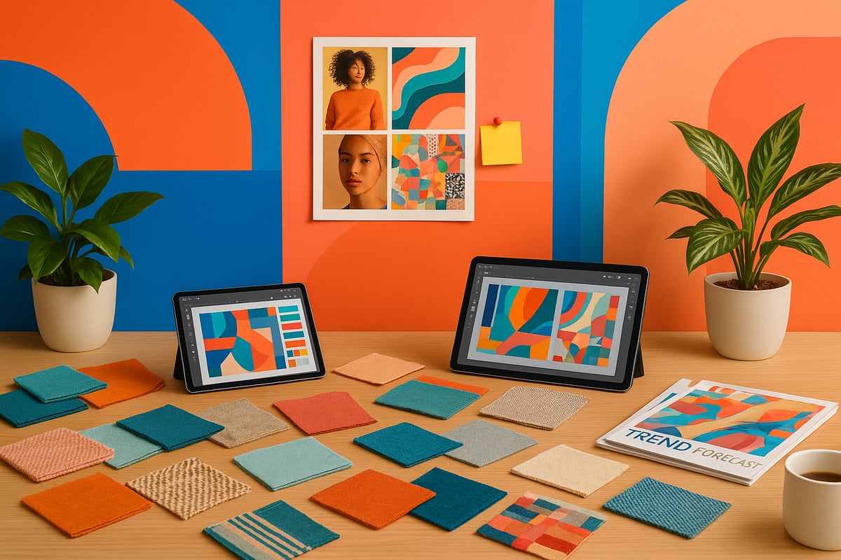
So, what actually counts as a pattern of colours in 2026? It’s more than just picking a few pretty shades and hoping for the best. A pattern of colours is a deliberate, repeated arrangement of hues and motifs that tells a visual story. Unlike a palette (which is just a set of colours) or a colour scheme (which is how those colours work together), a pattern of colours combines both, adding rhythm, movement, and personality to any surface or screen.
Designers use patterns of colours to create moods, build brand identities, and make us feel at home—or shake things up. From digital backgrounds to statement wallpaper, the pattern of colours is the rebel’s tool for making spaces and products unforgettable.
The Psychology Behind Colour Combinations
Ever wondered why a certain pattern of colours makes you feel energised, relaxed, or suddenly desperate to hit “buy now”? That’s the magic of colour psychology. When colours mix in a pattern, they trigger emotions and behaviours—sometimes without us even realising.
Studies show that warm, saturated patterns of colours can spark excitement and boost creativity, while cooler, more muted patterns calm the mind. Marketers love this: one recent study found that 85% of shoppers cite colour as the main reason for choosing a product. The right pattern of colours isn’t just a vibe, it’s a science-backed way to influence everything from mood to money.
Key Elements of a Modern Colour Pattern
What makes a pattern of colours feel fresh in 2026? It’s all about repetition, rhythm, and a cheeky bit of contrast. Patterns that work well have motifs that repeat just enough to be satisfying, but not so much they feel flat. Rhythm keeps your eye moving, while contrast—think bold against neutral—adds drama.
Scale and proportion are your secret weapons. Go big for a statement wall or keep it tight for subtlety. And don’t forget context: a pattern of colours that rocks on a dress might flop on a website. Here’s a quick cheat sheet:
| Element | Why It Matters | 2026 Tip |
|---|---|---|
| Repetition | Creates cohesion | Vary motifs for depth |
| Rhythm | Guides the eye | Mix large and small |
| Contrast | Adds energy | Pair bold with muted |
| Scale | Sets the mood | Oversized is in |
| Context | Ensures harmony | Match space & purpose |
A modern pattern of colours is never boring—think of it as music for your eyes.
Historical Context & Evolution to 2026
Patterns of colours have always been a rebellious streak in history—from Art Deco’s glitz to 90s rave. Each decade, artists and designers pushed boundaries, mixing influences from street style, pop culture, and tech. Fast forward to 2026 and we’re seeing a wild blend: digital tools let creatives remix vintage patterns with futuristic flair.
The biggest shift? Colour trends are moving faster than ever. Thanks to globalisation and social media, a pattern of colours born in Tokyo can end up on London catwalks by next week. And with Pantone naming “Cloud Dancer” as the 2026 Color of the Year, expect to see this ethereal shade popping up everywhere, proving how quickly a single colour can shape the next big pattern. Pantone's 2026 Color of the Year
The Impact of Technology on Colour Pattern Trends
Let’s be honest: tech is changing everything, even the pattern of colours. AI can now whip up custom patterns in seconds, predicting what you’ll love before you even know it. Digital tools let designers visualise patterns instantly, swap colours, and test how they’ll look in real life—no more guessing or waiting for paint to dry.
Personalisation is the new normal. Want a pattern of colours that matches your mood, your playlist, or your star sign? There’s an app for that. Generative design means everyone can be a pattern rebel, remixing classics or inventing their own. The future? It’s bold, bright, and totally bespoke.
2026 Colour Pattern Trends Across Industries
Ready to rebel against beige? Let’s dive into the wild, colourful playground that is 2026. The pattern of colours is shaking up every industry, from your living room cushions to the city skyline. We’re talking bold choices, personality-packed spaces, and tech-driven designs. If you want to know what’s hot (and what’s not) in the pattern of colours, you’re in the right place.
Interior Design: Patterns for Modern Living Spaces
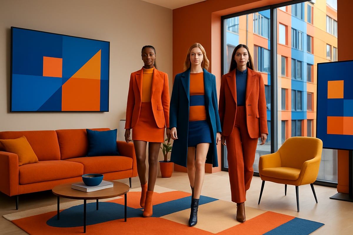
Interior design in 2026 is anything but shy. The pattern of colours is splashed across walls, textiles, and even furniture legs. Maximalist patterns are making a comeback—think oversized florals, geometric mashups, and wild animal prints. Yet, the minimalist crowd is not left out, as crisp, repetitive motifs in calming palettes offer a soothing counterpoint.
Recent data shows that 60% of homeowners are now mixing patterns and colours, compared to just 35% in 2022. Design houses like Studio Rebel and Colour Collective are leading the charge, blending nostalgia with futuristic twists. The right pattern of colours can transform a room from bland to bold in seconds.
Fashion: Patterns Dominating the Runway
The runway is a riot of energy, with the pattern of colours leading the parade. For 2026, digital brights and earthy tones are clashing in the best way possible. Expect to see neon blues paired with terracotta, and upcycled fabrics stitched into patchwork masterpieces.
Sustainability is queen, so recycled prints and dye techniques are all the rage. Fashion week reports reveal that designers are rebelling against plain, instead layering patterns for maximum drama. Want to master the art yourself? Check out Mastering Colour and Pattern Pairing for tips on bringing the runway’s pattern of colours into your own wardrobe.
Graphic & Digital Design: Web, Branding, and UI
Digital spaces are ditching the dull. The pattern of colours is alive on screens, with gradients, duotones, and animated motifs stealing the spotlight. Websites and app interfaces in 2026 are designed to dazzle, using bold, interactive patterns to keep users hooked.
Animated backgrounds and shape-shifting patterns are boosting brand engagement by up to 30%. Designers are balancing contrast and rhythm, making sure every scroll feels fresh. The pattern of colours is not just decoration—it’s a digital handshake, a brand’s first impression, and a reason users remember you.
Product & Packaging: Attracting the 2026 Consumer
Walk down any shop aisle and you’ll see it—the pattern of colours practically jumping off the shelves. From tech gadgets to cosmetics, packaging is bolder and more playful than ever. Brands are using vibrant, layered patterns to stand out in a sea of sameness.
A recent survey found that 70% of consumers are more likely to buy a product with a unique pattern of colours on its packaging. FMCG giants and indie brands alike are embracing this trend, using patterns to tell stories and build loyalty. The right pattern of colours can turn a ‘maybe’ into a ‘must-have’.
Architecture & Public Spaces: Urban Colour Patterns
Cities are getting a much-needed dose of personality. The pattern of colours is transforming public spaces, making urban life brighter and more inviting. Think murals that sprawl across buildings, patterned walkways, and interactive installations.
Data from major cities shows that people feel happier and safer in colourful environments. Projects in places like Tokyo, Cape Town, and São Paulo are proof that bold patterns foster community pride. The pattern of colours is not just about aesthetics—it’s about shaping how we feel in our shared spaces.
Cultural & Regional Influences on Pattern of Colours
No industry trend exists in a vacuum. The pattern of colours is deeply influenced by culture and region. Asian motifs, African textiles, and Latin American palettes are setting the global tone for 2026. Designers are borrowing, blending, and celebrating these traditions.
Regional palettes like Japanese indigo, Moroccan ochre, and Brazilian lime are making waves internationally. The pattern of colours connects us, sparking inspiration and collaboration across continents. Embracing these influences is the ultimate rebellion against boring, one-size-fits-all design.
Step-by-Step Guide: Creating Your Own Colour Pattern for 2026
Ready to rebel against beige and make your mark with a bold pattern of colours in 2026? Here’s your sassy, no-nonsense roadmap. Each step is designed to help you unleash your creative confidence, whether you’re jazzing up interiors, personal style, or digital spaces. Let’s dive in, shall we?
Step 1: Research and Inspiration
Every legendary pattern of colours starts with a spark. So, where do you find yours? Start with a deep dive into your favourite sources—nature’s jaw-dropping sunsets, bold artwork, or even digital landscapes. Get out, get inspired, and snap photos of anything that makes your heart skip a beat.
- Scroll through Instagram and Pinterest for global trends.
- Explore art galleries and design museums.
- Use AI tools to generate fresh pattern ideas.
Feeling stuck? The Pattern Playbook for Creative Inspiration is your secret weapon for jumpstarting creativity and keeping your finger on the pulse of what’s next. Remember, your pattern of colours should reflect your unique energy.
Step 2: Choosing Your Colour Palette
Now, let’s talk palettes. Picking the right mix is crucial for your pattern of colours to sing, not scream. Start with colour theory basics—think about complementary, analogous, and triadic combos. Use digital tools like Adobe Color or Pantone’s online guides to refine your selection.
- Test out trending shades for 2026.
- Play with both vibrant and muted tones.
- Don’t forget to add a wildcard colour for flair.
Your palette is the backbone of your pattern of colours, so choose hues that tell your story and set the mood you want.
Step 3: Developing the Pattern Structure
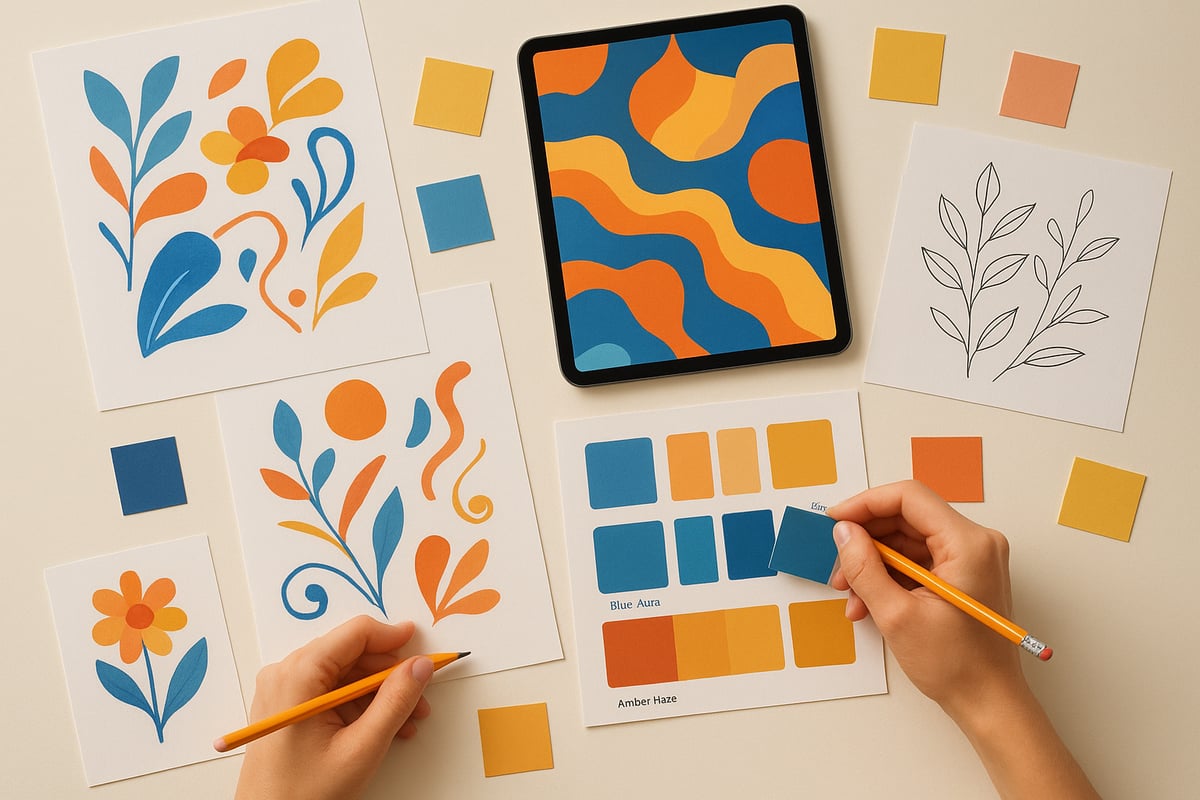
Here’s where your pattern of colours gets its groove. Decide on a motif—is it geometric, organic, or something entirely rebellious? Sketch out your ideas on paper, then move to digital prototyping for precision.
- Choose your base shape or icon.
- Experiment with repetition and rhythm.
- Adjust the scale for visual interest.
Remember, the structure should enhance your pattern of colours, not overwhelm it. Keep it punchy, memorable, and unmistakably you.
Step 4: Testing and Refinement
You’ve created a pattern of colours, but is it ready for the spotlight? Time to test! Share your draft with a mate, a client, or your online community. Honest feedback is gold.
- Ask for gut reactions—does it spark joy or confusion?
- Tweak the contrast and spacing.
- Run A/B tests if using the pattern digitally.
Refinement transforms a good pattern of colours into a showstopper. Don’t be precious—be ruthless in pursuit of brilliance.
Step 5: Application and Adaptation
A killer pattern of colours is nothing if it doesn’t work in real life. Adapt your design for every medium you fancy—print, digital, textiles, or even wallpaper. Each surface brings its own quirks.
- Test colours in different lighting.
- Ensure legibility and visual harmony.
- Make sure your pattern of colours is accessible to all.
Balance is key. Let your pattern of colours stand out without causing visual chaos—think statement, not sensory overload.
Step 6: Staying Ahead with Trend Forecasting
Want your pattern of colours to stay fresh in 2026 and beyond? Get obsessed with trend forecasting. Subscribe to colour trend platforms, and join design communities where the rebels hang out.
- Read industry reports and forecasts.
- Attend creative events and seminars.
- Collaborate with other pattern pioneers.
Keep your pattern of colours ahead of the curve. The goal? Create designs that set the trends, not chase them.
Step 7: Licensing and Protecting Your Pattern
You’ve crafted a signature pattern of colours—now protect it! Understand copyright basics and explore licensing options to keep your creative genius safe.
- Register your design where possible.
- Use platforms to sell or license your pattern.
- Know your rights before sharing with brands.
A protected pattern of colours isn’t just smart—it’s pure creative rebellion. Make sure your work gets the recognition (and royalties) it deserves.
Expert Insights: What the Pros Predict for 2026
Ready for a peek behind the velvet curtain? The experts have spoken, and their predictions for the pattern of colours in 2026 are anything but beige. If you want to stay ahead of the curve, you’ll need to know what the pros see on the horizon, from colour consultants to data crunchers and AI rebels.
Interviews with Leading Colour Consultants
What’s the word from those who practically live inside a Pantone fan deck? Top colour consultants say the pattern of colours for 2026 is all about confident contrasts and unexpected harmony. According to renowned consultant Jamie Rowe, “Clients are craving colour stories that reflect optimism and resilience.”
Designers are mixing digital brights with earthy neutrals, creating playful yet grounded palettes. Experts agree: storytelling is the backbone of every successful pattern of colours. Want to make a statement? Choose combinations that challenge the status quo, but keep one foot in reality.
Data-Driven Forecasts from Design Institutes
Numbers don’t lie, darling. The latest reports from global design institutes reveal a surge in bold, layered patterns—think Blue Aura, Amber Haze, and even playful digital gradients. These trends are backed by real consumer data and industry analysis.
If you’re curious about the specifics, you’ll find a comprehensive breakdown of 2026’s most influential palettes in the 2026 Interior Color Trends report. The pattern of colours is shifting toward immersive experiences that are both visually stimulating and emotionally comforting.
Sustainability and Ethical Colour Patterning
Eco is the new black. As we march into 2026, the pattern of colours isn’t just about looking good—it’s about doing good. Experts highlight the rise of plant-based dyes, recycled materials, and ethical production methods.
Brands are discovering that a sustainable pattern of colours attracts conscious consumers who want their style to have substance. The message? You don’t have to sacrifice vibrancy for virtue. The future is bold, bright, and beautifully responsible.
The Role of AI and Personalization in Future Patterns
Here’s where things get futuristic. Artificial intelligence is revolutionising the pattern of colours, serving up custom combinations faster than you can say “bespoke.” AI tools can predict trends, generate unique designs, and even tailor patterns to individual tastes.
Forward-thinking brands are already showcasing AI-generated pattern of colours in everything from digital branding to textiles. The result? Hyper-personalised, ever-evolving patterns that make everyone feel like a trendsetter. The robots aren’t coming—they’re already here, and they’re fabulous.
Practical Applications: Using Colour Patterns to Enhance Spaces and Style
Colour is magic for your home. The right pattern of colours can turn a dull room into a showstopper. Want to know the secret to making bold patterns work without feeling like you live inside a kaleidoscope? It’s all about balance, baby.
Transforming Interiors with Bold Patterns
Let’s make your walls do the talking. In 2026, the pattern of colours is all about mixing statement prints with calming neutrals. Think oversized geometrics on a single wall, or vivid textiles that pop against soft backdrops. Maximalist? Minimalist? There’s room for both, as long as you pick your battles.
Top tips:
- Choose one hero pattern and let it shine.
- Layer in smaller motifs for texture.
- Use negative space to give eyes a break.
If you’re stuck choosing, check out Interior Design Colour Choices Simplified for a rebellious approach to picking your palette.
Elevating Personal Style with Colour Patterns
Ready to ditch the beige and embrace your inner colour rebel? The pattern of colours in fashion is a confidence game. Mixing florals with stripes? Yes, please. Wearing clashing hues? Even better. The trick is to anchor wild prints with a consistent colour or silhouette.
Quick wins for a pattern-rich wardrobe:
- Start with one patterned piece and build from there.
- Mix scales—tiny dots with big florals.
- Use accessories as your testing ground.
Want a step-by-step plan? The Step-by-Step Guide to Your Colour Wardrobe will have you mixing patterns like a pro.
Patterns in Branding and Business Identity
Brands are finally waking up. Forget bland logos and boring packaging. In 2026, the pattern of colours is the secret sauce for a memorable brand. Think bold stripes on packaging or unexpected colour combos in logos—these choices stick in people’s minds and set you apart from the crowd.
Pro branding moves:
- Use repeating motifs for instant recognition.
- Pair bright colours with grounding neutrals.
- Test patterns across different mediums for consistency.
A killer pattern tells your brand story before you say a word.
Enhancing Digital Experiences with Dynamic Patterns
Let’s talk digital. The pattern of colours is no longer static on screens. Animated backgrounds, interactive motifs, and shifting gradients keep users glued. Want to boost engagement? Give your website or app a living, breathing pattern that responds to clicks and scrolls.
Digital pattern hacks:
- Use duotones for depth and mood.
- Add subtle animations for intrigue, not chaos.
- Prioritise accessibility—contrast is your friend.
Your digital space deserves as much personality as your wardrobe or lounge.
The Colour Rebel Studio: Empowering Confident Colour Choices
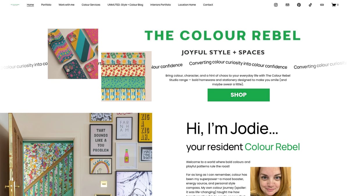
This is where the magic happens. The Colour Rebel Studio lives for helping you find your signature pattern of colours. Whether you want to transform your flat, your wardrobe, or your brand, their bespoke consulting makes you the trendsetter, not the follower.
What’s on offer?
- Personalised pattern and colour advice for individuals and businesses.
- Real-life makeovers that turn beige into brilliant.
- Access to resources, memberships, and licensing for creative pros.
Ready to rebel against the ordinary? The Colour Rebel Studio is your backstage pass to 2026’s boldest colour moves.
Navigating Challenges: Common Pitfalls and Expert Solutions
Taming the wild world of pattern of colours is not for the faint-hearted. Sometimes, what starts as a playful experiment ends in a visual circus. Fear not, rebel! Here’s your toolkit for sidestepping the most common disasters and strutting into 2026 with colour confidence.
Overcoming Pattern Overload and Visual Fatigue
Ever walked into a room and felt instantly dizzy? You’ve just met pattern overload. The secret to a harmonious pattern of colours is knowing when to shout and when to whisper.
- Mix bold and neutral shades for breathing space.
- Limit the number of competing motifs.
- Use repetition to create rhythm, not chaos.
If your eyes ache, your guests will too. Take a step back, squint, and ask yourself: does anything need to be edited out? Sometimes, less is genuinely more with a pattern of colours.
Avoiding Trend Traps: Timeless vs. Trendy Patterns
Here’s a truth bomb: not every hot trend deserves a place in your home or wardrobe. Patterns that scream “2026!” might be yesterday’s news by 2027. The art is in blending timeless foundations with a playful nod to what’s new.
- Invest in classic motifs, then layer in on-trend colours.
- Check out 2026 Graphic Design Color Trends for inspiration on what’s truly gaining traction.
- Ask: Will I still love this pattern of colours next year?
When in doubt, trust your gut, not just the trend report.
Ensuring Accessibility and Inclusivity in Pattern Design
Design is for everyone, so your pattern of colours should never leave anyone out. Accessibility means more than ticking boxes—it’s about ensuring your creations can be enjoyed by all.
- Use high contrast for legibility.
- Avoid colour combos that blend for colour-blind viewers.
- Test patterns in different lighting and on various devices.
Inclusivity also means celebrating diverse cultures and perspectives. The most powerful pattern of colours is one that welcomes everyone into the story.
Sourcing Sustainable Materials and Ethical Production
If you want your pattern of colours to be a force for good, start with what it’s made from. Ethical sourcing and eco-friendly materials are more than buzzwords—they’re your ticket to guilt-free creativity.
- Research suppliers committed to sustainability.
- Look for recycled, organic, or low-impact materials.
- Build relationships with transparent partners.
Consumers are savvy. A pattern of colours that’s beautiful and ethical will always win hearts—and keep your rebel reputation sparkling.
Alright, rebel, you’ve now got the inside scoop on how patterns of colours are about to take over 2026—your wardrobe, your home, even your digital life. You know the difference between fleeting fads and patterns with staying power, and how to inject a bit of personality (and a lot of joy) into everything you touch. Ready to keep that colour confidence burning bright and never let your style fade into the background? Trust me, you were never meant to play it safe. Because joy isn’t neutral. And your life was never meant to be muted
0 comments