

Ready to ditch the beige and step into a world where your walls, wardrobe, and wildest dreams burst with energy? You’re in the right place.
For 2026, the design world is obsessed with patterns with colour, and honestly, who can blame them? Vibrant prints and bold hues aren’t just a trend; they’re a movement.
This guide is your ticket to mastering patterns with colour, whether you want a home that radiates personality or a wardrobe that turns heads on the high street.
We’ll break down what’s trending, share expert tips, and give you the confidence to create a look that’s unmistakably yours. Let’s rebel against the ordinary—one bold choice at a time.
The 2026 Colour & Pattern Landscape: What’s Trending?
Step into 2026 and you’ll find the world shouting back at beige. This year, patterns with colour are not just a trend—they’re a joyful rebellion. Let’s unpack what’s making waves, who’s leading the charge, and how you can ride the crest of this vibrant movement.
The Rise of Maximalism and Bold Statements
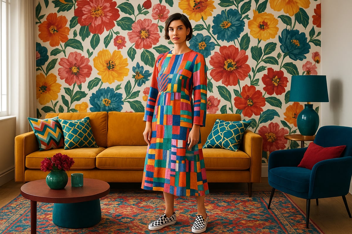
Minimalism has officially been shown the door. In its place, maximalist design is making a triumphant return, with Pinterest’s 2024 trend reports showing a surge in searches for “bold patterns” and “colourful interiors.” People want their homes—and their wardrobes—to shout personality, not whisper it.
Think oversized florals sprawling across sofas, geometric abstractions on feature walls, and playful stripes that zigzag with confidence. Maximalism lets you break the rules, mixing patterns with colour in ways that spark joy. According to the 2026 Interior Design Trends Survey, designers are going bolder, with earthy tones and statement prints leading the pack.
Trending Colour Palettes for 2026
This year’s palettes are anything but shy. Dulux and Pantone have crowned rich, saturated tones as their Colours of the Year, and the design world is listening. Expect to see deep emeralds, sapphire blues, and punchy magentas paired with unexpected pastels and earthy brights.
Surveys show that 68% of homeowners are craving more vibrancy in their spaces. Patterns with colour are everywhere, from dreamy, sun-washed peach and mint combos to the grounding energy of ochre and terracotta. Mixing these hues with bold prints delivers a double dose of personality.
Patterns in Fashion vs. Interiors
Here’s where things get juicy: patterns with colour are blurring the lines between your closet and your living room. Checkerboard motifs have strutted off the catwalk and onto your cushions. Retro prints—think swirling 70s psychedelia—are back in both fashion and interiors, giving everything a playful, nostalgic twist.
While interiors lean into scale and layering, fashion gets flirty with smaller, punchier prints. Yet, both worlds share a love for unapologetic self-expression. It’s all about making patterns with colour your own, wherever you wear them.
Influences Shaping 2026 Trends
What’s fuelling this creative explosion? Culture, tech, and the planet itself. Digital art and AI-generated prints are flooding the market, while eco-friendly dyes and sustainable materials are more sought after than ever. Gen Z’s love for dopamine dressing is pushing patterns with colour into the mainstream, making bold choices the new “normal.”
Environmental concerns are driving designers to experiment with plant-based pigments and recycled textiles. The result? A world of patterns with colour that’s as kind to the earth as it is to your eyes.
Key Designers and Brands to Watch
If you want to see patterns with colour done right, watch the trailblazers. Designers like Yinka Ilori and Camille Walala are painting the world with optimism, while brands like Marimekko and House of Hackney are redefining playful maximalism.
Collaborations between fashion and homeware brands are creating cohesive pattern stories, letting you dress yourself and your home in matching moods. These creative partnerships are proof that patterns with colour are more than a trend—they’re a movement. Keep your eyes peeled, because this is only the beginning.
The Psychology of Colour and Pattern: Impact on Mood and Space
Ever walked into a room and instantly felt your shoulders drop, or tried on a wild print and suddenly wanted to dance? That’s the secret sauce of patterns with colour. They’re not just pretty details. They’re mood-shifters, energy-boosters, and confidence-makers—if you know how to use them.
How Colour Influences Emotions and Perceptions
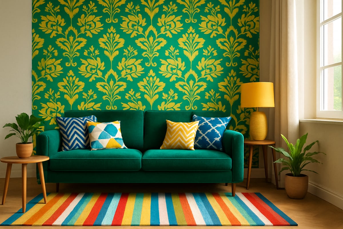
Let’s get one thing straight: colour isn’t just “nice to have”—it’s a mind-bender. Blues soothe our nerves, making bedrooms and chill-out zones feel like a spa day. Yellows? They’re like a shot of espresso for your walls, sparking creativity and optimism. Red is the extrovert of the rainbow, cranking up excitement and even heart rates.
Studies in environmental psychology show that patterns with colour can literally change how we feel in a space. Imagine a home office splashed with energising coral or an entryway cloaked in calming sage. These choices aren’t random—they’re backed by science.
But here’s the plot twist: the same colour can feel totally different depending on how you use it. A bold red accent might empower you in a living room, but overwhelm in a tiny bathroom. It’s all about balance, intention, and a pinch of rebellion.
The Power of Patterns in Shaping Experience
Now, let’s talk patterns. They’re more than eye-candy—they’re mood-shapers. Organic patterns (think leafy or floral) tend to relax us, whispering “breathe out” every time you walk by. Geometrics? They’re the go-getters, adding order and structure, perfect for spaces where you need to focus.
Abstract and high-contrast patterns with colour can energise a room or outfit, turning up the fun and confidence. Ever noticed how a bold striped jacket makes you stand taller? Or how a soft, repetitive motif in your bedroom feels like a lullaby? That’s the genius of pattern psychology.
Mixing patterns with colour is like DJ-ing for vibes. The tempo, the repetition, the visual rhythm—it all plays into how we experience a space or look. The trick is knowing when to pump up the volume and when to let things breathe.
Combining Colour and Pattern for Maximum Impact
Here’s where the real magic happens: combining patterns with colour to create the mood you crave. Want a restful retreat? Pair soft, muted patterns with gentle hues. Craving energy in your workspace? Try punchy geometric prints in uplifting colours.
To nail the look, link colours across patterns for cohesion, and balance busy prints with calm solids. If you’re nervous about clashing, check out Mastering Colour and Pattern Pairing for cheeky, foolproof tips from the pros.
Remember, the most memorable spaces and outfits are never beige. Patterns with colour are your ticket to a life less ordinary—so go on, give your world a mood makeover.
Step-by-Step Guide: Creating Your Signature Look with Patterns and Colour
Ready to rebel against the beige brigade? It’s time to step off the safe path and into your own vibrant spotlight. Follow this step-by-step guide to mastering patterns with colour and claim your signature style for 2026. Whether you’re revamping your lounge, your wardrobe, or both, you’ll find all the cheeky wisdom and practical tips you need right here.
Step 1: Define Your Style and Goals
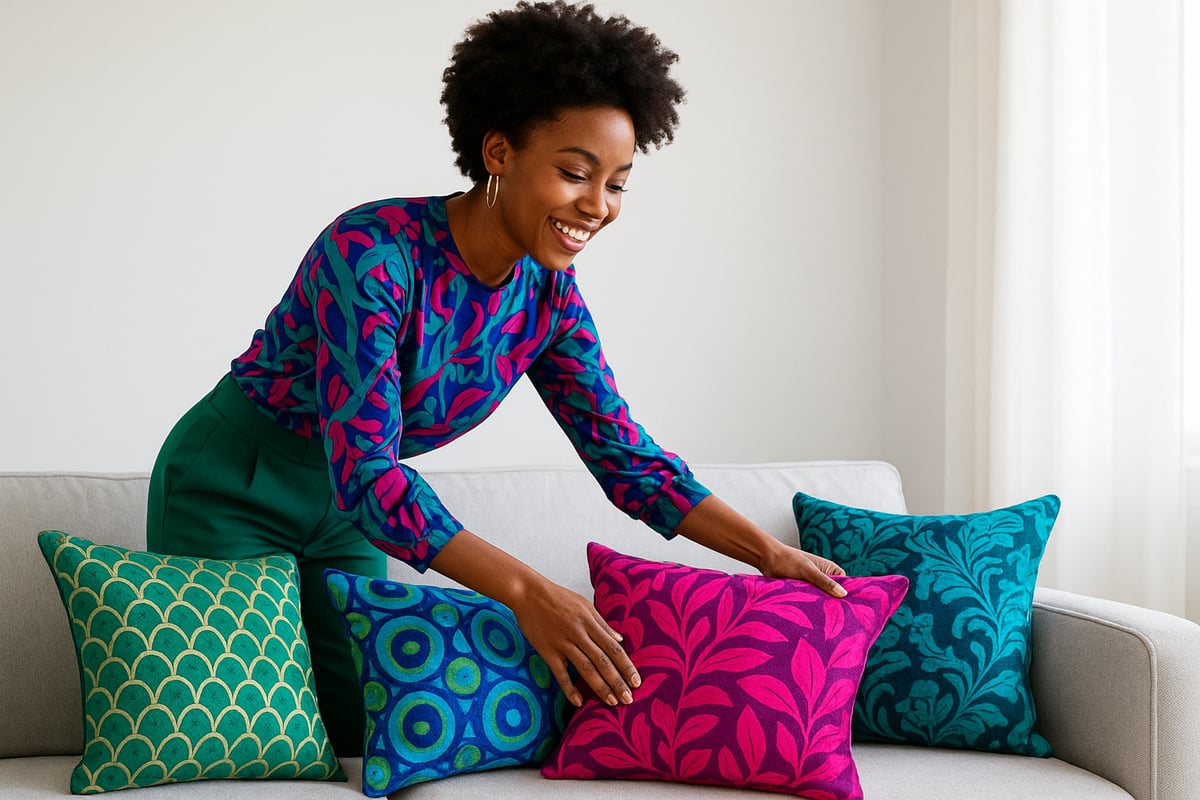
Before you start splashing patterns with colour everywhere, let’s get personal. Who are you when no one’s watching? Do you crave calm or crave chaos? Start with a self-assessment—snap pics of spaces and outfits you love, scroll your saved boards, and jot down three words that describe your dream vibe.
Ask yourself:
- Do I want my space or look to feel energising or restful?
- Which colours and patterns make me smile?
- What message do I want to send to the world (or just my nosy neighbour)?
For a deep dive, check out this Step-by-Step Colour Wardrobe Guide to help you define your style and set confident goals. Remember, your signature style is about expressing you, not anyone else’s Pinterest board.
Step 2: Choose Your Colour Palette
Now for the fun bit—picking your colours. Patterns with colour start with a palette that sings (or shouts, if that’s your thing). Play with three classic approaches:
- Analogous: Colours next to each other on the wheel, like teal, blue, and green.
- Complementary: Opposites attract—think pink and lime green.
- Triadic: Three evenly spaced hues, like purple, orange, and teal.
Use digital tools or paint chips to see combos in real life. Don’t just guess—hold colours up to the light, your face, or your sofa. The right palette can make patterns with colour feel harmonious, not chaotic. Test, tweak, and trust your gut. If it makes you grin, it’s a winner.
Step 3: Select Patterns That Reflect Your Personality
Patterns with colour aren’t just about what’s trending—they’re about what feels like you. Are you wild for florals, obsessed with geometrics, or partial to a cheeky animal print? Start by exploring:
- Florals: Soft or bold, romantic or punchy.
- Geometrics: Crisp lines, modern vibes.
- Abstracts: Artsy, unexpected, and full of attitude.
- Animal prints: Go subtle or go full-on safari.
Consider scale and density. Big room? Go large and in charge. Tiny flat? Maybe keep it petite. Patterns with colour should mirror your personality, not swallow it whole. If you’re unsure, test with samples or accessories first.
Step 4: Mix and Layer Patterns with Confidence
Mixing patterns with colour is like hosting a party—everyone needs to get along, but not everyone can be the loud one. Follow these cheeky rules:
- Vary scale: One big, one medium, one small.
- Link colours: Share at least one hue across patterns.
- Balance busy and calm: Pair wild prints with solids or subtle textures.
Visualise the mix. Lay out swatches or try a digital mood board. Don’t be afraid to break a rule or two—just make sure there’s some logic holding your patterns with colour together. If it feels like a riot, edit until it feels like a celebration.
Step 5: Apply Patterns and Colour to Different Contexts
Ready to take patterns with colour off the mood board and into reality? In interiors, start with walls, rugs, or curtains for impact, then layer in cushions or art. In fashion, go bold with a statement dress or keep it subtle with a patterned scarf.
Try this quick-fire table for inspiration:
| Context | Statement | Accent |
|---|---|---|
| Living Room | Wallpaper | Cushions |
| Bedroom | Duvet | Lampshade |
| Outfit | Dress | Belt/Shoes |
Patterns with colour can transform any space or look. Start small if you’re nervous, or jump in feet first if you’re feeling brave.
Step 6: Edit, Refine, and Personalize
You’ve created a riot of patterns with colour. Now, take a step back and review. Is there flow from room to room, or outfit to outfit? Remove anything that feels forced. Add a personal touch—a vintage find, a DIY project, or something only you would choose.
Ask for feedback, but trust your instincts. Patterns with colour should make you feel fabulous every time you walk in or get dressed. If it doesn’t spark joy, out it goes. Your signature look is all about embracing what makes you unique, rebellious, and brilliantly bold.
Expert Insights: Tips from Leading Colour Consultants and Designers
Ready to get the inside scoop from the rebels shaking up the world of patterns with colour? We’ve tapped top designers and colour consultants for their juiciest secrets—so you can skip the rookie mistakes and strut into 2026 with confidence.
Common Mistakes to Avoid with Patterns and Colour
Let’s start with the big don’ts. Overcrowding your space with too many patterns with colour is an instant headache. Top designers agree: if it feels busy, it probably is. Another pitfall? Forgetting to link your patterns with colour—when shades clash, the vibe gets chaotic fast.
Lack of cohesion is the silent killer of style. Before you splash out, ask yourself: do these patterns with colour actually talk to each other or are they fighting for attention? For inspiration and practical ways to sidestep these blunders, check out Make Your Home Pop with Colour. It’s a goldmine for rebels ready to break the rules (but still look pulled together).
Finally, don’t forget scale. That massive leopard print might look fierce on a cushion, but on every wall? Not so much.
Pro Tips for Long-Lasting, Versatile Designs
Want your patterns with colour to outlast the next design cycle? Here’s the secret: choose timeless bases and sprinkle in trend-driven accents. Designers swear by starting with classic geometrics or subtle stripes, then layering on bold, seasonal pops. This way, your space or wardrobe never feels stuck in the past.
Think about versatility. Opt for investment pieces in patterns with colour you truly love, not just what’s trending this week. Adaptable colour schemes—like jewel tones paired with neutrals—give you room to play without major overhauls.
Balance is everything. If you go wild with patterns with colour on the sofa, keep the curtains calm and let your accessories do the talking. The pros call it the “one star, two backups” rule: one showstopper, two supporting acts, and you’re golden.
Sustainability and Ethical Choices
Want to make a statement and save the planet? The new rebellion is all about sustainable patterns with colour. Choose eco-friendly materials, like organic cotton and recycled fibres. Opt for low-VOC paints when you’re revamping walls or upcycling furniture.
Responsible sourcing isn’t just a buzzword. It’s driving real change. According to the 2025 Houzz survey, more than half of design-savvy shoppers now demand sustainable options for their patterns with colour. That’s a revolution worth joining.
Look for brands that prioritise ethical production and transparency. And remember: buying less but better is the most rebellious act of all. Your patterns with colour can be both bold and kind to the world.
Inspiration Gallery: Real-Life Pattern & Colour Success Stories
Ready for a joy injection? Let’s peek behind the curtain at how patterns with colour have flipped dull into dazzling in real homes, wardrobes, and public spaces. These aren’t just stories, they’re rebellions against the beige, the boring, and the “play it safe” crowd. Prepare to be inspired by the bold and the beautiful.
Transformative Interiors: Before & After
Nothing says rebellion like tearing up the rulebook and splashing your space with patterns with colour. Take Emily’s once-drab lounge. She swapped bland walls for a wild mural of geometric shapes, threw in a punchy teal sofa, and scattered quirky patterned cushions everywhere. The result? Her friends now call her flat “the happiest place in town.”
Here’s a quick peek at another transformation:
| Before | After |
|---|---|
| Plain beige walls | Oversized abstract wallpaper |
| Grey sofa | Emerald green velvet sectional |
| Sparse décor | Playful patterned rugs and throws |
Clients consistently rave about the mood boost. One said, “I feel like I live inside a magazine spread, but it’s actually my home.” If you’re itching to try it yourself, check out this guide on how to choose a room's colour scheme to kickstart your own pattern revolution.
Fashion Forward: Personal Style Makeovers
Patterns with colour aren’t just for your walls. Meet Zara. She ditched her monochrome work wardrobe for checkerboard trousers and a sunshine yellow blazer. Result? Instant confidence boost and a string of compliments. Her stylist’s advice: “Clothes should make you grin, not yawn.”
Let’s see how these makeovers stack up:
- Before: Black trousers, white shirt, invisible in the crowd.
- After: Bold stripes, pink animal print scarf, and a skip in her step.
- Feedback: “I finally feel like my wardrobe matches my personality.”
Curious about what’s next in the world of wearable boldness? Dive into the 2026 pattern trends in fashion for a taste of what’s coming hot off the catwalk.
Public Spaces and Commercial Projects
Patterns with colour aren’t just personal—they’re powerful in public. Cafés swapping sterile white for playful murals report a spike in Instagram tags and foot traffic. Offices embracing earthy brights and statement stripes find staff energy (and creativity) levels soaring.
One co-working space used a mash-up of organic patterns and vibrant hues to turn a “meh” breakroom into the building’s social hub. The data? A 20 percent jump in employee satisfaction, and, yes, people actually WANT to eat lunch there now.
From boutique hotels to retail shops, brands are learning that patterns with colour are the new secret weapon for unforgettable customer experiences. The result: more buzz, more bookings, more joy. Who knew rebellion could look this good?
How The Colour Rebel Empowers Confident Colour Choices
Ready to ditch the beige and embrace a life bursting with patterns with colour? Welcome to The Colour Rebel Studio, where bland is banned and bold is the new black. Here, confidence isn’t optional—it’s contagious. The Colour Rebel exists to help you find your voice in a world that loves to play it safe, making maximalism feel like a personal revolution.
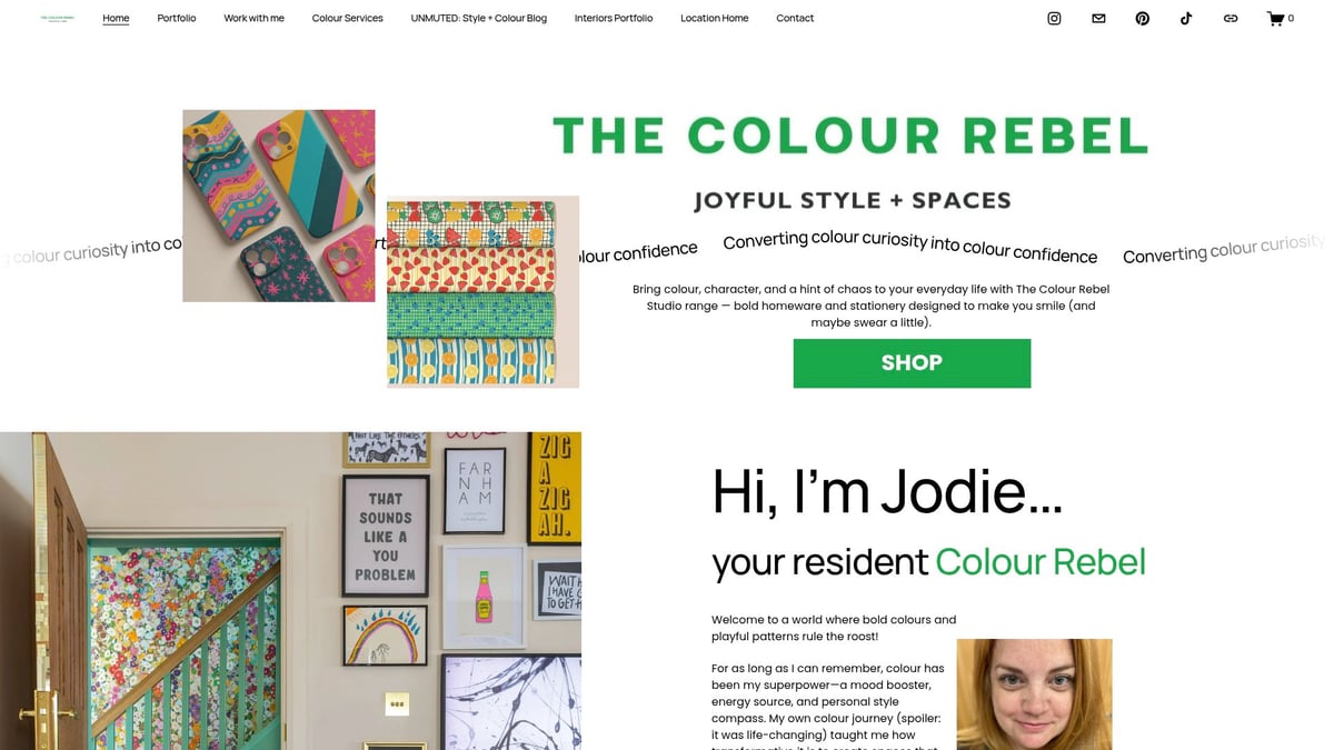
The philosophy is simple: everyone deserves to surround themselves with joy, and nothing says joy quite like playful patterns with colour. Through a blend of cheeky encouragement and expert advice, The Colour Rebel helps you give your home and wardrobe a vibrant new personality.
What does The Colour Rebel actually do? In short, they make your design dreams a reality. Here’s what’s on offer:
- Bespoke colour and pattern schemes for interiors that scream “you” (in a good way).
- Wardrobe colour analysis, so every outfit feels like a power move.
- Personalised design consultations—think of it as therapy, but for your living room and clothing rails.
Want ongoing support? Enter The Rebellion Membership. It’s your secret weapon for style clarity and daily pep talks, with a community that actually gets your love for patterns with colour. Members enjoy:
- Exclusive access to workshops and Q&As.
- Daily doses of inspiration (and a little tough love) from Jodie herself.
- A supportive network of fellow rebels who know that confidence is the best accessory.
Let’s talk real results. The Colour Rebel isn’t just about pretty palettes and trendy patterns with colour. Clients rave about feeling more themselves—whether they’re revamping a dull lounge or finally daring to wear those statement trousers. Jodie, a certified Colour Consultant and Interior Designer, uses her expertise to create spaces and wardrobes that reflect your true colours, not just what’s trending.
The best bit? The Colour Rebel’s maximalist magic is perfectly in sync with the 2026 Color Trends in Interiors. Think richer neutrals, uplifting yellows, and a fearless approach to mixing it all together. No more tiptoeing around colour—here, you become the main character.
In a world obsessed with playing it safe, The Colour Rebel dares you to go bold, live loud, and let your personality shine through patterns with colour. Ready to start your own colour rebellion? The door’s open, and the paint pots are waiting.
So you’ve soaked up the bold patterns, the juicy colour combos, and all the cheeky tips from our 2026 guide—now what? Here’s the truth You don’t need to play it safe or blend into the background. If you’re ready to ditch the neutral and let your personality do the talking (loudly), you’re in the right place. I want you to wake up each day feeling unapologetically you—at home, in your wardrobe, everywhere. Ready to rebel in technicolour
Because joy isn’t neutral. And your life was never meant to be muted
0 comments